
Author
Suzanne is an Owner/Designer
Author
Suzanne is an Owner/Designer
A big living room can still feel crowded, and square footage is rarely the culprit. Here's how I diagnose the real causes, from blocked walkways to a rug that's two sizes too small, and what to do about each one.
A big living room can still feel crowded, and square footage is rarely the culprit. Here's how I diagnose the real causes, from blocked walkways to a rug that's two sizes too small, and what to do about each one.

Honestly, toys are one of the biggest offenders. Organizing them isn't my lane, but I'll say this: half the time the fix isn't more storage, it's fewer toys in the shared room. Move some to bedrooms. Rotate the rest. And whatever stays, put it behind a lid, because closed storage takes twenty small chaotic things and turns them into one calm intentional thing.
Then we define zones so your brain knows where to walk and where to sit the second you step in.
Here's the short answer: a living room feels crowded because of circulation, scale, and visual weight, not square footage. If your walking paths cut straight through the middle of your seating, if your furniture is either too small or too big for the room, and if your eye has forty things to land on, the room reads as cramped no matter how many feet you have. Fix the path first, then the scale, then the clutter.
Start With the Walkways, Not the Furniture
Before I move a single chair, I figure out how people actually travel through the room. Front door to kitchen. Hallway to couch. Dining opening to the back slider.
Those paths exist whether you plan for them or not. If you don't give them a lane, they'll carve one right through your conversation area, and every time someone crosses it the room feels busy and interrupted.
The general guidance I work from: major walkways want roughly 30 to 36 inches of clear width, and a secondary path you use less often can squeeze to around 24. Between a sofa and coffee table, 14 to 18 inches tends to feel right, close enough to reach your drink, far enough to get by.
Those are starting points, not laws. A narrow room sometimes forces a tighter number, and that's fine as long as you're choosing it on purpose.
The move that solves this most often is pulling the sofa forward and routing traffic behind it. People resist that. Pushing furniture against the wall feels like it creates space, and it does create empty floor, but empty floor in the wrong shape just makes the middle of the room feel like a parking lot with a couch on the edge.

Furniture Against the Walls Is Not Free Space
There's an instinct to line every piece up against the perimeter, especially in a big room. The result is a donut: furniture around the edges, nothing in the middle, and a conversation area where everyone is shouting across eight feet of rug.
Pulling pieces inward creates a defined seating zone with a boundary. Boundaries are what make a room feel organized. Your brain gets a clear message about what this corner is for.
The flip side is furniture floating for no reason. A chair angled into the middle of the room, touching nothing, serving no zone, is just an obstacle with upholstery. Every floating piece should be doing a job: closing a conversation circle, defining an edge, or facing a real focal point.
When Not To Pull It Off the Wall
In a genuinely narrow room, say under eleven feet wide, pulling the sofa forward can eat the only walkway you have. Sometimes the sofa belongs against the wall and the definition comes from the rug and lighting instead. I'd rather have a wall-hugging sofa and a clear path than a floating sofa and a shuffle.
Scale: The Quiet Reason Big Rooms Feel Small
Undersized furniture in a large room is the most common scale mistake I see, and it's counterintuitive. People buy a small sofa thinking it will preserve space. Instead they end up buying more pieces to fill the gaps, and now there are eleven objects where three would have done the job.
A large room wants fewer, bigger items. One substantial sofa reads calmer than a loveseat plus two chairs plus an ottoman plus a side table plus a plant stand.
Oversized furniture has the opposite failure. A deep sectional in a modest room leaves you edging sideways past the coffee table. The room isn't small, the pieces just ate the circulation.
What you're seeing | Likely cause | The fix |
|---|---|---|
Room feels busy but not full | Too many small objects and furniture pieces | Consolidate into fewer, larger items and closed storage |
You keep bumping into things | Walkway under about 30 inches or a path crossing the seating zone | Reroute circulation, usually behind the sofa |
Furniture looks like it's drifting | Rug too small, nothing anchoring the group | Size up the rug so front legs land on it |
Room feels shorter than it is | Low curtain rod, low art, single overhead light | Hang curtains near the ceiling, add lamps at multiple heights |
Eye doesn't know where to land | Two or three competing focal points | Pick one primary, let the rest support it |
Corners feel dead and dark | No light below ceiling height | Floor lamp or table lamp in each dark corner |
The Rug Is Almost Always Too Small
If I could fix one thing in most living rooms, it would be rug size. A rug that's too small acts like a little island in the middle of the floor, and it visually chops the room into pieces.
The general rule I use: all front legs of the seating pieces should sit on the rug, and ideally the whole group. In a large room, a fully-on rug is worth the cost. Aim to leave a consistent border of bare floor around the perimeter, often somewhere in the 8 to 18 inch range depending on room size.
When a big rug isn't in the budget, layering a smaller patterned rug over a large natural fiber one gets you most of the way there for less.
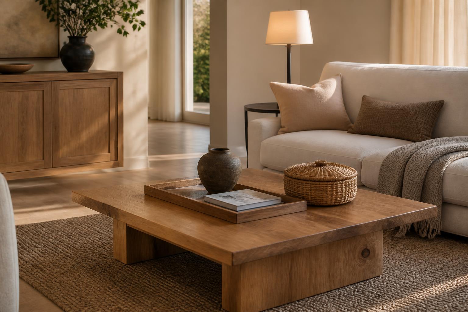
Visual Weight: Twenty Things Versus One Thing
This is where the toy conversation comes back, and it applies to adults too. A shelf with eighteen individual objects on it reads as clutter. The same shelf with three groupings reads as styled.
Closed storage is the cheat code. Doors, lids, drawers. The contents don't change, the visual noise does.
The other half is editing. Not minimalism, just honest assessment. Every item on a surface is asking for a bit of your attention, and a room full of small requests feels tiring even when it's clean.
If you're not sure what your version of calm actually looks like, the Style Discovery quiz is a solid starting point. Readers can take it free with the code FRIENDS, a $49 value.
Pick One Focal Point and Mean It
A fireplace, a TV wall, and a big window on three different walls will pull your seating in three directions. That tug of war is a real source of crowded feeling, because nothing lines up and every piece is compromising.
I choose a primary focal point, usually architectural, and let everything else support it. The TV can live above or beside the fireplace. The window becomes a light source and a view rather than a thing the sofa must face.
If you truly have two strong anchors, split the room into two zones with two purposes instead of forcing one layout to serve both.
Lighting That Makes a Room Feel Bigger
One ceiling fixture in the middle of the room lights the middle of the room. The corners go dark, the walls fall away, and your brain reads the lit area as the whole room. Smaller than it is.
The fix is light at three heights: overhead, eye level from table and floor lamps, and something low or indirect like a wall sconce or uplight. Put a light source in every dark corner and the walls come back.
Warm bulbs, ideally in the 2700K to 3000K range, and dimmers where you can. If you want the deeper version, I broke it down in this guide to lighting spacing and placement.
And hang your curtains high and wide. Rod near the ceiling, panels extending past the window frame so they stack on wall rather than glass. There's a full walkthrough in how to hang curtains like a designer.
Quick Self-Audit
Walk to your living room doorway and stand there. Then run through this:
Can you walk from every entry to every seat without turning sideways or going around furniture?
Does a main path cut through the middle of your seating group?
Do the front legs of your sofa and chairs sit on the rug?
Is there a piece of furniture touching a wall that doesn't need to be?
Count the loose objects on open surfaces. More than about a dozen in your sightline?
Are there dark corners after sunset?
Where does your eye go first? Is that the thing you'd choose?
Is anything in the room serving no function and defining no zone?
Two or three yeses and you have a plan. Start with circulation, then the rug, then editing.
Before and After, In Words
Before: sofa flat against the long wall, two chairs against the opposite wall facing it across eight feet, 5x7 rug floating in the middle touching nothing, open shelving stacked with bins and toys, one ceiling light, a path running diagonally through the center.
After: sofa pulled about three feet off the wall onto a 9x12 rug, chairs rotated in at angles to close the conversation circle, walkway rerouted to a clear 34 inch lane behind the sofa, open shelving swapped for a closed console with lidded baskets, arc lamp in the dark corner and table lamps at each end.
Same square footage. Half the pieces. Feels twice as big.
Shop This Room
As an Amazon Associate, I earn from qualifying purchases. It doesn't change what I recommend.

The rug that's finally big enough goes under the seating group so at least the front legs of every piece land on it. This single swap does more than any furniture change.
Lidded baskets that hide the small stuff live under the console or beside a chair. Lids matter. Open baskets still read as visual noise.
A closed-front media console replaces the open shelving unit that's currently displaying your router. Doors turn a wall of clutter into one clean plane.
The low coffee table with a bottom shelf anchors the seating zone and gives remotes and coasters a home one level down.
An arc floor lamp for the dark corner throws light into the ceiling and pushes the corner outward instead of letting it disappear.
Curtains long enough to hang high go near the ceiling and wide of the frame, which makes the window and the wall read taller.
A toy bench with a lid does double duty as extra seating and a fast cleanup target near the play zone.
Slim table lamps for the corners sit on end tables and console tops so the room has light at eye level, not just overhead.
It Depends on Your Space
Small room, under about 12 by 14. Prioritize the path over the perfect layout. Fewer, leggier pieces so you can see floor underneath. Skip the bulky ottoman.
Large or open-concept room. Your problem is usually definition, not space. Use rugs and furniture backs to draw zone edges. One big seating group beats three scattered clusters.
Renters. Rug size, lamp placement, and closed storage are all portable. Tension rods and removable hooks let you hang curtains high without patching later.
Owners. Worth considering: widening a cased opening, moving a light switch, adding recessed lighting on a dimmer. Structural fixes outlast furniture fixes.
Low light. Lighter upholstery, mirrors across from windows, and warm lamps in every corner. Avoid heavy dark furniture crowded together.
Bright light. You have room for deeper colors and heavier pieces. Just watch for glare that makes you close blinds and lose the advantage.
Kids and pets. Fewer, larger, washable. Storage that closes. A defined play zone with a boundary the family understands, which makes cleanup a location instead of a scavenger hunt. If toys are the main pressure point, this room-by-room toy storage system gets specific.
Tight budget. Rearranging is free. Do that first, live with it a week, then spend on the rug.

If you've rearranged three times and it still feels off, the issue is probably the plan, not the pieces. Drawing the layout before buying anything is the whole job, and it's exactly the kind of work I take on.
Getting the Scale Right on Paper First
The reason I plan on paper is that furniture shopping is expensive guessing. A floor plan with real dimensions tells you whether that 96 inch sofa leaves you a walkway or leaves you annoyed.
If you want to see how scale and layering work together in a layout that's already resolved, this breakdown of a warm transitional living room covers the thinking.
Space planning is the service I'd point you to first if the room feels wrong and you can't name why. You can see how that works and what's included here.
FAQ
Why does my living room feel small even though it's big?
Usually the walkways and the seating group are fighting for the same floor, so no part of the room feels generous. Add undersized furniture and a rug that's too small and the room reads as a collection of unrelated parts. Fix the circulation path first and the size comes back.
How much space should there be between a sofa and a coffee table?
Somewhere around 14 to 18 inches is comfortable for most people, close enough to reach and wide enough to walk. Adjust for your household, since long legs and small kids change the math. Tape it out on the floor before you commit.
Should living room furniture touch the walls?
Not by default. Pulling pieces a few inches to a few feet off the wall defines the seating zone and lets you route traffic behind it. The exception is a genuinely narrow room where floating the sofa would eat your only walkway.
What size rug do I need for a living room?
Big enough that at least the front legs of every seating piece rest on it, and ideally the full group. For most living rooms that means 8x10 or 9x12, not 5x7. Leave a fairly even band of bare floor around the edges.
Does decluttering actually make a room feel bigger?
It makes it feel calmer, which most people experience as bigger. Twenty small objects each ask for a bit of attention, while three groupings ask for one. Closed storage gets you the same effect without throwing anything away.
If your living room is big on paper and cramped in real life, that gap is solvable and it usually doesn't require new furniture. Tell me about your room and we'll find out what's actually going on.
Honestly, toys are one of the biggest offenders. Organizing them isn't my lane, but I'll say this: half the time the fix isn't more storage, it's fewer toys in the shared room. Move some to bedrooms. Rotate the rest. And whatever stays, put it behind a lid, because closed storage takes twenty small chaotic things and turns them into one calm intentional thing.
Then we define zones so your brain knows where to walk and where to sit the second you step in.
Here's the short answer: a living room feels crowded because of circulation, scale, and visual weight, not square footage. If your walking paths cut straight through the middle of your seating, if your furniture is either too small or too big for the room, and if your eye has forty things to land on, the room reads as cramped no matter how many feet you have. Fix the path first, then the scale, then the clutter.
Start With the Walkways, Not the Furniture
Before I move a single chair, I figure out how people actually travel through the room. Front door to kitchen. Hallway to couch. Dining opening to the back slider.
Those paths exist whether you plan for them or not. If you don't give them a lane, they'll carve one right through your conversation area, and every time someone crosses it the room feels busy and interrupted.
The general guidance I work from: major walkways want roughly 30 to 36 inches of clear width, and a secondary path you use less often can squeeze to around 24. Between a sofa and coffee table, 14 to 18 inches tends to feel right, close enough to reach your drink, far enough to get by.
Those are starting points, not laws. A narrow room sometimes forces a tighter number, and that's fine as long as you're choosing it on purpose.
The move that solves this most often is pulling the sofa forward and routing traffic behind it. People resist that. Pushing furniture against the wall feels like it creates space, and it does create empty floor, but empty floor in the wrong shape just makes the middle of the room feel like a parking lot with a couch on the edge.
Furniture Against the Walls Is Not Free Space
There's an instinct to line every piece up against the perimeter, especially in a big room. The result is a donut: furniture around the edges, nothing in the middle, and a conversation area where everyone is shouting across eight feet of rug.
Pulling pieces inward creates a defined seating zone with a boundary. Boundaries are what make a room feel organized. Your brain gets a clear message about what this corner is for.
The flip side is furniture floating for no reason. A chair angled into the middle of the room, touching nothing, serving no zone, is just an obstacle with upholstery. Every floating piece should be doing a job: closing a conversation circle, defining an edge, or facing a real focal point.
When Not To Pull It Off the Wall
In a genuinely narrow room, say under eleven feet wide, pulling the sofa forward can eat the only walkway you have. Sometimes the sofa belongs against the wall and the definition comes from the rug and lighting instead. I'd rather have a wall-hugging sofa and a clear path than a floating sofa and a shuffle.
Scale: The Quiet Reason Big Rooms Feel Small
Undersized furniture in a large room is the most common scale mistake I see, and it's counterintuitive. People buy a small sofa thinking it will preserve space. Instead they end up buying more pieces to fill the gaps, and now there are eleven objects where three would have done the job.
A large room wants fewer, bigger items. One substantial sofa reads calmer than a loveseat plus two chairs plus an ottoman plus a side table plus a plant stand.
Oversized furniture has the opposite failure. A deep sectional in a modest room leaves you edging sideways past the coffee table. The room isn't small, the pieces just ate the circulation.
What you're seeing | Likely cause | The fix |
|---|---|---|
Room feels busy but not full | Too many small objects and furniture pieces | Consolidate into fewer, larger items and closed storage |
You keep bumping into things | Walkway under about 30 inches or a path crossing the seating zone | Reroute circulation, usually behind the sofa |
Furniture looks like it's drifting | Rug too small, nothing anchoring the group | Size up the rug so front legs land on it |
Room feels shorter than it is | Low curtain rod, low art, single overhead light | Hang curtains near the ceiling, add lamps at multiple heights |
Eye doesn't know where to land | Two or three competing focal points | Pick one primary, let the rest support it |
Corners feel dead and dark | No light below ceiling height | Floor lamp or table lamp in each dark corner |
The Rug Is Almost Always Too Small
If I could fix one thing in most living rooms, it would be rug size. A rug that's too small acts like a little island in the middle of the floor, and it visually chops the room into pieces.
The general rule I use: all front legs of the seating pieces should sit on the rug, and ideally the whole group. In a large room, a fully-on rug is worth the cost. Aim to leave a consistent border of bare floor around the perimeter, often somewhere in the 8 to 18 inch range depending on room size.
When a big rug isn't in the budget, layering a smaller patterned rug over a large natural fiber one gets you most of the way there for less.
Visual Weight: Twenty Things Versus One Thing
This is where the toy conversation comes back, and it applies to adults too. A shelf with eighteen individual objects on it reads as clutter. The same shelf with three groupings reads as styled.
Closed storage is the cheat code. Doors, lids, drawers. The contents don't change, the visual noise does.
The other half is editing. Not minimalism, just honest assessment. Every item on a surface is asking for a bit of your attention, and a room full of small requests feels tiring even when it's clean.
If you're not sure what your version of calm actually looks like, the Style Discovery quiz is a solid starting point. Readers can take it free with the code FRIENDS, a $49 value.
Pick One Focal Point and Mean It
A fireplace, a TV wall, and a big window on three different walls will pull your seating in three directions. That tug of war is a real source of crowded feeling, because nothing lines up and every piece is compromising.
I choose a primary focal point, usually architectural, and let everything else support it. The TV can live above or beside the fireplace. The window becomes a light source and a view rather than a thing the sofa must face.
If you truly have two strong anchors, split the room into two zones with two purposes instead of forcing one layout to serve both.
Lighting That Makes a Room Feel Bigger
One ceiling fixture in the middle of the room lights the middle of the room. The corners go dark, the walls fall away, and your brain reads the lit area as the whole room. Smaller than it is.
The fix is light at three heights: overhead, eye level from table and floor lamps, and something low or indirect like a wall sconce or uplight. Put a light source in every dark corner and the walls come back.
Warm bulbs, ideally in the 2700K to 3000K range, and dimmers where you can. If you want the deeper version, I broke it down in this guide to lighting spacing and placement.
And hang your curtains high and wide. Rod near the ceiling, panels extending past the window frame so they stack on wall rather than glass. There's a full walkthrough in how to hang curtains like a designer.
Quick Self-Audit
Walk to your living room doorway and stand there. Then run through this:
Can you walk from every entry to every seat without turning sideways or going around furniture?
Does a main path cut through the middle of your seating group?
Do the front legs of your sofa and chairs sit on the rug?
Is there a piece of furniture touching a wall that doesn't need to be?
Count the loose objects on open surfaces. More than about a dozen in your sightline?
Are there dark corners after sunset?
Where does your eye go first? Is that the thing you'd choose?
Is anything in the room serving no function and defining no zone?
Two or three yeses and you have a plan. Start with circulation, then the rug, then editing.
Before and After, In Words
Before: sofa flat against the long wall, two chairs against the opposite wall facing it across eight feet, 5x7 rug floating in the middle touching nothing, open shelving stacked with bins and toys, one ceiling light, a path running diagonally through the center.
After: sofa pulled about three feet off the wall onto a 9x12 rug, chairs rotated in at angles to close the conversation circle, walkway rerouted to a clear 34 inch lane behind the sofa, open shelving swapped for a closed console with lidded baskets, arc lamp in the dark corner and table lamps at each end.
Same square footage. Half the pieces. Feels twice as big.
Shop This Room
As an Amazon Associate, I earn from qualifying purchases. It doesn't change what I recommend.
The rug that's finally big enough goes under the seating group so at least the front legs of every piece land on it. This single swap does more than any furniture change.
Lidded baskets that hide the small stuff live under the console or beside a chair. Lids matter. Open baskets still read as visual noise.
A closed-front media console replaces the open shelving unit that's currently displaying your router. Doors turn a wall of clutter into one clean plane.
The low coffee table with a bottom shelf anchors the seating zone and gives remotes and coasters a home one level down.
An arc floor lamp for the dark corner throws light into the ceiling and pushes the corner outward instead of letting it disappear.
Curtains long enough to hang high go near the ceiling and wide of the frame, which makes the window and the wall read taller.
A toy bench with a lid does double duty as extra seating and a fast cleanup target near the play zone.
Slim table lamps for the corners sit on end tables and console tops so the room has light at eye level, not just overhead.
It Depends on Your Space
Small room, under about 12 by 14. Prioritize the path over the perfect layout. Fewer, leggier pieces so you can see floor underneath. Skip the bulky ottoman.
Large or open-concept room. Your problem is usually definition, not space. Use rugs and furniture backs to draw zone edges. One big seating group beats three scattered clusters.
Renters. Rug size, lamp placement, and closed storage are all portable. Tension rods and removable hooks let you hang curtains high without patching later.
Owners. Worth considering: widening a cased opening, moving a light switch, adding recessed lighting on a dimmer. Structural fixes outlast furniture fixes.
Low light. Lighter upholstery, mirrors across from windows, and warm lamps in every corner. Avoid heavy dark furniture crowded together.
Bright light. You have room for deeper colors and heavier pieces. Just watch for glare that makes you close blinds and lose the advantage.
Kids and pets. Fewer, larger, washable. Storage that closes. A defined play zone with a boundary the family understands, which makes cleanup a location instead of a scavenger hunt. If toys are the main pressure point, this room-by-room toy storage system gets specific.
Tight budget. Rearranging is free. Do that first, live with it a week, then spend on the rug.
If you've rearranged three times and it still feels off, the issue is probably the plan, not the pieces. Drawing the layout before buying anything is the whole job, and it's exactly the kind of work I take on.
Getting the Scale Right on Paper First
The reason I plan on paper is that furniture shopping is expensive guessing. A floor plan with real dimensions tells you whether that 96 inch sofa leaves you a walkway or leaves you annoyed.
If you want to see how scale and layering work together in a layout that's already resolved, this breakdown of a warm transitional living room covers the thinking.
Space planning is the service I'd point you to first if the room feels wrong and you can't name why. You can see how that works and what's included here.
FAQ
Why does my living room feel small even though it's big?
Usually the walkways and the seating group are fighting for the same floor, so no part of the room feels generous. Add undersized furniture and a rug that's too small and the room reads as a collection of unrelated parts. Fix the circulation path first and the size comes back.
How much space should there be between a sofa and a coffee table?
Somewhere around 14 to 18 inches is comfortable for most people, close enough to reach and wide enough to walk. Adjust for your household, since long legs and small kids change the math. Tape it out on the floor before you commit.
Should living room furniture touch the walls?
Not by default. Pulling pieces a few inches to a few feet off the wall defines the seating zone and lets you route traffic behind it. The exception is a genuinely narrow room where floating the sofa would eat your only walkway.
What size rug do I need for a living room?
Big enough that at least the front legs of every seating piece rest on it, and ideally the full group. For most living rooms that means 8x10 or 9x12, not 5x7. Leave a fairly even band of bare floor around the edges.
Does decluttering actually make a room feel bigger?
It makes it feel calmer, which most people experience as bigger. Twenty small objects each ask for a bit of attention, while three groupings ask for one. Closed storage gets you the same effect without throwing anything away.
If your living room is big on paper and cramped in real life, that gap is solvable and it usually doesn't require new furniture. Tell me about your room and we'll find out what's actually going on.
Other Blogs
Other Similar Blogs
Your go-to destination for insightful articles, tips, and inspiration on all things landscaping and outdoor living
Other Blogs
Other Similar Blogs
Your go-to destination for insightful articles, tips, and inspiration on all things landscaping and outdoor living
Other Blogs
Other Similar Blogs
Your go-to destination for insightful articles, tips, and inspiration on all things landscaping and outdoor living


Join our newsletter list
Sign up to get the most recent blog articles in your email every week.