Author
Suzanne is an Owner/Designer
Author
Suzanne is an Owner/Designer
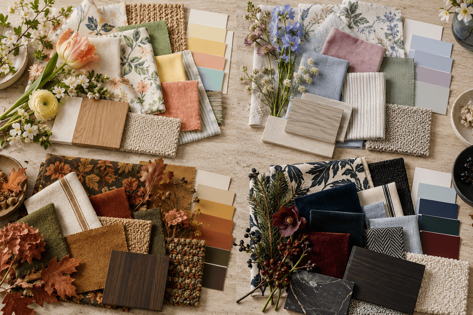
Cottage color does not stop at cream and sage. Here are three palettes, from soft and airy to rich and moody, plus how placement decides whether a room reads cheerful or cozy.
Cottage color does not stop at cream and sage. Here are three palettes, from soft and airy to rich and moody, plus how placement decides whether a room reads cheerful or cozy.

You know how the homes in Nancy Meyers films feel like a hug? Somehow they have stayed desirable instead of looking dated and a little silly the way most movie interiors do. That warmth is what people are usually after when they say cottage, and it is not owned by one color palette.
Here is the short answer. A cottage color palette works when you commit to three to four colors you genuinely like, repeat each one at least three times around the room, and let the furniture and pattern do the cottage part. Soft, cheerful, or moody is decided less by the colors themselves and more by where you put them, especially on the walls and the biggest upholstered pieces.
What Actually Makes a Room Read Cottage
Strip out color for a second. Cottage is a set of furniture and material decisions.
Slipcovers with a little slouch. Skirts on chairs and ottomans. Turned spindle legs, painted wood, cane and rattan. Florals and ticking stripes and block prints sharing a room without matching. Ruffles, scallops, pleated lampshades. Old things mixed with new things.
The mental model I use is a rich English grandmother who has been collecting for forty years. She never bought a set. She just kept picking up things in colors she liked, and because her taste held steady, it all landed in the same family.
That is the whole trick. Consistency of preference, not consistency of purchase.
If none of your furniture reads cottage, no paint color will fix it. Color is the finish, not the foundation.
Placement Decides the Mood
The same three colors can feel like a spring morning or a rainy October depending on what you put where.
Where the color goes | Soft and airy result | Rich and moody result |
|---|---|---|
Walls | Tinted white or the palest version of your hue | The deepest color in the palette, trim included |
Sofa | Cream, oatmeal, or pale slipcover | Olive, aubergine, or a saturated print |
Rug | Light wool-jute or faded vintage | Deep-ground floral or worn red-brown |
Accent color | Small doses in pillows and ceramics | Large doses in drapery and upholstery |
Wood tones | Painted, bleached, honey | Walnut, stained oak, dark antiques |
Lighting matters just as much. Warm bulbs around 2700K in table and floor lamps keep every palette below flattering. Overhead cans at full blast make even the prettiest color look like a dentist office. A handful of warm dimmable bulbs does more for mood than another paint sample.

Palette One: Butter Yellow, Fresh Green, and Coral
This is the clear, warm, spring-leaning version. It is the closest to that movie-kitchen feeling, and it is having a real moment right now without feeling trendy, because these colors have been in cottages for a century.
Butter yellow on the walls, not cream. It is more forgiving than white in a north-facing room and it makes a cream slipcover look intentional instead of dirty.
Fresh green shows up in a painted bookcase, a block-print pillow, plants, and glassware. Think leaf, not sage. Sage is the safe default that made everyone tired of cottage in the first place.
Coral is the smallest dose. A few pillows, a stack of stoneware, one lampshade, flowers.
This palette needs warm wood to stay grounded. Honey oak, pine, cane. All-white wood with these colors tips into nursery territory fast.

Palette Two: Dusty Rose, Lavender, and Blue
The cooler, softer cousin. Summer influence, faded rather than bright, like everything spent a decade in a sunny window.
The key is muddying each color. Clean lavender and clean pink read like a candy shop. Dusty rose with gray in it, lavender that leans toward mauve, and a soft chalky blue give you depth without weight.
Put the blue somewhere structural. Painted built-ins, a blue ground floral on the chairs, or the drapery. If blue only shows up in accessories it floats and the room reads pink by accident.
Walls here can be a tinted white with a pink or lilac drop so the whole room glows slightly. If you like the idea of one color on walls, trim, and ceiling together, my guide to color drenching walks through how to pick the right sheen so it does not look like a cake.
This palette is the trickiest with existing wood floors. Orange-toned oak fights dusty rose. A large pale rug solves it faster than refinishing.

Palette Three: Olive, Ochre, and Aubergine
Now the moody one. Autumn influence, warm and deep and genuinely cozy at night.
Olive on the walls, going up onto the trim if you are brave. Ochre in leather, lampshades, and a wool rug. Aubergine as the surprise, in velvet pillows, a painted inside-cabinet, or one dramatic pair of chairs. Purple and green are natural neighbors on the color wheel, which is why this feels old rather than invented. If you want more on making plum look expensive instead of dated, I broke that down in the aubergine rooms post.
Moody rooms need more light sources, not fewer. Five or six lamps at different heights, none of them overhead. Dark walls swallow light, so the fix is scattering small pools of it.
This palette is a sibling to the dark cottagecore kitchen look, so if you have done that in your kitchen, this living room will flow right out of it.
If you are staring at three palettes and cannot pick, the Style Discovery quiz sorts out which direction you actually gravitate toward. Use the code FRIENDS to take it free, a $49 value.
Keep It From Looking Like a Set
Three rules keep any of these from going flat.
Repeat each color three times at different scales. Big, medium, small. One green chair is an accident. A green chair, a green pillow across the room, and a green vase is a plan.
Break the palette on purpose. One black element. A dark iron lamp base, a black frame, a charcoal plaid throw. It sharpens everything else.
Mix your pattern scales. A large floral, a medium check, a thin stripe, and one solid texture. Same colors, different rhythms. That is how the grandmother method actually works in practice.

If your room has the right pieces but still feels unsettled, that is usually a layout problem wearing a color costume. Planning that out is exactly what I do, and you can tell me about your room here.
It Depends on Your Space
Small room. Go moody or go monochromatic, not medium. Pale walls with lots of contrasting accents chop a small room into pieces. One enveloping color, or one pale wall color with low contrast, makes it read larger.
Large or open room. Carry one of your three colors into every zone so the rooms read as related. Change the ratios, not the cast.
Renters. Skip paint. Get your color from drapery hung high and wide, a big rug, and slipcovers. Removable peel and stick wallpaper on one wall or inside a bookcase gives you the pattern without the deposit risk.
Owners. Paint the trim. Colored trim is the single fastest way to make a room stop looking builder-standard.
Low light. Warm palettes only. Butter yellow or olive. Cool dusty rose and lavender go gray and sad in a dim north room.
Bright light. Southern sun will wash out pale yellow into white. Take everything one step deeper than the sample looks.
Kids and pets. Performance fabric slipcovers you can pull off and wash, patterned rugs with a mid-tone ground, and your palest color above kid height. Put durability on the bottom half of the room.
Tight budget. Paint, pillow covers, and lampshades first. Those three change more than a new sofa does, and the sofa can wait. If you want a sense of what professional help runs before you decide, my services and pricing page lays it out.
Shop This Room
As an Amazon Associate, I earn from qualifying purchases. It doesn't change what I recommend.

The slipcover that survives everything anchors the seating group facing the fireplace and washes when life happens.
The rug that hides everything goes under all front legs and keeps the palette grounded.
The lamp that makes the corner glow belongs on the console behind the sofa, warm bulb only.
The pillows doing the pattern work sit on the sofa and carry your mid-scale print.
The ruffle that keeps it from being serious goes on the accent chairs, one per chair.
The skirted ottoman standing in for a coffee table sits center on the rug and doubles as a footrest.
The curtains that make the ceiling look taller hang high and wide on the window wall.
The little glass that makes grocery flowers look intentional lives on the mantel and side tables.
The basket that eats the throw blankets tucks beside the fireplace.
The frames for your grandmother-energy gallery cluster on the wall next to the chimney breast.
A ticking stripe fabric is also worth having around if you or a local workroom can recover a lampshade or a chair seat.
FAQ
What colors make a house look cottage?
Warm, slightly softened colors do most of the work. Butter yellow, leaf green, coral, dusty rose, chalky blue, olive, ochre, and aubergine all read cottage depending on how deep you take them. The key is choosing three or four and repeating them, rather than adding one of everything.
Can a cottage living room be dark?
Absolutely, and deep cottage rooms are often the coziest ones. Use olive or aubergine on the walls, add five or six warm lamps at different heights, and keep the ceiling light off in the evening. Dark plus a single overhead fixture is what makes a room feel like a cave.
What is the best white for cottage walls?
Look for a white with a warm or slightly yellow undertone rather than a crisp gallery white. Cool whites read modern and make old wood and antiques look dingy. Always sample on two walls and check it at night under your actual bulbs.
How do I mix florals without it looking busy?
Vary the scale and keep the color family tight. One large floral, one medium check or plaid, one narrow stripe, and a solid texture will happily share a sofa if they share two or three colors. If it feels chaotic, the problem is usually that two patterns are the same size.
Is cottage style going out of style?
The costumey version has cooled off, but the underlying pieces have been around for generations and are not going anywhere. Skirted seating, slipcovers, painted wood, and layered pattern have outlasted dozens of trends. Choosing a palette you actually love, instead of the one you see everywhere, is what keeps it from feeling dated.
If you want a plan that gets the layout, palette, and pieces settled all at once, let's talk about your room.
More Inspiration

You know how the homes in Nancy Meyers films feel like a hug? Somehow they have stayed desirable instead of looking dated and a little silly the way most movie interiors do. That warmth is what people are usually after when they say cottage, and it is not owned by one color palette.
Here is the short answer. A cottage color palette works when you commit to three to four colors you genuinely like, repeat each one at least three times around the room, and let the furniture and pattern do the cottage part. Soft, cheerful, or moody is decided less by the colors themselves and more by where you put them, especially on the walls and the biggest upholstered pieces.
What Actually Makes a Room Read Cottage
Strip out color for a second. Cottage is a set of furniture and material decisions.
Slipcovers with a little slouch. Skirts on chairs and ottomans. Turned spindle legs, painted wood, cane and rattan. Florals and ticking stripes and block prints sharing a room without matching. Ruffles, scallops, pleated lampshades. Old things mixed with new things.
The mental model I use is a rich English grandmother who has been collecting for forty years. She never bought a set. She just kept picking up things in colors she liked, and because her taste held steady, it all landed in the same family.
That is the whole trick. Consistency of preference, not consistency of purchase.
If none of your furniture reads cottage, no paint color will fix it. Color is the finish, not the foundation.
Placement Decides the Mood
The same three colors can feel like a spring morning or a rainy October depending on what you put where.
Where the color goes | Soft and airy result | Rich and moody result |
|---|---|---|
Walls | Tinted white or the palest version of your hue | The deepest color in the palette, trim included |
Sofa | Cream, oatmeal, or pale slipcover | Olive, aubergine, or a saturated print |
Rug | Light wool-jute or faded vintage | Deep-ground floral or worn red-brown |
Accent color | Small doses in pillows and ceramics | Large doses in drapery and upholstery |
Wood tones | Painted, bleached, honey | Walnut, stained oak, dark antiques |
Lighting matters just as much. Warm bulbs around 2700K in table and floor lamps keep every palette below flattering. Overhead cans at full blast make even the prettiest color look like a dentist office. A handful of warm dimmable bulbs does more for mood than another paint sample.
Palette One: Butter Yellow, Fresh Green, and Coral
This is the clear, warm, spring-leaning version. It is the closest to that movie-kitchen feeling, and it is having a real moment right now without feeling trendy, because these colors have been in cottages for a century.
Butter yellow on the walls, not cream. It is more forgiving than white in a north-facing room and it makes a cream slipcover look intentional instead of dirty.
Fresh green shows up in a painted bookcase, a block-print pillow, plants, and glassware. Think leaf, not sage. Sage is the safe default that made everyone tired of cottage in the first place.
Coral is the smallest dose. A few pillows, a stack of stoneware, one lampshade, flowers.
This palette needs warm wood to stay grounded. Honey oak, pine, cane. All-white wood with these colors tips into nursery territory fast.
Palette Two: Dusty Rose, Lavender, and Blue
The cooler, softer cousin. Summer influence, faded rather than bright, like everything spent a decade in a sunny window.
The key is muddying each color. Clean lavender and clean pink read like a candy shop. Dusty rose with gray in it, lavender that leans toward mauve, and a soft chalky blue give you depth without weight.
Put the blue somewhere structural. Painted built-ins, a blue ground floral on the chairs, or the drapery. If blue only shows up in accessories it floats and the room reads pink by accident.
Walls here can be a tinted white with a pink or lilac drop so the whole room glows slightly. If you like the idea of one color on walls, trim, and ceiling together, my guide to color drenching walks through how to pick the right sheen so it does not look like a cake.
This palette is the trickiest with existing wood floors. Orange-toned oak fights dusty rose. A large pale rug solves it faster than refinishing.
Palette Three: Olive, Ochre, and Aubergine
Now the moody one. Autumn influence, warm and deep and genuinely cozy at night.
Olive on the walls, going up onto the trim if you are brave. Ochre in leather, lampshades, and a wool rug. Aubergine as the surprise, in velvet pillows, a painted inside-cabinet, or one dramatic pair of chairs. Purple and green are natural neighbors on the color wheel, which is why this feels old rather than invented. If you want more on making plum look expensive instead of dated, I broke that down in the aubergine rooms post.
Moody rooms need more light sources, not fewer. Five or six lamps at different heights, none of them overhead. Dark walls swallow light, so the fix is scattering small pools of it.
This palette is a sibling to the dark cottagecore kitchen look, so if you have done that in your kitchen, this living room will flow right out of it.
If you are staring at three palettes and cannot pick, the Style Discovery quiz sorts out which direction you actually gravitate toward. Use the code FRIENDS to take it free, a $49 value.
Keep It From Looking Like a Set
Three rules keep any of these from going flat.
Repeat each color three times at different scales. Big, medium, small. One green chair is an accident. A green chair, a green pillow across the room, and a green vase is a plan.
Break the palette on purpose. One black element. A dark iron lamp base, a black frame, a charcoal plaid throw. It sharpens everything else.
Mix your pattern scales. A large floral, a medium check, a thin stripe, and one solid texture. Same colors, different rhythms. That is how the grandmother method actually works in practice.
If your room has the right pieces but still feels unsettled, that is usually a layout problem wearing a color costume. Planning that out is exactly what I do, and you can tell me about your room here.
It Depends on Your Space
Small room. Go moody or go monochromatic, not medium. Pale walls with lots of contrasting accents chop a small room into pieces. One enveloping color, or one pale wall color with low contrast, makes it read larger.
Large or open room. Carry one of your three colors into every zone so the rooms read as related. Change the ratios, not the cast.
Renters. Skip paint. Get your color from drapery hung high and wide, a big rug, and slipcovers. Removable peel and stick wallpaper on one wall or inside a bookcase gives you the pattern without the deposit risk.
Owners. Paint the trim. Colored trim is the single fastest way to make a room stop looking builder-standard.
Low light. Warm palettes only. Butter yellow or olive. Cool dusty rose and lavender go gray and sad in a dim north room.
Bright light. Southern sun will wash out pale yellow into white. Take everything one step deeper than the sample looks.
Kids and pets. Performance fabric slipcovers you can pull off and wash, patterned rugs with a mid-tone ground, and your palest color above kid height. Put durability on the bottom half of the room.
Tight budget. Paint, pillow covers, and lampshades first. Those three change more than a new sofa does, and the sofa can wait. If you want a sense of what professional help runs before you decide, my services and pricing page lays it out.
Shop This Room
As an Amazon Associate, I earn from qualifying purchases. It doesn't change what I recommend.
The slipcover that survives everything anchors the seating group facing the fireplace and washes when life happens.
The rug that hides everything goes under all front legs and keeps the palette grounded.
The lamp that makes the corner glow belongs on the console behind the sofa, warm bulb only.
The pillows doing the pattern work sit on the sofa and carry your mid-scale print.
The ruffle that keeps it from being serious goes on the accent chairs, one per chair.
The skirted ottoman standing in for a coffee table sits center on the rug and doubles as a footrest.
The curtains that make the ceiling look taller hang high and wide on the window wall.
The little glass that makes grocery flowers look intentional lives on the mantel and side tables.
The basket that eats the throw blankets tucks beside the fireplace.
The frames for your grandmother-energy gallery cluster on the wall next to the chimney breast.
A ticking stripe fabric is also worth having around if you or a local workroom can recover a lampshade or a chair seat.
FAQ
What colors make a house look cottage?
Warm, slightly softened colors do most of the work. Butter yellow, leaf green, coral, dusty rose, chalky blue, olive, ochre, and aubergine all read cottage depending on how deep you take them. The key is choosing three or four and repeating them, rather than adding one of everything.
Can a cottage living room be dark?
Absolutely, and deep cottage rooms are often the coziest ones. Use olive or aubergine on the walls, add five or six warm lamps at different heights, and keep the ceiling light off in the evening. Dark plus a single overhead fixture is what makes a room feel like a cave.
What is the best white for cottage walls?
Look for a white with a warm or slightly yellow undertone rather than a crisp gallery white. Cool whites read modern and make old wood and antiques look dingy. Always sample on two walls and check it at night under your actual bulbs.
How do I mix florals without it looking busy?
Vary the scale and keep the color family tight. One large floral, one medium check or plaid, one narrow stripe, and a solid texture will happily share a sofa if they share two or three colors. If it feels chaotic, the problem is usually that two patterns are the same size.
Is cottage style going out of style?
The costumey version has cooled off, but the underlying pieces have been around for generations and are not going anywhere. Skirted seating, slipcovers, painted wood, and layered pattern have outlasted dozens of trends. Choosing a palette you actually love, instead of the one you see everywhere, is what keeps it from feeling dated.
If you want a plan that gets the layout, palette, and pieces settled all at once, let's talk about your room.
More Inspiration
Other Blogs
Other Similar Blogs
Your go-to destination for insightful articles, tips, and inspiration on all things landscaping and outdoor living
Other Blogs
Other Similar Blogs
Your go-to destination for insightful articles, tips, and inspiration on all things landscaping and outdoor living
Other Blogs
Other Similar Blogs
Your go-to destination for insightful articles, tips, and inspiration on all things landscaping and outdoor living



Join our newsletter list
Sign up to get the most recent blog articles in your email every week.