
Author
Suzanne is an Owner/Designer
Author
Suzanne is an Owner/Designer
Aubergine is one of those colors that either looks incredible or like a mistake. Here's how to use it in a room so it reads rich and grounded, not costume-y.
Aubergine is one of those colors that either looks incredible or like a mistake. Here's how to use it in a room so it reads rich and grounded, not costume-y.
Aubergine In Design: How to Use Purple and Make It Look Timeless
*Contains affiliate links
I almost never recommend purple to clients. Not because I don't love it, but because the gap between "this is stunning" and "this is a college apartment" is about two shades wide. And most of the time, when someone says they want purple in a room, what they actually want is warmth. Depth. A little bit of mood without going dark. Aubergine, specifically, does that better than almost any color. When it works, it reads like something between wine and chocolate. When it doesn't work, it reads like a statement you didn't mean to make.
So I wanted to break this down. Not just "pair it with gold," but the actual mechanics. The undertones. The saturation decisions. The lighting that makes or breaks it.
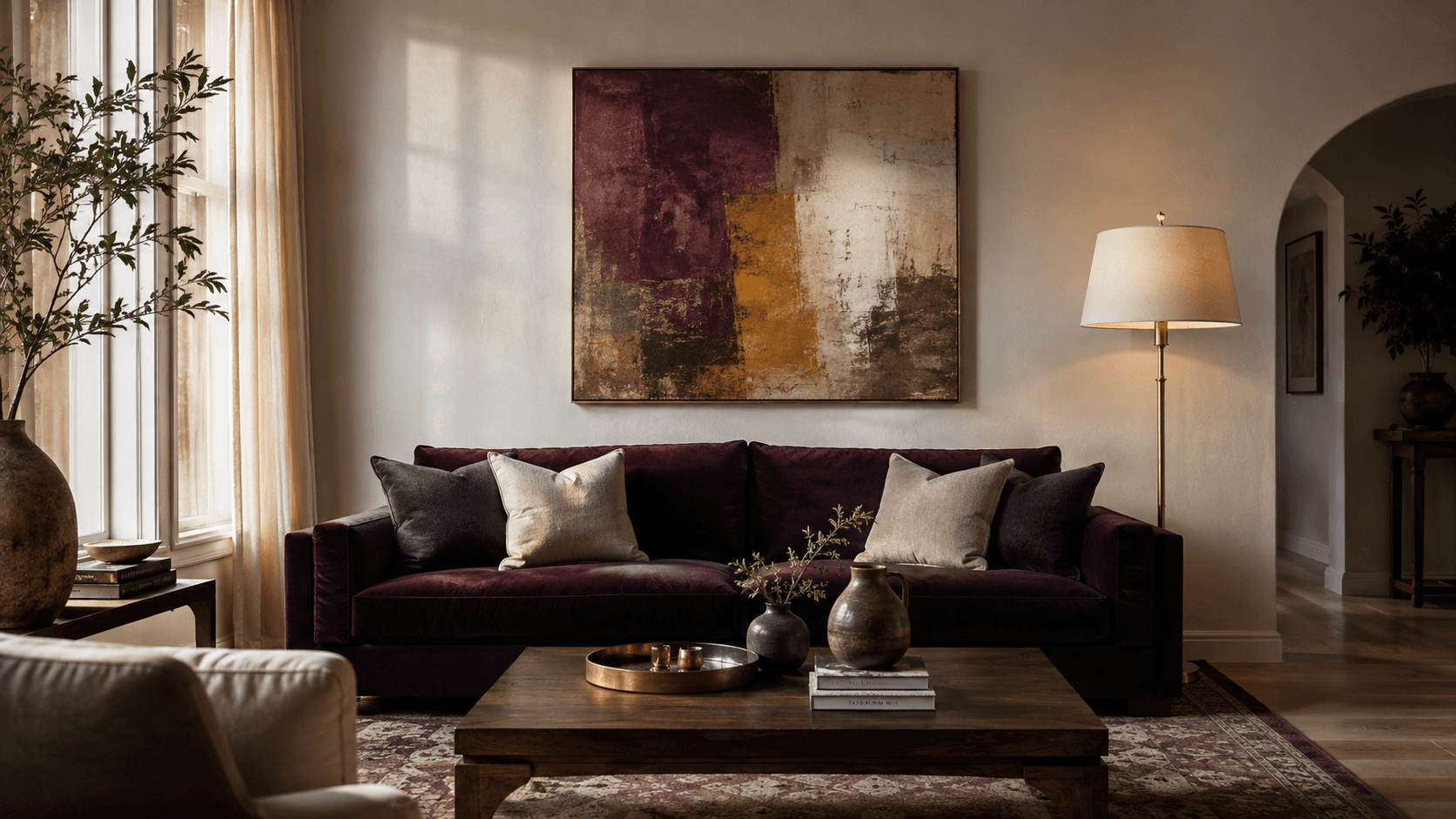
Shop This Room
Here are the pieces that build the foundation. These are the kinds of things I reach for when I'm anchoring a room around aubergine.
---
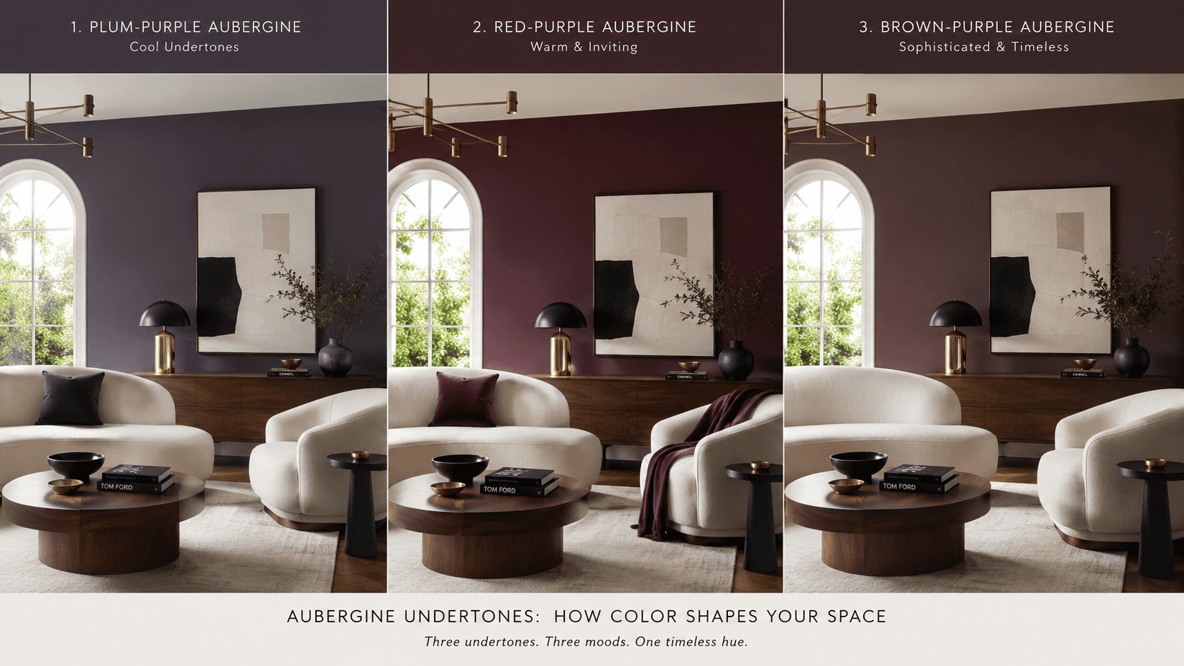
First, Let's Talk Undertones
This is where most purple rooms go sideways. "Aubergine" isn't one color. It's a family, and the members don't all get along.
Plum-purple leans cool. It has blue in it. It's the one that shows up in a lot of paint swatches labeled "eggplant" and honestly, it can read a little bruised on walls. It works in small doses, on a pillow or in artwork, but I'd keep it away from large surfaces unless the room gets a lot of warm natural light.
Red-purple is warmer, closer to burgundy's moody cousin. It's gorgeous in fabrics, especially velvet, because the texture catches light and shifts the color. This is the aubergine that works on a sofa or a dining chair. The red undertone keeps it from feeling cold.
Brown-purple is the quiet one. It barely reads as purple in some lighting. More like a dark chocolate that's been left in the sun. This is the one I reach for on walls. It lives in the same family as warm greys and deep taupes, and it plays well with almost everything.
The trick is figuring out which undertone you're working with before you commit. And that means testing.
---
The Saturation Decision
This is the layout question that matters most with aubergine. Where does the color live in the room, and how much of it do you let in?
Think of it in three tiers.
Tier 1: The room is aubergine. You're painting a wall. Maybe two. Maybe the whole room if it's small and moody, like a powder bath or a dining room you only use at night. At this level, everything else needs to be calm. Cream, warm white, natural wood, stone. Let the color do the work and keep the furniture quiet. A simple cream boucle accent chair against an aubergine wall is one of my favorite combinations. It's the kind of pairing that looks expensive without trying.
Tier 2: The furniture carries the color. An aubergine sofa. A pair of velvet dining chairs in deep plum. Maybe a tufted headboard in eggplant. Walls stay neutral. This is the most forgiving approach because you're working with a contained surface area. You can always add a throw or pull the chairs if it feels like too much.
Tier 3: Decor only. Throw pillows, a ceramic vase in a muted plum, art with purple tones. This is the least risky, and honestly, sometimes it's enough. A single aubergine object in a room full of warm neutrals can act like a period at the end of a sentence. It finishes the thought.
Most of the rooms I design land somewhere between Tier 2 and Tier 3. Enough color to feel intentional, not enough to feel themed.
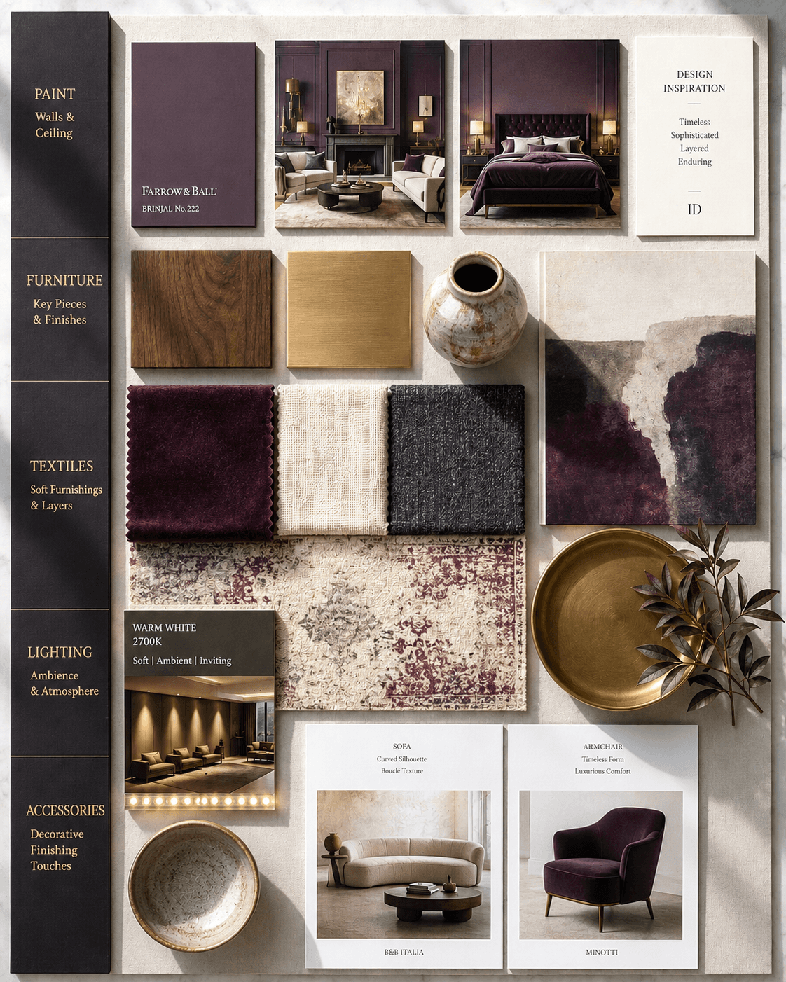
Palette 1: Aubergine + Brass + Cream
This is the warmer, more approachable palette. It works in living rooms, bedrooms, and dining rooms. The brass adds a layer of warmth that keeps the purple from feeling heavy.
Here's how I'd build it.
Walls in a warm cream or soft white. Something like Benjamin Moore "White Dove" or "Swiss Coffee." Sofa or accent chairs in aubergine velvet. Coffee table or side table in a warm brass finish. Curtains in cream linen. Rug in a warm tone, something with ivory, blush, and muted plum running through it. Lighting is key here. A brass table lamp with a linen shade and a warm bulb. Maybe a brass pendant if the room needs overhead light.
The cream does the heavy lifting. It gives the eye a place to rest. The brass creates visual warmth without adding another color. And the aubergine sits in the middle, grounded but not overwhelming.
Palette 2: Aubergine + Black + Walnut
This is the moodier, more editorial version. It works beautifully in a study, a formal living room, or a bedroom where you want the feeling of being held by the room.
Walls in a deep warm white or even a soft greige. Something that has body to it. Aubergine comes in through a large wool rug or a statement sofa. Black shows up in the hardware. Matte black picture frames. A black iron floor lamp. Maybe black window frames if the architecture allows it. Walnut anchors everything. A walnut bookshelf or credenza, a walnut bed frame, a walnut desk.
This palette has more contrast. It reads more intentional and a little more serious. And honestly, that tracks. Aubergine paired with black can feel almost architectural when you keep the lines clean.
---
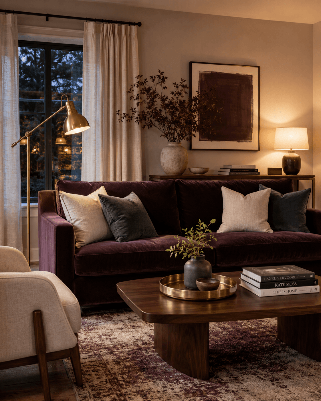
Lighting Guidance (This Part Matters More Than You Think)
I cannot overstate this. The wrong light will ruin aubergine.
Cool LEDs, anything above 4000K, will pull the blue undertones forward and flatten the warmth right out of the color. Your beautiful brown-purple will look like a bruise. Your red-purple will look muddy.
Stick to 2700K warm white bulbs. Dimmable is even better because aubergine looks its absolute best at about 60% brightness. That's where the color starts to glow instead of just sit there.
If you have recessed lighting, add warm-toned bulbs and consider a dimmer switch. If you rely on lamps, go for shades in cream or natural linen, not white, because white shades cast a cooler light.
One more thing. Aubergine rooms benefit from at least one warm metallic surface to bounce light around. That's why brass shows up so often in these palettes. A brass lamp, a gold-framed mirror, even a brass wall sconce. It gives the light something to play with.
---
This is exactly what I do for clients. Want me to design your room like this? Let's Chat
---
Styling: Art, Rugs, and Decor That Doesn't Fight the Color
This is where a lot of rooms lose the thread. You've committed to aubergine in the right way, at the right saturation, with the right lighting. And then you add a bright teal pillow because the blog said "complementary colors" and suddenly the room looks like it's arguing with itself.
Here's how I think about styling around aubergine.
Art. Go abstract, go muted, or go black and white. A piece with soft washes of plum, ochre, and cream will feel like it belongs. Abstract prints in muted tones are a great starting point. Bold graphic art can work too, but keep the palette tight. Avoid anything with bright saturated colors competing for attention.
Rugs. The rug is often the biggest surface in the room after the walls, so it matters. If your aubergine is on the furniture, keep the rug warm and neutral. Something in cream, tan, or soft grey. If the aubergine is on the walls, the rug can carry some of that color, but diluted. A vintage-style rug with faded plum tones reads collected rather than coordinated, and that's always the goal.
Textiles. Layer textures, not colors. Cream linen, charcoal wool, maybe a dusty rose cashmere throw if you want a third tone. But keep the range narrow. Three to four colors in the textile layer is plenty.
Objects. Ceramics in warm white or stone. Books with muted spines (yes, I rotate books based on covers, and no, I don't feel weird about it, though the 47 books I pulled off the shelf last Tuesday might disagree). Dried branches in a simple vase. The goal is to let the aubergine breathe.
Aubergine In Design: How to Use Purple and Make It Look Timeless
*Contains affiliate links
I almost never recommend purple to clients. Not because I don't love it, but because the gap between "this is stunning" and "this is a college apartment" is about two shades wide. And most of the time, when someone says they want purple in a room, what they actually want is warmth. Depth. A little bit of mood without going dark. Aubergine, specifically, does that better than almost any color. When it works, it reads like something between wine and chocolate. When it doesn't work, it reads like a statement you didn't mean to make.
So I wanted to break this down. Not just "pair it with gold," but the actual mechanics. The undertones. The saturation decisions. The lighting that makes or breaks it.
Shop This Room
Here are the pieces that build the foundation. These are the kinds of things I reach for when I'm anchoring a room around aubergine.
---
First, Let's Talk Undertones
This is where most purple rooms go sideways. "Aubergine" isn't one color. It's a family, and the members don't all get along.
Plum-purple leans cool. It has blue in it. It's the one that shows up in a lot of paint swatches labeled "eggplant" and honestly, it can read a little bruised on walls. It works in small doses, on a pillow or in artwork, but I'd keep it away from large surfaces unless the room gets a lot of warm natural light.
Red-purple is warmer, closer to burgundy's moody cousin. It's gorgeous in fabrics, especially velvet, because the texture catches light and shifts the color. This is the aubergine that works on a sofa or a dining chair. The red undertone keeps it from feeling cold.
Brown-purple is the quiet one. It barely reads as purple in some lighting. More like a dark chocolate that's been left in the sun. This is the one I reach for on walls. It lives in the same family as warm greys and deep taupes, and it plays well with almost everything.
The trick is figuring out which undertone you're working with before you commit. And that means testing.
---
The Saturation Decision
This is the layout question that matters most with aubergine. Where does the color live in the room, and how much of it do you let in?
Think of it in three tiers.
Tier 1: The room is aubergine. You're painting a wall. Maybe two. Maybe the whole room if it's small and moody, like a powder bath or a dining room you only use at night. At this level, everything else needs to be calm. Cream, warm white, natural wood, stone. Let the color do the work and keep the furniture quiet. A simple cream boucle accent chair against an aubergine wall is one of my favorite combinations. It's the kind of pairing that looks expensive without trying.
Tier 2: The furniture carries the color. An aubergine sofa. A pair of velvet dining chairs in deep plum. Maybe a tufted headboard in eggplant. Walls stay neutral. This is the most forgiving approach because you're working with a contained surface area. You can always add a throw or pull the chairs if it feels like too much.
Tier 3: Decor only. Throw pillows, a ceramic vase in a muted plum, art with purple tones. This is the least risky, and honestly, sometimes it's enough. A single aubergine object in a room full of warm neutrals can act like a period at the end of a sentence. It finishes the thought.
Most of the rooms I design land somewhere between Tier 2 and Tier 3. Enough color to feel intentional, not enough to feel themed.
Palette 1: Aubergine + Brass + Cream
This is the warmer, more approachable palette. It works in living rooms, bedrooms, and dining rooms. The brass adds a layer of warmth that keeps the purple from feeling heavy.
Here's how I'd build it.
Walls in a warm cream or soft white. Something like Benjamin Moore "White Dove" or "Swiss Coffee." Sofa or accent chairs in aubergine velvet. Coffee table or side table in a warm brass finish. Curtains in cream linen. Rug in a warm tone, something with ivory, blush, and muted plum running through it. Lighting is key here. A brass table lamp with a linen shade and a warm bulb. Maybe a brass pendant if the room needs overhead light.
The cream does the heavy lifting. It gives the eye a place to rest. The brass creates visual warmth without adding another color. And the aubergine sits in the middle, grounded but not overwhelming.
Palette 2: Aubergine + Black + Walnut
This is the moodier, more editorial version. It works beautifully in a study, a formal living room, or a bedroom where you want the feeling of being held by the room.
Walls in a deep warm white or even a soft greige. Something that has body to it. Aubergine comes in through a large wool rug or a statement sofa. Black shows up in the hardware. Matte black picture frames. A black iron floor lamp. Maybe black window frames if the architecture allows it. Walnut anchors everything. A walnut bookshelf or credenza, a walnut bed frame, a walnut desk.
This palette has more contrast. It reads more intentional and a little more serious. And honestly, that tracks. Aubergine paired with black can feel almost architectural when you keep the lines clean.
---
Lighting Guidance (This Part Matters More Than You Think)
I cannot overstate this. The wrong light will ruin aubergine.
Cool LEDs, anything above 4000K, will pull the blue undertones forward and flatten the warmth right out of the color. Your beautiful brown-purple will look like a bruise. Your red-purple will look muddy.
Stick to 2700K warm white bulbs. Dimmable is even better because aubergine looks its absolute best at about 60% brightness. That's where the color starts to glow instead of just sit there.
If you have recessed lighting, add warm-toned bulbs and consider a dimmer switch. If you rely on lamps, go for shades in cream or natural linen, not white, because white shades cast a cooler light.
One more thing. Aubergine rooms benefit from at least one warm metallic surface to bounce light around. That's why brass shows up so often in these palettes. A brass lamp, a gold-framed mirror, even a brass wall sconce. It gives the light something to play with.
---
This is exactly what I do for clients. Want me to design your room like this? Let's Chat
---
Styling: Art, Rugs, and Decor That Doesn't Fight the Color
This is where a lot of rooms lose the thread. You've committed to aubergine in the right way, at the right saturation, with the right lighting. And then you add a bright teal pillow because the blog said "complementary colors" and suddenly the room looks like it's arguing with itself.
Here's how I think about styling around aubergine.
Art. Go abstract, go muted, or go black and white. A piece with soft washes of plum, ochre, and cream will feel like it belongs. Abstract prints in muted tones are a great starting point. Bold graphic art can work too, but keep the palette tight. Avoid anything with bright saturated colors competing for attention.
Rugs. The rug is often the biggest surface in the room after the walls, so it matters. If your aubergine is on the furniture, keep the rug warm and neutral. Something in cream, tan, or soft grey. If the aubergine is on the walls, the rug can carry some of that color, but diluted. A vintage-style rug with faded plum tones reads collected rather than coordinated, and that's always the goal.
Textiles. Layer textures, not colors. Cream linen, charcoal wool, maybe a dusty rose cashmere throw if you want a third tone. But keep the range narrow. Three to four colors in the textile layer is plenty.
Objects. Ceramics in warm white or stone. Books with muted spines (yes, I rotate books based on covers, and no, I don't feel weird about it, though the 47 books I pulled off the shelf last Tuesday might disagree). Dried branches in a simple vase. The goal is to let the aubergine breathe.
Other Blogs
Other Similar Blogs
Your go-to destination for insightful articles, tips, and inspiration on all things landscaping and outdoor living
Other Blogs
Other Similar Blogs
Your go-to destination for insightful articles, tips, and inspiration on all things landscaping and outdoor living
Other Blogs
Other Similar Blogs
Your go-to destination for insightful articles, tips, and inspiration on all things landscaping and outdoor living


