Author
Suzanne is an Owner/Designer
Author
Suzanne is an Owner/Designer
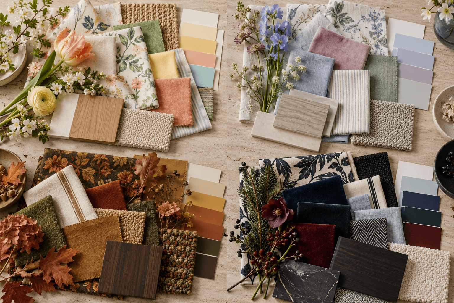
A step-by-step method for choosing a color palette for your home, starting with your design direction and the clothes you actually love wearing. Includes a worked living room example, a palette roles table, and a sampling plan that keeps you from repainting twice.
A step-by-step method for choosing a color palette for your home, starting with your design direction and the clothes you actually love wearing. Includes a worked living room example, a palette roles table, and a sampling plan that keeps you from repainting twice.

Sometimes when I am working with someone on a room, I ask to see their closet. Not the whole thing, just the pieces they reach for when they want to love the way they look. Is it the sage cardigan or the Kelly green jacket. Both are green, and they tell completely different color stories. One is softened and a little gray. The other is clear and loud and wants attention.
Here is the short version of the method. Name your design direction first, write down everything in the room that is not changing, then look at what you already love wearing to figure out which version of each color you actually want. From there you build a small palette, give every color a job and an amount, and test it in the actual room before anything gets painted.
That is the whole sequence. Let me walk through it with one real-feeling example so it is not abstract.
Step 1: Name the Design Direction and the Feeling
Color without direction is just preference soup. You end up with six things you like that do not agree with each other.
So before any paint chips, decide what the room is trying to be. Collected and traditional. Airy and coastal. Quiet and Japandi. Moody and enclosed. Then add a feeling word, because the same style can go two ways. Calm traditional and lively traditional use very different levels of contrast.
Our example room for this post is collected modern traditional, and the feeling is warm and settled with a little depth. Not beige. Not bright.
If you cannot name your direction yet, that is normal and it is fixable. The Style Discovery quiz is built for exactly this moment, and you can take it free with the code FRIENDS, a $49 value.

Step 2: Inventory What Stays
This is the step people skip, and it is the reason so many palettes fall apart on delivery day.
Walk the room and write down everything that is not leaving. Flooring. Countertops if they are in view. The sofa. Wood tones on furniture and trim. Art you will not part with. Metal finishes. And daylight, which is a material whether you think of it that way or not.
In our example room, two things are staying: white oak floors with a warm honey cast, and a flax linen sofa that is beige with a slightly yellow-gray tone. That is the foundation. Every color we choose has to look good sitting next to those two.
Also note your light. A north-facing room mutes and cools everything. A west-facing room turns warm and orange for two hours at the end of the day. A room with a big green tree outside the window gets a green cast in summer that disappears in January.

Step 3: Go Look at Five Things You Love Wearing
Now the closet part. Pull five pieces you genuinely love. Not the ones you should love. The ones you reach for.
Lay them out and look for patterns instead of individual colors:
Undertone. Do the colors lean warm and golden or cool and blue-gray
Clarity. Are they clear and saturated or softened and slightly grayed
Depth. Mostly light, mostly mid-tone, or mostly deep
Contrast. Do you wear tonal outfits or do you pair cream with black
Somebody who lives in oatmeal, olive, camel, and rust is telling you something very different from somebody who lives in navy, white, and true red. Neither is better. They are just different instructions.
In our example, the five pieces come back softened, warm-leaning, mid to deep, with moderate contrast. Two greens, one plum, one ochre scarf, one flax shirt. That is a palette hiding in plain sight.

One Important Caveat
What you like wearing and what you want to live inside of are not always the same, and there is no rule that says your walls have to flatter you the way a sweater does. Clothing sits six inches from your face for a few hours. A wall surrounds you all day.
I have seen the love of a bold color translate beautifully into a lamp and terribly into a ceiling. So treat the closet as evidence, not as a verdict.
And if someone else lives in the room, run the same exercise with them. Overlap is usually larger than either person expects. You are looking for the shared undertone and shared level of contrast, and then you split the difference on the loud color.
Step 4: Build the Palette
A working palette is small. Five to seven colors including neutrals, with a clear hierarchy.
Here is the structure I use:
Lead family. One color in three depths: light, middle, deep
Secondary family. A second color in one or two depths, used less
Accent. One color, small, and a little unexpected
Background neutrals. Walls, trim, and the big soft surfaces
Materials. Wood, metal, and stone count as colors even though nobody puts them on a paint chip
For the example room, the lead family is soft sage, olive, and deep forest. Secondary is dusty plum with deep mulberry underneath it. The accent is a restrained ochre. Background is pale stone paint with white oak and unlacquered brass carrying the material weight.
Notice what that mixture is not. It is not a strict seasonal prescription. It is a personal room palette built from one person's evidence.

Step 5: Give Every Color a Job and an Amount
This is the engineering part, and it is where most palettes get saved. Colors do not fail because they are wrong. They fail because they are the wrong size.
Role | Rough share of the room | In our example | Where it lands |
|---|---|---|---|
Background | About half or more | Pale stone | Walls, ceiling, trim |
Foundation neutral | Large | Flax and white oak | Sofa, floor, rug field |
Lead, light | Medium | Soft sage | Pillows, a painted bookcase back, ceramics |
Lead, deep | Medium-small | Olive and deep forest | Two chairs, a vessel, art |
Secondary | Small to medium | Dusty plum and mulberry | Curtains or pillows, depending |
Accent | Small | Ochre | One lamp, one book stack, one throw |
Then the fun test. Take the same room and change only the amount of one color. Below is what happens when plum goes from a pillow to two full curtain panels, with the furniture staying exactly where it is.
Small plum accent (a pillow and a vase) | Large plum area (floor-length curtain panels) | |
|---|---|---|
Overall read | Neutral room with a warm surprise | Colorful room with a clear secondary story |
Effect on the greens | Greens read as the main event | Greens and plum share the stage |
Effect on white oak | Floors stay the warmest thing in the room | Floors calm down and read more neutral |
Risk | Can feel like an afterthought if it is the only plum | Can feel heavy in a small or low-light room |
Reversibility | High, swap a cover | Medium, curtains are a real purchase |
Best for | Renters, cautious starts, small rooms | Tall windows, larger rooms, people ready to commit |
Same palette. Two very different rooms. This is why I always ask how much before I ask which color.
If working out the amounts is where you keep stalling, that is genuinely the part I do for a living. Tell me about your room and we can sort out what goes where and how big.

Step 6: Seasons Are Shorthand, Not Law
Some people find seasonal color language useful, and I have no problem with it as a shortcut. If saying autumn helps you remember warm, softened, and deep, use it.
Where it goes wrong is when it becomes a rulebook and someone tells you that you are not allowed to own a clear blue. Your home is not being color analyzed for a wedding. Use the vocabulary to describe relationships you already noticed, then drop it.
Step 7: Test in the Room, Not at the Store
Paint chips lie. Store lighting lies harder.
Get large samples, at least the size of a sheet of paper and preferably bigger. Peel-and-stick paint samples make this painless, and if you prefer brush-outs, paint two coats on white poster board so the old wall color underneath does not skew the result.
Then do this:
Tape samples to more than one wall, including the wall opposite the window
Keep them off the trim so the white does not fight the reading
Look morning, mid-afternoon, and at night with the lamps on
Set the paint next to your retained items, the flooring offcut and a fabric arm of the sofa
Live with them three days before deciding
Fabric gets the same treatment. Order large upholstery and drapery swatches and drape them where they will actually hang rather than holding them up flat.
If you want to go deeper on committing to one dominant color across walls, trim, and ceiling, my guide to color drenching a room covers that decision. And if plum is calling you, the purple and aubergine post has more on keeping it from going costume.

Step 8: Carry the Palette Into Adjoining Rooms
You do not need one wall color everywhere, and you do not need every room to match. What you need is a relationship.
The simplest approach is to keep the same palette and rotate the emphasis. If the living room leads with sage and uses plum small, the dining room can lead with deep forest and let ochre take more room. Same family, different weighting. Anything you see from two rooms at once, like a hallway or an open sightline, should stay in the calm background color.
Start with one room, finish it, and let the next room borrow from it. Whole-house paint plans built in a spreadsheet before a single room exists tend to collapse the first time something real gets delivered.
It Depends on Your Space
If the room is small and low-light: keep the background pale and put the depth into textiles and one piece of furniture. Deep forest walls in a dim 10 x 11 room read like a closet unless you are doing it on purpose and lighting it well.
If the room is large with tall windows: you can afford the big plum curtains and deeper walls. Large rooms swallow small color and make it look accidental.
If you rent: load your palette into pillows, curtains, rugs, lamps, and art. Curtains especially, since they hang on a rod and come with you.
If you own and plan to stay: paint is the cheapest color you will ever buy. Use it on the walls and stop paying for color in furniture you will get tired of.
If two people disagree: agree on the neutral and the contrast level first, then each person gets one color they love at a size they can live with. In practice that is usually one large area each and shared accents.
If you have kids or pets: put your deep colors in the mid-height zone where hands and paws do not land, use performance fabrics on the sofa, and choose a rug with two or three tones from your palette so crumbs and fur are not a spotlight.
If the budget is tight: paint, pillow covers, and one lamp will move a room further than a new sofa. Cost planning for the bigger work is on the services page.
Shop This Room
As an Amazon Associate, I earn from qualifying purchases. It doesn't change what I recommend.
The peel-and-stick paint samples that save a repaint Test three greens on two walls before you commit to anything.
The plum velvet curtains that carry the secondary color Hang them high and wide on the window wall to give the palette a real second voice.
The sage pillow covers that do the light lead Two on the sofa, and swap the covers when you want a different season.
The olive throw that ties the chairs to the sofa Drape it over one chair arm so the deeper green appears twice.
The ochre lamp that is your one loud thing Put it on the side table where it catches the eye first.
The wool rug in stone and moss tones It holds the seating group together and keeps the floor from being the loudest surface.
The walnut side table that warms the greens Sits between sofa and chair and gives the palette a darker wood note.
The brass picture light that flatters color at night Mount it over art on the fireplace wall so evenings stay warm.
The forest green ceramic vessel for the mantel One deep green object up high balances the chairs below.
Your Fill-in Exercise
Write these down. It takes ten minutes.
My design direction is ___ and I want the room to feel ___.
Staying in this room: ___, , ___.
My five favorite things to wear have this undertone: ___ and this level of contrast: ___.
Lead family: ___ light, middle, ___ deep.
Secondary family: ______.
Accent, used small: ______.
Background: ______.
The one color I am nervous about is ___, so it gets ___ square feet, not the whole wall.
FAQ
Can my favorite clothing color work as a small home accent?
Usually yes, and small is the safest way to find out. A color that feels like too much on a wall often works perfectly as a lamp, a pillow pair, or a book stack. If you still love it after a month at that size, go bigger.
What if my partner prefers a different color palette?
Start with what you agree on, which is almost always the neutral and the overall contrast level. Then each person picks one color they genuinely love, and you decide together how much room each one gets. Amount is easier to negotiate than color.
Can I keep warm wood floors with cool-toned textiles?
Yes, and it often looks better than matching everything to the wood. The trick is repeating a bit of warmth elsewhere, like brass, leather, or an ochre accent, so the cool textiles read as a deliberate contrast instead of a clash.
Does every room in my house need the same wall color?
No. Keep shared sightlines and hallways in the same calm background color, then let each room lead with a different member of the same palette. Consistency comes from the family of colors, not from one paint.
How many paint samples should I test before choosing?
Three per decision is plenty. More than that and you start comparing samples to each other instead of to your floor, your sofa, and your daylight, which is what actually matters.
If you have the colors and you are stuck on where they go and how much of each, that is the exact problem I like solving. Send me your room and we will build the plan.
Sometimes when I am working with someone on a room, I ask to see their closet. Not the whole thing, just the pieces they reach for when they want to love the way they look. Is it the sage cardigan or the Kelly green jacket. Both are green, and they tell completely different color stories. One is softened and a little gray. The other is clear and loud and wants attention.
Here is the short version of the method. Name your design direction first, write down everything in the room that is not changing, then look at what you already love wearing to figure out which version of each color you actually want. From there you build a small palette, give every color a job and an amount, and test it in the actual room before anything gets painted.
That is the whole sequence. Let me walk through it with one real-feeling example so it is not abstract.
Step 1: Name the Design Direction and the Feeling
Color without direction is just preference soup. You end up with six things you like that do not agree with each other.
So before any paint chips, decide what the room is trying to be. Collected and traditional. Airy and coastal. Quiet and Japandi. Moody and enclosed. Then add a feeling word, because the same style can go two ways. Calm traditional and lively traditional use very different levels of contrast.
Our example room for this post is collected modern traditional, and the feeling is warm and settled with a little depth. Not beige. Not bright.
If you cannot name your direction yet, that is normal and it is fixable. The Style Discovery quiz is built for exactly this moment, and you can take it free with the code FRIENDS, a $49 value.
Step 2: Inventory What Stays
This is the step people skip, and it is the reason so many palettes fall apart on delivery day.
Walk the room and write down everything that is not leaving. Flooring. Countertops if they are in view. The sofa. Wood tones on furniture and trim. Art you will not part with. Metal finishes. And daylight, which is a material whether you think of it that way or not.
In our example room, two things are staying: white oak floors with a warm honey cast, and a flax linen sofa that is beige with a slightly yellow-gray tone. That is the foundation. Every color we choose has to look good sitting next to those two.
Also note your light. A north-facing room mutes and cools everything. A west-facing room turns warm and orange for two hours at the end of the day. A room with a big green tree outside the window gets a green cast in summer that disappears in January.
Step 3: Go Look at Five Things You Love Wearing
Now the closet part. Pull five pieces you genuinely love. Not the ones you should love. The ones you reach for.
Lay them out and look for patterns instead of individual colors:
Undertone. Do the colors lean warm and golden or cool and blue-gray
Clarity. Are they clear and saturated or softened and slightly grayed
Depth. Mostly light, mostly mid-tone, or mostly deep
Contrast. Do you wear tonal outfits or do you pair cream with black
Somebody who lives in oatmeal, olive, camel, and rust is telling you something very different from somebody who lives in navy, white, and true red. Neither is better. They are just different instructions.
In our example, the five pieces come back softened, warm-leaning, mid to deep, with moderate contrast. Two greens, one plum, one ochre scarf, one flax shirt. That is a palette hiding in plain sight.
One Important Caveat
What you like wearing and what you want to live inside of are not always the same, and there is no rule that says your walls have to flatter you the way a sweater does. Clothing sits six inches from your face for a few hours. A wall surrounds you all day.
I have seen the love of a bold color translate beautifully into a lamp and terribly into a ceiling. So treat the closet as evidence, not as a verdict.
And if someone else lives in the room, run the same exercise with them. Overlap is usually larger than either person expects. You are looking for the shared undertone and shared level of contrast, and then you split the difference on the loud color.
Step 4: Build the Palette
A working palette is small. Five to seven colors including neutrals, with a clear hierarchy.
Here is the structure I use:
Lead family. One color in three depths: light, middle, deep
Secondary family. A second color in one or two depths, used less
Accent. One color, small, and a little unexpected
Background neutrals. Walls, trim, and the big soft surfaces
Materials. Wood, metal, and stone count as colors even though nobody puts them on a paint chip
For the example room, the lead family is soft sage, olive, and deep forest. Secondary is dusty plum with deep mulberry underneath it. The accent is a restrained ochre. Background is pale stone paint with white oak and unlacquered brass carrying the material weight.
Notice what that mixture is not. It is not a strict seasonal prescription. It is a personal room palette built from one person's evidence.
Step 5: Give Every Color a Job and an Amount
This is the engineering part, and it is where most palettes get saved. Colors do not fail because they are wrong. They fail because they are the wrong size.
Role | Rough share of the room | In our example | Where it lands |
|---|---|---|---|
Background | About half or more | Pale stone | Walls, ceiling, trim |
Foundation neutral | Large | Flax and white oak | Sofa, floor, rug field |
Lead, light | Medium | Soft sage | Pillows, a painted bookcase back, ceramics |
Lead, deep | Medium-small | Olive and deep forest | Two chairs, a vessel, art |
Secondary | Small to medium | Dusty plum and mulberry | Curtains or pillows, depending |
Accent | Small | Ochre | One lamp, one book stack, one throw |
Then the fun test. Take the same room and change only the amount of one color. Below is what happens when plum goes from a pillow to two full curtain panels, with the furniture staying exactly where it is.
Small plum accent (a pillow and a vase) | Large plum area (floor-length curtain panels) | |
|---|---|---|
Overall read | Neutral room with a warm surprise | Colorful room with a clear secondary story |
Effect on the greens | Greens read as the main event | Greens and plum share the stage |
Effect on white oak | Floors stay the warmest thing in the room | Floors calm down and read more neutral |
Risk | Can feel like an afterthought if it is the only plum | Can feel heavy in a small or low-light room |
Reversibility | High, swap a cover | Medium, curtains are a real purchase |
Best for | Renters, cautious starts, small rooms | Tall windows, larger rooms, people ready to commit |
Same palette. Two very different rooms. This is why I always ask how much before I ask which color.
If working out the amounts is where you keep stalling, that is genuinely the part I do for a living. Tell me about your room and we can sort out what goes where and how big.
Step 6: Seasons Are Shorthand, Not Law
Some people find seasonal color language useful, and I have no problem with it as a shortcut. If saying autumn helps you remember warm, softened, and deep, use it.
Where it goes wrong is when it becomes a rulebook and someone tells you that you are not allowed to own a clear blue. Your home is not being color analyzed for a wedding. Use the vocabulary to describe relationships you already noticed, then drop it.
Step 7: Test in the Room, Not at the Store
Paint chips lie. Store lighting lies harder.
Get large samples, at least the size of a sheet of paper and preferably bigger. Peel-and-stick paint samples make this painless, and if you prefer brush-outs, paint two coats on white poster board so the old wall color underneath does not skew the result.
Then do this:
Tape samples to more than one wall, including the wall opposite the window
Keep them off the trim so the white does not fight the reading
Look morning, mid-afternoon, and at night with the lamps on
Set the paint next to your retained items, the flooring offcut and a fabric arm of the sofa
Live with them three days before deciding
Fabric gets the same treatment. Order large upholstery and drapery swatches and drape them where they will actually hang rather than holding them up flat.
If you want to go deeper on committing to one dominant color across walls, trim, and ceiling, my guide to color drenching a room covers that decision. And if plum is calling you, the purple and aubergine post has more on keeping it from going costume.
Step 8: Carry the Palette Into Adjoining Rooms
You do not need one wall color everywhere, and you do not need every room to match. What you need is a relationship.
The simplest approach is to keep the same palette and rotate the emphasis. If the living room leads with sage and uses plum small, the dining room can lead with deep forest and let ochre take more room. Same family, different weighting. Anything you see from two rooms at once, like a hallway or an open sightline, should stay in the calm background color.
Start with one room, finish it, and let the next room borrow from it. Whole-house paint plans built in a spreadsheet before a single room exists tend to collapse the first time something real gets delivered.
It Depends on Your Space
If the room is small and low-light: keep the background pale and put the depth into textiles and one piece of furniture. Deep forest walls in a dim 10 x 11 room read like a closet unless you are doing it on purpose and lighting it well.
If the room is large with tall windows: you can afford the big plum curtains and deeper walls. Large rooms swallow small color and make it look accidental.
If you rent: load your palette into pillows, curtains, rugs, lamps, and art. Curtains especially, since they hang on a rod and come with you.
If you own and plan to stay: paint is the cheapest color you will ever buy. Use it on the walls and stop paying for color in furniture you will get tired of.
If two people disagree: agree on the neutral and the contrast level first, then each person gets one color they love at a size they can live with. In practice that is usually one large area each and shared accents.
If you have kids or pets: put your deep colors in the mid-height zone where hands and paws do not land, use performance fabrics on the sofa, and choose a rug with two or three tones from your palette so crumbs and fur are not a spotlight.
If the budget is tight: paint, pillow covers, and one lamp will move a room further than a new sofa. Cost planning for the bigger work is on the services page.
Shop This Room
As an Amazon Associate, I earn from qualifying purchases. It doesn't change what I recommend.
The peel-and-stick paint samples that save a repaint Test three greens on two walls before you commit to anything.
The plum velvet curtains that carry the secondary color Hang them high and wide on the window wall to give the palette a real second voice.
The sage pillow covers that do the light lead Two on the sofa, and swap the covers when you want a different season.
The olive throw that ties the chairs to the sofa Drape it over one chair arm so the deeper green appears twice.
The ochre lamp that is your one loud thing Put it on the side table where it catches the eye first.
The wool rug in stone and moss tones It holds the seating group together and keeps the floor from being the loudest surface.
The walnut side table that warms the greens Sits between sofa and chair and gives the palette a darker wood note.
The brass picture light that flatters color at night Mount it over art on the fireplace wall so evenings stay warm.
The forest green ceramic vessel for the mantel One deep green object up high balances the chairs below.
Your Fill-in Exercise
Write these down. It takes ten minutes.
My design direction is ___ and I want the room to feel ___.
Staying in this room: ___, , ___.
My five favorite things to wear have this undertone: ___ and this level of contrast: ___.
Lead family: ___ light, middle, ___ deep.
Secondary family: ______.
Accent, used small: ______.
Background: ______.
The one color I am nervous about is ___, so it gets ___ square feet, not the whole wall.
FAQ
Can my favorite clothing color work as a small home accent?
Usually yes, and small is the safest way to find out. A color that feels like too much on a wall often works perfectly as a lamp, a pillow pair, or a book stack. If you still love it after a month at that size, go bigger.
What if my partner prefers a different color palette?
Start with what you agree on, which is almost always the neutral and the overall contrast level. Then each person picks one color they genuinely love, and you decide together how much room each one gets. Amount is easier to negotiate than color.
Can I keep warm wood floors with cool-toned textiles?
Yes, and it often looks better than matching everything to the wood. The trick is repeating a bit of warmth elsewhere, like brass, leather, or an ochre accent, so the cool textiles read as a deliberate contrast instead of a clash.
Does every room in my house need the same wall color?
No. Keep shared sightlines and hallways in the same calm background color, then let each room lead with a different member of the same palette. Consistency comes from the family of colors, not from one paint.
How many paint samples should I test before choosing?
Three per decision is plenty. More than that and you start comparing samples to each other instead of to your floor, your sofa, and your daylight, which is what actually matters.
If you have the colors and you are stuck on where they go and how much of each, that is the exact problem I like solving. Send me your room and we will build the plan.
Other Blogs
Other Similar Blogs
Your go-to destination for insightful articles, tips, and inspiration on all things landscaping and outdoor living
Other Blogs
Other Similar Blogs
Your go-to destination for insightful articles, tips, and inspiration on all things landscaping and outdoor living
Other Blogs
Other Similar Blogs
Your go-to destination for insightful articles, tips, and inspiration on all things landscaping and outdoor living



Join our newsletter list
Sign up to get the most recent blog articles in your email every week.