Author
Suzanne is an Owner/Designer
Author
Suzanne is an Owner/Designer
Color drenching is painting walls, trim, and ceiling the same color, and it changes a room more than any single piece of furniture can. Here's how to do it without making your house feel like a cave.
Color drenching is painting walls, trim, and ceiling the same color, and it changes a room more than any single piece of furniture can. Here's how to do it without making your house feel like a cave.
Color Drenching: A Designer's Guide to Doing One-Color Rooms the Virmae Way
I painted my guest bedroom ceiling the same green as the walls on a Wednesday night at 11pm because I couldn't stop once I started. The roller was already loaded. The trim was already done. And standing there with paint in my hair and a crick in my neck, looking up at a ceiling that finally didn't look like it belonged to a different room, I remember thinking, oh. Thats what was wrong.
That was the first time I color drenched a room.
Color drenching is exactly what it sounds like. One color, everywhere. Walls. Trim. Ceiling. Sometimes even the furniture and textiles. You erase the visual breaks between surfaces, and the room stops being a collection of planes and starts being a single environment.
Its not new. European designers have been doing it for decades. But its having a moment right now, and honestly, that tracks. After years of white walls with one "pop of color" accent wall, of course the pendulum swung.
The thing is, drenching works because of something most design advice ignores: the trim line. That little strip of white where your wall meets the ceiling or the baseboard. It chops the room into pieces. When you drench, those seams disappear, and the room suddenly reads as taller, wider, and more finished.
Lets talk about how to actually do it.
---
Shop This Room
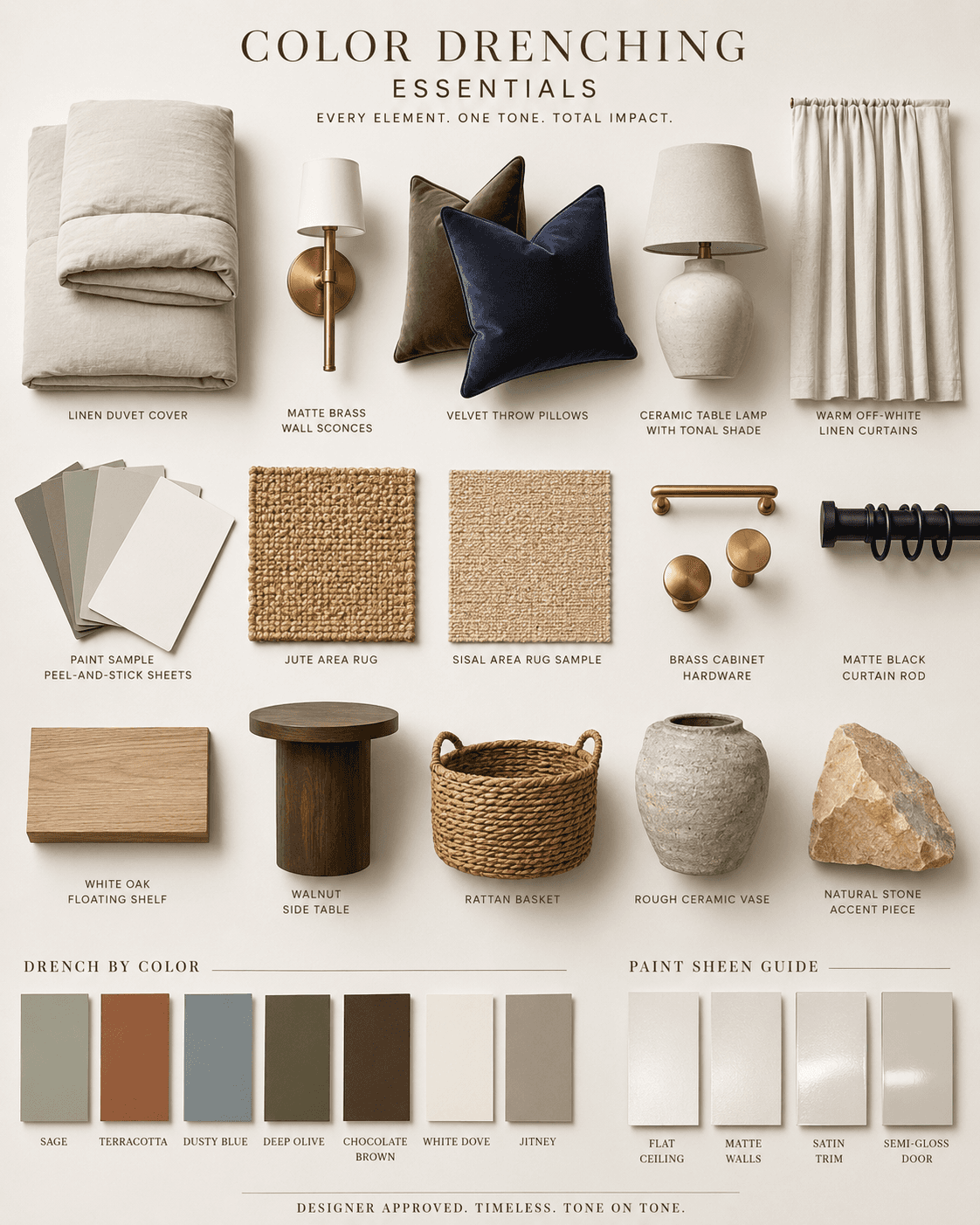
Before we get into the method, here are the kinds of pieces that make a drenched room sing:
A linen duvet cover in a tonal neutral for soft-neutral drenches
Matte brass wall sconces because warm metal against a single-color wall is the whole vibe
Velvet throw pillows in deep olive or navy for moody drenches
A ceramic table lamp with a tonal shade so the lamp doesn't fight the room
Linen curtains in a warm off-white that layer into softer drenches
Paint sample peel-and-stick sheets so you can test before committing
A jute or sisal area rug to ground the room with texture instead of more color
---
The Three Drench Types
Not all drenches feel the same. The color you pick determines the emotional temperature of the room, and I think of them in three categories.
1. The Soft-Neutral Drench
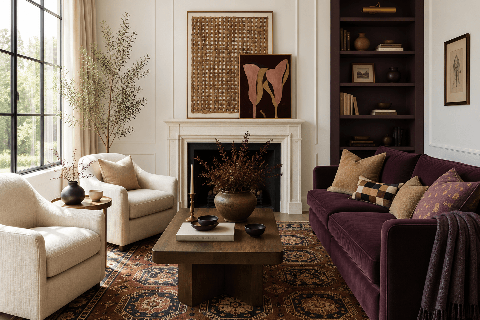
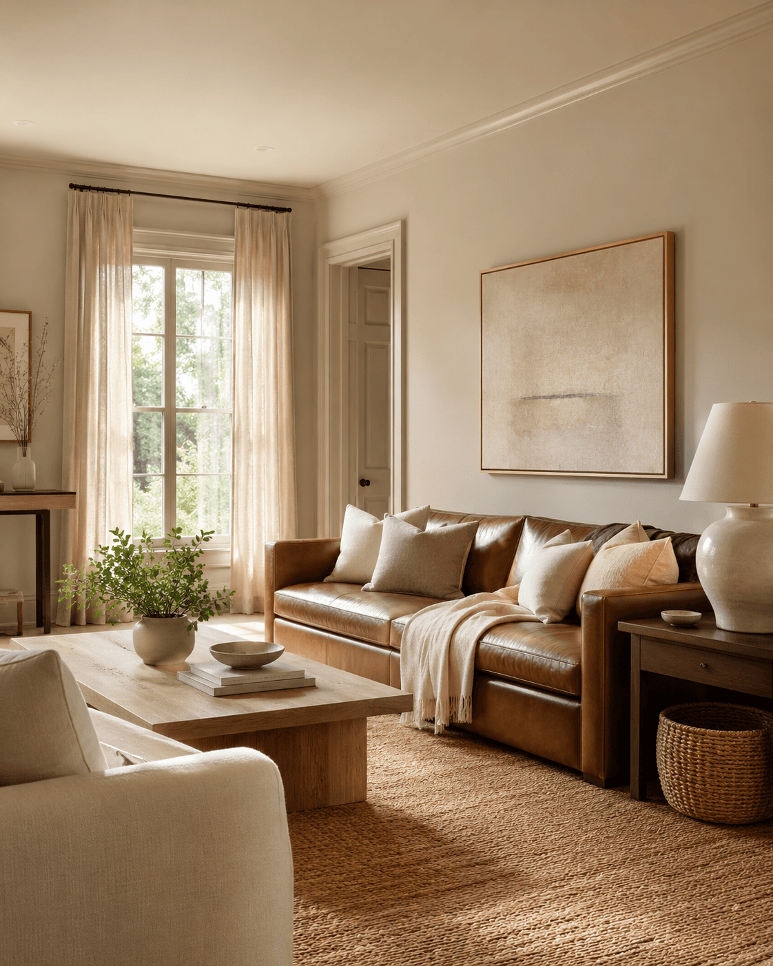
This is the gateway drench. Warm white, putty, clay, greige, that family. You paint everything the same warm tone and suddenly the room feels like a linen shirt. Calm and expensive without trying.
This works in almost any room. Its especially good in living rooms and bedrooms where you want the furniture and art to lead, not the walls.
The trick here is warmth. Cool neutrals drenched across every surface can feel institutional. Go warm. Think Benjamin Moore White Dove or Farrow & Ball Jitney. Something with a little yellow or pink undertone.
2. The Moody Drench
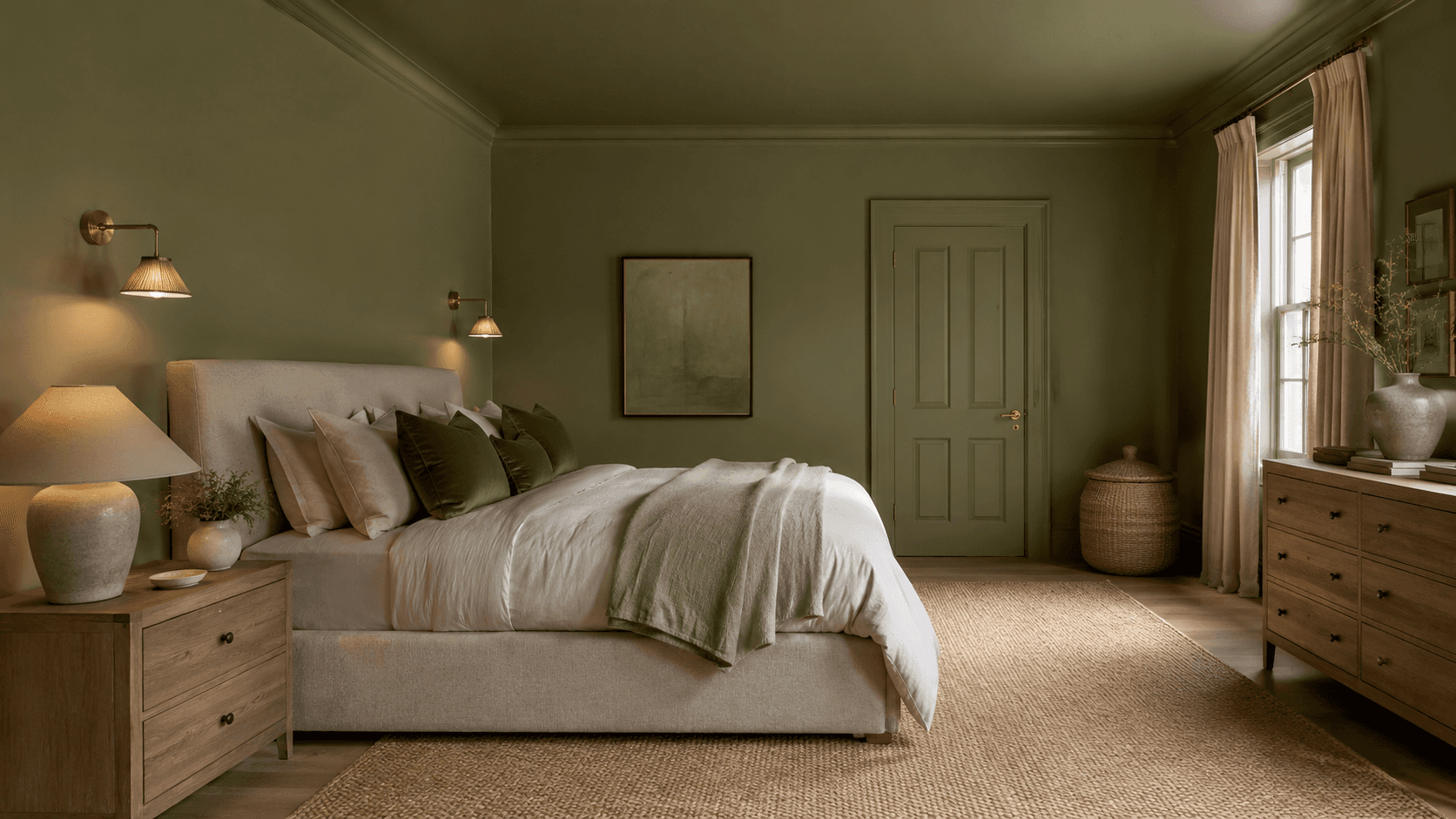
Deep olive. Charcoal. Navy. Rich chocolate brown. This is the one that makes guests stop talking when they walk in.
Moody drenches work best in rooms that are already a little dark, which always makes me nervous to say because the instinct is to fight darkness with white paint. Dont. If the room doesnt get much direct sun, lean in. A deep green bedroom with warm lighting is one of the most beautiful things you can build.
The key to moody drenches: you need light sources inside the room. A pair of warm-toned bedside lamps, a brass pendant, candles on the dresser. The room makes its own light.

3. The Playful-Color Drench
Terracotta. Dusty blue. Sage. Mauve. These are colors with personality that still read as grown-up when you commit to them fully.
This is the drench type that looks worst as an accent wall and best as a full drench. A single sage wall looks like a rental upgrade. Sage on every surface, with cream linen and warm wood, looks like a room in Provence.
The playful drench is where I see the most hesitation, and also the most dramatic payoff. Commit.
---
The Method: How to Drench a Room Right
Step 1: Sample, Then Sample Again
Get at least three shades of your chosen color. Paint them on large boards or use oversized peel-and-stick samples and move them around the room. Look at them in morning light, afternoon light, and lamp light.
Colors shift dramatically between a north-facing wall and a south-facing one, even in the same room. I once picked a green that looked perfect on the sample board and looked like toothpaste in the actual room at 2pm. The light was just different.
Spend at least two days with samples up before you buy a gallon.
Step 2: Build a Sheen Map
This is the part most tutorials skip, and its the part that makes or breaks a drench.
Same color, different sheens. That creates subtle dimension across surfaces without introducing a new color.
My go-to sheen map:
Ceiling: Flat or ultra-matte
Walls: Eggshell or matte
Trim and molding: Satin
Doors: Satin or semi-gloss
The slight sheen variation means light catches the trim and doors differently than the walls, so the room has depth instead of looking like the inside of a painted box. You still read it as one color. But it breathes.
A quality angled brush for trim is worth the extra few dollars here. Satin on trim shows every lazy brushstroke.
Step 3: The Lighting Check
Before you paint, look at where your light comes from.
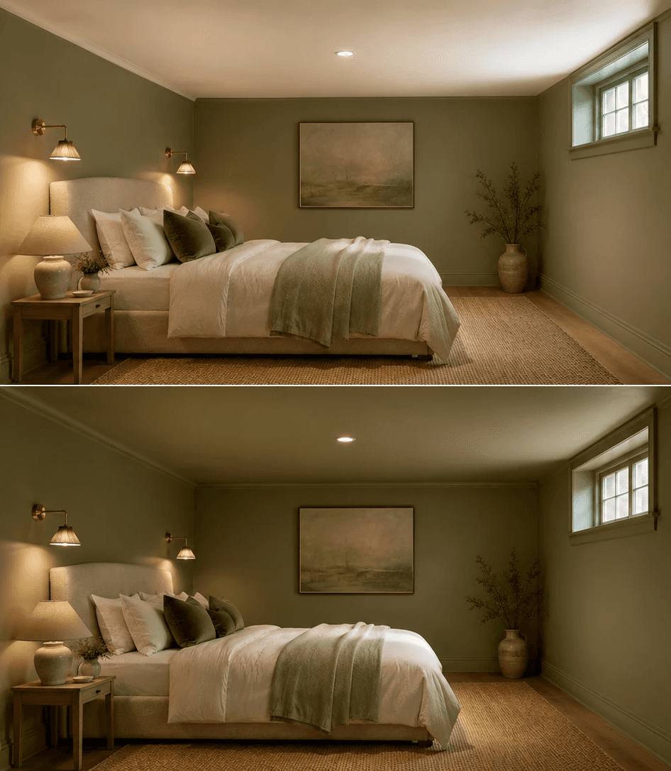
Natural light from north-facing windows is cool and blue. It will push warm colors cooler and cool colors grayer. South-facing light is warm and will make everything glow.
For drenched rooms with limited natural light, you need warm artificial light. Swap in warm-white LED bulbs (2700K) everywhere. Cool-white bulbs in a dark drenched room will make it feel like a bunker.
And if you can, add a light source at more than one height. A ceiling fixture plus a table lamp plus a low candle. Layered light in a drenched room is what makes it feel enveloping instead of suffocating.
Step 4: The Accent Strategy
A fully drenched room still needs contrast. Not much. Just enough to keep your eye interested.
My accent hierarchy for drenched rooms:
Metals. Brass, aged gold, or matte black. Brass cabinet pulls or a black iron curtain rod against a drenched wall is clean and intentional.
Wood. One wood tone, maybe two. A natural oak floating shelf or a walnut side table. The organic grain breaks up the monochrome without competing.
Textiles in a neighboring tone. Not a contrasting color. A shade lighter or darker. If the walls are deep sage, the throw blanket is a pale celadon. Tonal, not matching.
One surprising texture. A woven rattan basket, a rough ceramic vase, a piece of stone. Something that feels like a different material entirely.
---
This is exactly what I do for clients. Want me to design your room like this?
Start with the Style Discovery to tell me about your room. Or jump straight to A Quick Chat and lets figure this out together.
---
The Rent-Friendly Drench
You cant paint. I know. Heres how you drench without a roller.
The idea is the same: one dominant color across as many surfaces as you can control.
Textiles first. Curtains, bedding, throw pillows, a blanket draped over the couch. All in the same color family.
Art. A large-scale piece or a grouped set in your drench color. Oversized abstract prints in a single tone family work well here.
Removable wallpaper. This has gotten genuinely good. Peel-and-stick wallpaper in a solid color or subtle texture on one or two walls starts the drench effect even if the ceiling stays white.
A large rug. If your floor is a color that doesn't fit the drench, cover most of it. A large solid-color area rug in your drench tone anchors the whole room.
You wont get the full ceiling-to-floor effect. But you'll get the emotional temperature of a drenched room, and thats most of it.
---
Where It Goes Wrong
I've seen drenched rooms that feel incredible and drenched rooms that feel like a mistake. The difference usually comes down to a few things.
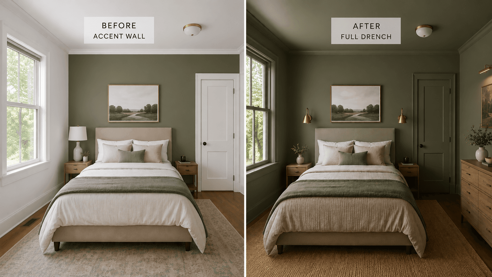
White trim left in. This is the number one drench killer. You paint the walls a beautiful deep green, leave the trim white, and now you have green walls with white racing stripes. The whole point of drenching is erasing those lines. If you drench, you drench everything.
No sheen variation. Same color, same sheen, every surface. It reads as flat and airless. You need the sheen map. Flat ceiling, eggshell walls, satin trim. Thats where the life comes from.
Fighting the room. If you have honey oak cabinets and terracotta tile floors, a cool gray drench is going to argue with everything thats already there. The drench color needs to be friends with your fixed finishes. Look at what you cant change first.
Too dark in a room that cant support it. I love a moody drench. But a 9x9 room with one small north-facing window and overhead fluorescent lighting is not the room for charcoal. It will feel like a closet. You need either enough natural light or enough warm artificial light to make the room feel like a choice, not a cave.
Going bright instead of deep. There is a difference between a bold color and a bright one. A dusty terracotta drenched across every surface feels warm and intentional. A fire-engine red does not. Depth over brightness, every time.
---
When Not to Drench: The Checklist
Drenching isn't always the answer. Don't do it when:
The room gets very little natural light AND you cant add warm artificial light sources
You have fixed finishes (countertops, tile, cabinetry) in a color that directly conflicts with your drench color
The room has a lot of architectural detail you want to highlight with contrast (sometimes crown molding looks best picked out in a different shade)
You're trying to fix a layout problem with paint. Color drenching makes a well-laid-out room feel amazing. It doesn't fix a room where the furniture is in the wrong place.
You don't like the color enough to live inside it. A drench is immersive. Ambivalence will catch up with you.
---
The Confidence Part
The hardest thing about drenching isn't the technique. Its the moment after you paint the first wall and it looks intense and you think, what did I do.
Every single time.
The second wall calms it down. The trim smooths it out. The ceiling ties it together. By the time the room is fully wrapped, the color feels quieter than it did on that first wall, because its everywhere, and everywhere is just the room now.
If you're going to try it, I would start with a bedroom. Its the most forgiving room, the most personal, and the one where the enveloping feeling of a drench pays off the most. Pick a color you already love wearing or looking at. Go two shades deeper than you think you should.
And if you want to work together to make it happen Let's Chat.
Color Drenching: A Designer's Guide to Doing One-Color Rooms the Virmae Way
I painted my guest bedroom ceiling the same green as the walls on a Wednesday night at 11pm because I couldn't stop once I started. The roller was already loaded. The trim was already done. And standing there with paint in my hair and a crick in my neck, looking up at a ceiling that finally didn't look like it belonged to a different room, I remember thinking, oh. Thats what was wrong.
That was the first time I color drenched a room.
Color drenching is exactly what it sounds like. One color, everywhere. Walls. Trim. Ceiling. Sometimes even the furniture and textiles. You erase the visual breaks between surfaces, and the room stops being a collection of planes and starts being a single environment.
Its not new. European designers have been doing it for decades. But its having a moment right now, and honestly, that tracks. After years of white walls with one "pop of color" accent wall, of course the pendulum swung.
The thing is, drenching works because of something most design advice ignores: the trim line. That little strip of white where your wall meets the ceiling or the baseboard. It chops the room into pieces. When you drench, those seams disappear, and the room suddenly reads as taller, wider, and more finished.
Lets talk about how to actually do it.
---
Shop This Room
Before we get into the method, here are the kinds of pieces that make a drenched room sing:
A linen duvet cover in a tonal neutral for soft-neutral drenches
Matte brass wall sconces because warm metal against a single-color wall is the whole vibe
Velvet throw pillows in deep olive or navy for moody drenches
A ceramic table lamp with a tonal shade so the lamp doesn't fight the room
Linen curtains in a warm off-white that layer into softer drenches
Paint sample peel-and-stick sheets so you can test before committing
A jute or sisal area rug to ground the room with texture instead of more color
---
The Three Drench Types
Not all drenches feel the same. The color you pick determines the emotional temperature of the room, and I think of them in three categories.
1. The Soft-Neutral Drench
This is the gateway drench. Warm white, putty, clay, greige, that family. You paint everything the same warm tone and suddenly the room feels like a linen shirt. Calm and expensive without trying.
This works in almost any room. Its especially good in living rooms and bedrooms where you want the furniture and art to lead, not the walls.
The trick here is warmth. Cool neutrals drenched across every surface can feel institutional. Go warm. Think Benjamin Moore White Dove or Farrow & Ball Jitney. Something with a little yellow or pink undertone.
2. The Moody Drench
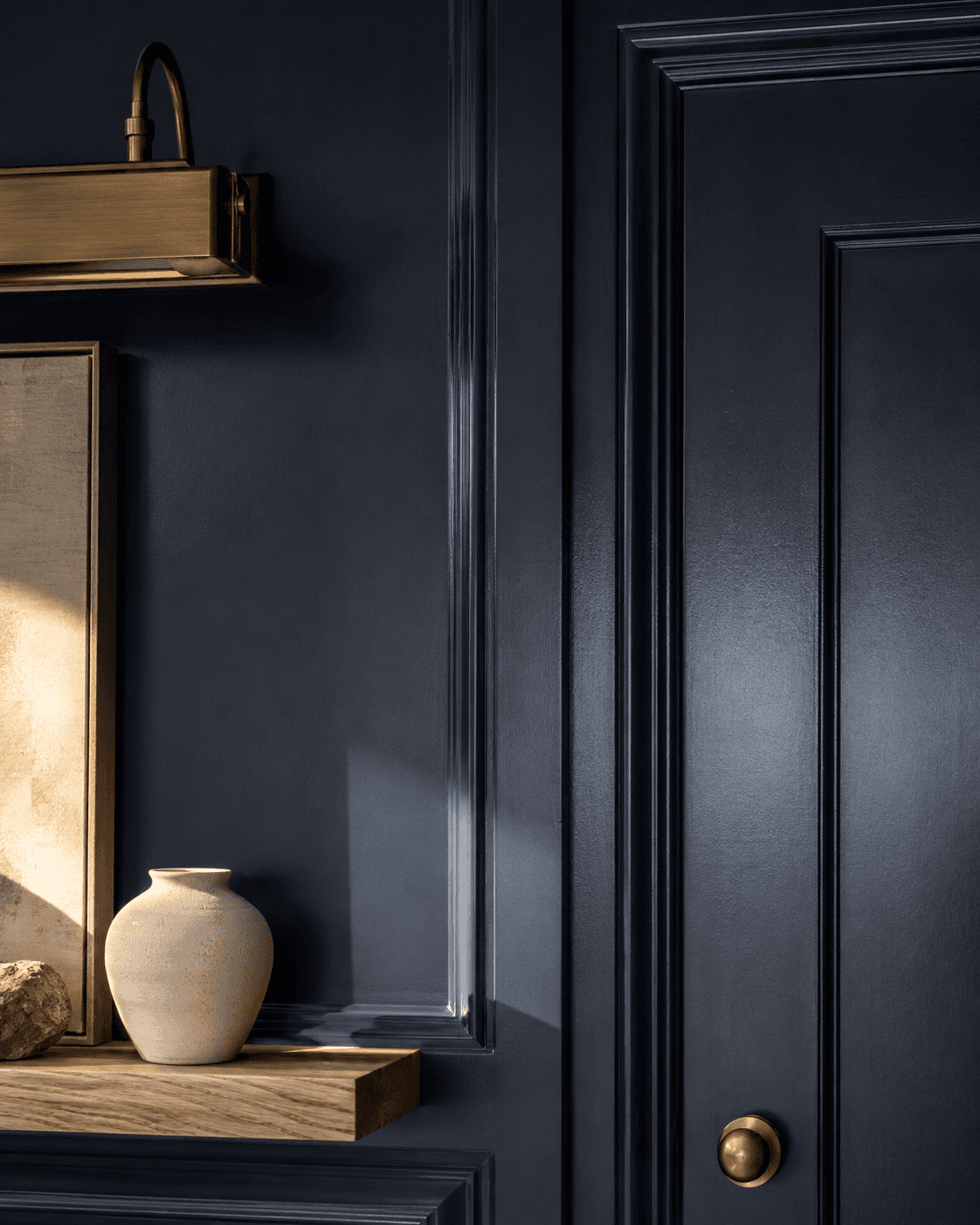
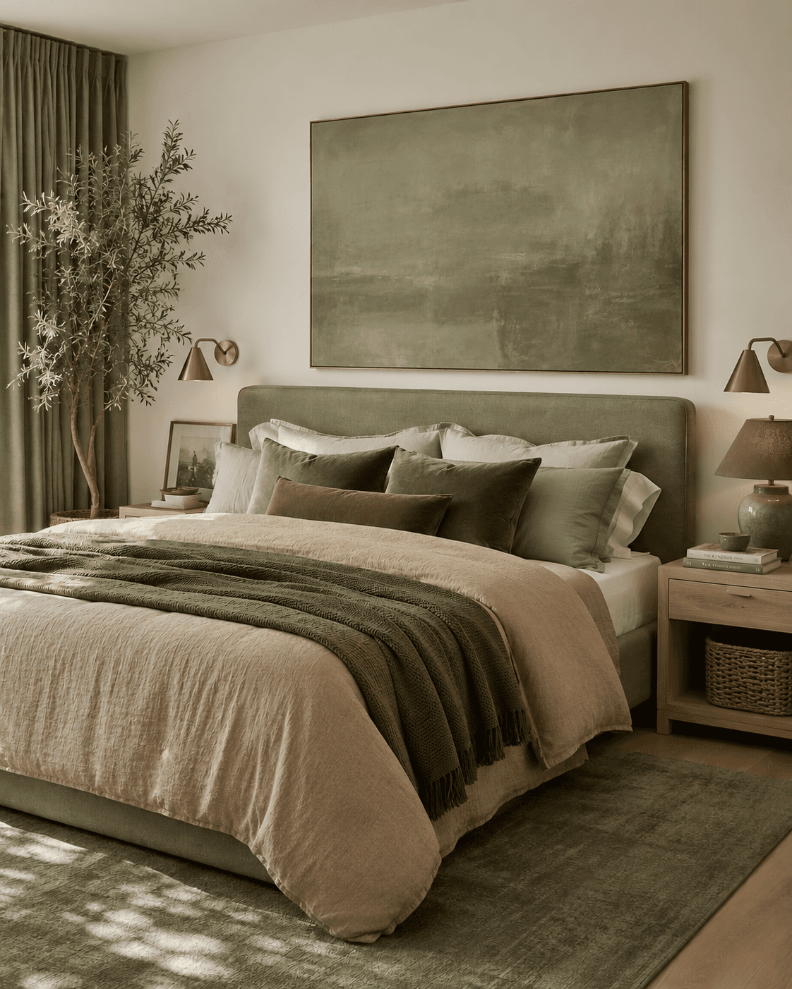
Deep olive. Charcoal. Navy. Rich chocolate brown. This is the one that makes guests stop talking when they walk in.
Moody drenches work best in rooms that are already a little dark, which always makes me nervous to say because the instinct is to fight darkness with white paint. Dont. If the room doesnt get much direct sun, lean in. A deep green bedroom with warm lighting is one of the most beautiful things you can build.
The key to moody drenches: you need light sources inside the room. A pair of warm-toned bedside lamps, a brass pendant, candles on the dresser. The room makes its own light.
3. The Playful-Color Drench
Terracotta. Dusty blue. Sage. Mauve. These are colors with personality that still read as grown-up when you commit to them fully.
This is the drench type that looks worst as an accent wall and best as a full drench. A single sage wall looks like a rental upgrade. Sage on every surface, with cream linen and warm wood, looks like a room in Provence.
The playful drench is where I see the most hesitation, and also the most dramatic payoff. Commit.
---
The Method: How to Drench a Room Right
Step 1: Sample, Then Sample Again
Get at least three shades of your chosen color. Paint them on large boards or use oversized peel-and-stick samples and move them around the room. Look at them in morning light, afternoon light, and lamp light.
Colors shift dramatically between a north-facing wall and a south-facing one, even in the same room. I once picked a green that looked perfect on the sample board and looked like toothpaste in the actual room at 2pm. The light was just different.
Spend at least two days with samples up before you buy a gallon.
Step 2: Build a Sheen Map
This is the part most tutorials skip, and its the part that makes or breaks a drench.
Same color, different sheens. That creates subtle dimension across surfaces without introducing a new color.
My go-to sheen map:
Ceiling: Flat or ultra-matte
Walls: Eggshell or matte
Trim and molding: Satin
Doors: Satin or semi-gloss
The slight sheen variation means light catches the trim and doors differently than the walls, so the room has depth instead of looking like the inside of a painted box. You still read it as one color. But it breathes.
A quality angled brush for trim is worth the extra few dollars here. Satin on trim shows every lazy brushstroke.
Step 3: The Lighting Check
Before you paint, look at where your light comes from.
Natural light from north-facing windows is cool and blue. It will push warm colors cooler and cool colors grayer. South-facing light is warm and will make everything glow.
For drenched rooms with limited natural light, you need warm artificial light. Swap in warm-white LED bulbs (2700K) everywhere. Cool-white bulbs in a dark drenched room will make it feel like a bunker.
And if you can, add a light source at more than one height. A ceiling fixture plus a table lamp plus a low candle. Layered light in a drenched room is what makes it feel enveloping instead of suffocating.
Step 4: The Accent Strategy
A fully drenched room still needs contrast. Not much. Just enough to keep your eye interested.
My accent hierarchy for drenched rooms:
Metals. Brass, aged gold, or matte black. Brass cabinet pulls or a black iron curtain rod against a drenched wall is clean and intentional.
Wood. One wood tone, maybe two. A natural oak floating shelf or a walnut side table. The organic grain breaks up the monochrome without competing.
Textiles in a neighboring tone. Not a contrasting color. A shade lighter or darker. If the walls are deep sage, the throw blanket is a pale celadon. Tonal, not matching.
One surprising texture. A woven rattan basket, a rough ceramic vase, a piece of stone. Something that feels like a different material entirely.
---
This is exactly what I do for clients. Want me to design your room like this?
Start with the Style Discovery to tell me about your room. Or jump straight to A Quick Chat and lets figure this out together.
---
The Rent-Friendly Drench
You cant paint. I know. Heres how you drench without a roller.
The idea is the same: one dominant color across as many surfaces as you can control.
Textiles first. Curtains, bedding, throw pillows, a blanket draped over the couch. All in the same color family.
Art. A large-scale piece or a grouped set in your drench color. Oversized abstract prints in a single tone family work well here.
Removable wallpaper. This has gotten genuinely good. Peel-and-stick wallpaper in a solid color or subtle texture on one or two walls starts the drench effect even if the ceiling stays white.
A large rug. If your floor is a color that doesn't fit the drench, cover most of it. A large solid-color area rug in your drench tone anchors the whole room.
You wont get the full ceiling-to-floor effect. But you'll get the emotional temperature of a drenched room, and thats most of it.
---
Where It Goes Wrong
I've seen drenched rooms that feel incredible and drenched rooms that feel like a mistake. The difference usually comes down to a few things.
White trim left in. This is the number one drench killer. You paint the walls a beautiful deep green, leave the trim white, and now you have green walls with white racing stripes. The whole point of drenching is erasing those lines. If you drench, you drench everything.
No sheen variation. Same color, same sheen, every surface. It reads as flat and airless. You need the sheen map. Flat ceiling, eggshell walls, satin trim. Thats where the life comes from.
Fighting the room. If you have honey oak cabinets and terracotta tile floors, a cool gray drench is going to argue with everything thats already there. The drench color needs to be friends with your fixed finishes. Look at what you cant change first.
Too dark in a room that cant support it. I love a moody drench. But a 9x9 room with one small north-facing window and overhead fluorescent lighting is not the room for charcoal. It will feel like a closet. You need either enough natural light or enough warm artificial light to make the room feel like a choice, not a cave.
Going bright instead of deep. There is a difference between a bold color and a bright one. A dusty terracotta drenched across every surface feels warm and intentional. A fire-engine red does not. Depth over brightness, every time.
---
When Not to Drench: The Checklist
Drenching isn't always the answer. Don't do it when:
The room gets very little natural light AND you cant add warm artificial light sources
You have fixed finishes (countertops, tile, cabinetry) in a color that directly conflicts with your drench color
The room has a lot of architectural detail you want to highlight with contrast (sometimes crown molding looks best picked out in a different shade)
You're trying to fix a layout problem with paint. Color drenching makes a well-laid-out room feel amazing. It doesn't fix a room where the furniture is in the wrong place.
You don't like the color enough to live inside it. A drench is immersive. Ambivalence will catch up with you.
---
The Confidence Part
The hardest thing about drenching isn't the technique. Its the moment after you paint the first wall and it looks intense and you think, what did I do.
Every single time.
The second wall calms it down. The trim smooths it out. The ceiling ties it together. By the time the room is fully wrapped, the color feels quieter than it did on that first wall, because its everywhere, and everywhere is just the room now.
If you're going to try it, I would start with a bedroom. Its the most forgiving room, the most personal, and the one where the enveloping feeling of a drench pays off the most. Pick a color you already love wearing or looking at. Go two shades deeper than you think you should.
And if you want to work together to make it happen Let's Chat.
Other Blogs
Other Similar Blogs
Your go-to destination for insightful articles, tips, and inspiration on all things landscaping and outdoor living
Other Blogs
Other Similar Blogs
Your go-to destination for insightful articles, tips, and inspiration on all things landscaping and outdoor living
Other Blogs
Other Similar Blogs
Your go-to destination for insightful articles, tips, and inspiration on all things landscaping and outdoor living