
Author
Suzanne is an Owner/Designer
Author
Suzanne is an Owner/Designer
A dark cottagecore kitchen isn't about going dark. Its about making the room where you actually live feel like it has a past, a mood, and a really good overhead light.
A dark cottagecore kitchen isn't about going dark. Its about making the room where you actually live feel like it has a past, a mood, and a really good overhead light.
Dark Cottagecore Kitchen: How to Create a Moody, Cozy, Vintage-Modern Heart of the Home
*This blog contains affiliate links
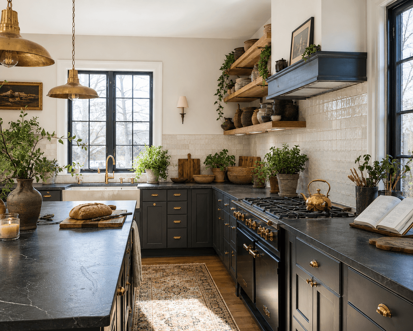
When clients ask for a room inspired by movies or TV shows it is my favorite. Set designers have amazing budgets, so I love it when a client comes in with screenshots from something like Practical Magic or that one scene in The Holiday where Cameron Diaz is standing in the English cottage kitchen looking confused but the kitchen behind her is perfect. And honestly, that tracks. Nobody screenshots a kitchen from a pharmaceutical commercial. They screenshot the ones that look like someone actually lives there, probably someone who bakes and has opinions about butter.
The thing I always say about dark cottagecore is that it isn't really a style. Its a feeling. Its the kitchen that looks like it was assembled over twenty years even if you did it in a weekend. Collected, not decorated. Warm, not sterile. And a little moody, which always makes me nervous to say out loud because moody gets misunderstood as dark-for-dark's-sake.
Its not that. Its intentional warmth with depth.
---
Shop This Room
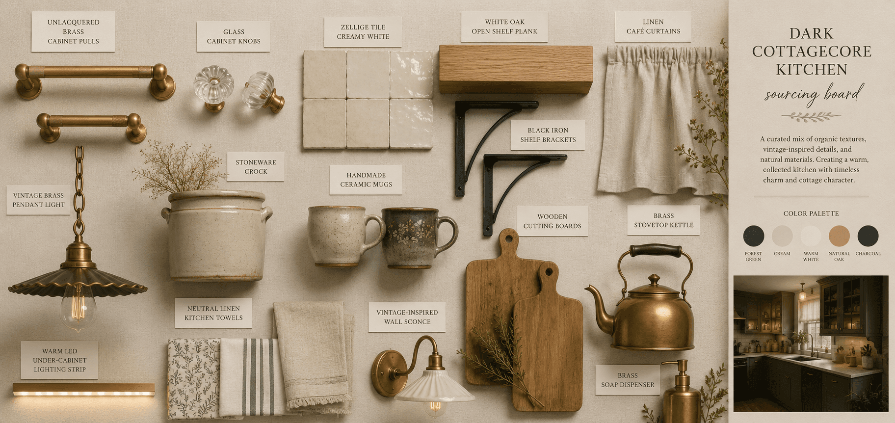
Before we get into the breakdown, here are the pieces that build this look. Every single one of these is something I've either used in a client project or have in my own kitchen.
Unlacquered brass cabinet pulls that patina over time, which is the whole point
Zellige-style handmade tile with that slightly imperfect, wavy finish
Glass cabinet knobs for the upper cabinets
Iron bracket open shelving for that one wall where you want to show your daily stuff
Linen cafe curtains because under-sink curtains are underrated and I will die on this hill
Vintage-style pendant light with a warm brass finish
Stoneware crock set for corralling wooden spoons and letting them breathe
A proper stovetop kettle because nothing ruins a cottagecore kitchen faster than a plastic electric kettle sitting on the counter
---
The Cabinets Set the Whole Mood
Lets start where the money is. Or isn't, depending on your situation.
The cabinet color is doing 80% of the work in a dark cottagecore kitchen. Not the backsplash. Not the hardware. The cabinets. They are the largest visual surface in the room, and if they're builder-grade white or that specific orange oak from 1993, no amount of styling is going to get you where you want to go.
Here are the color families that work:
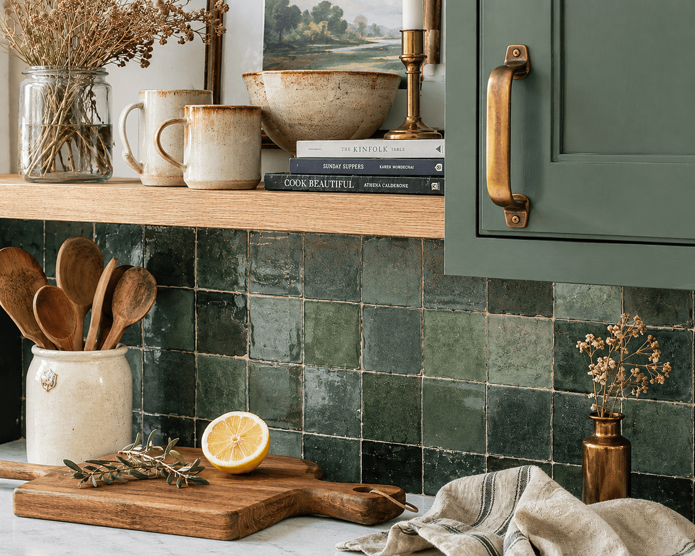
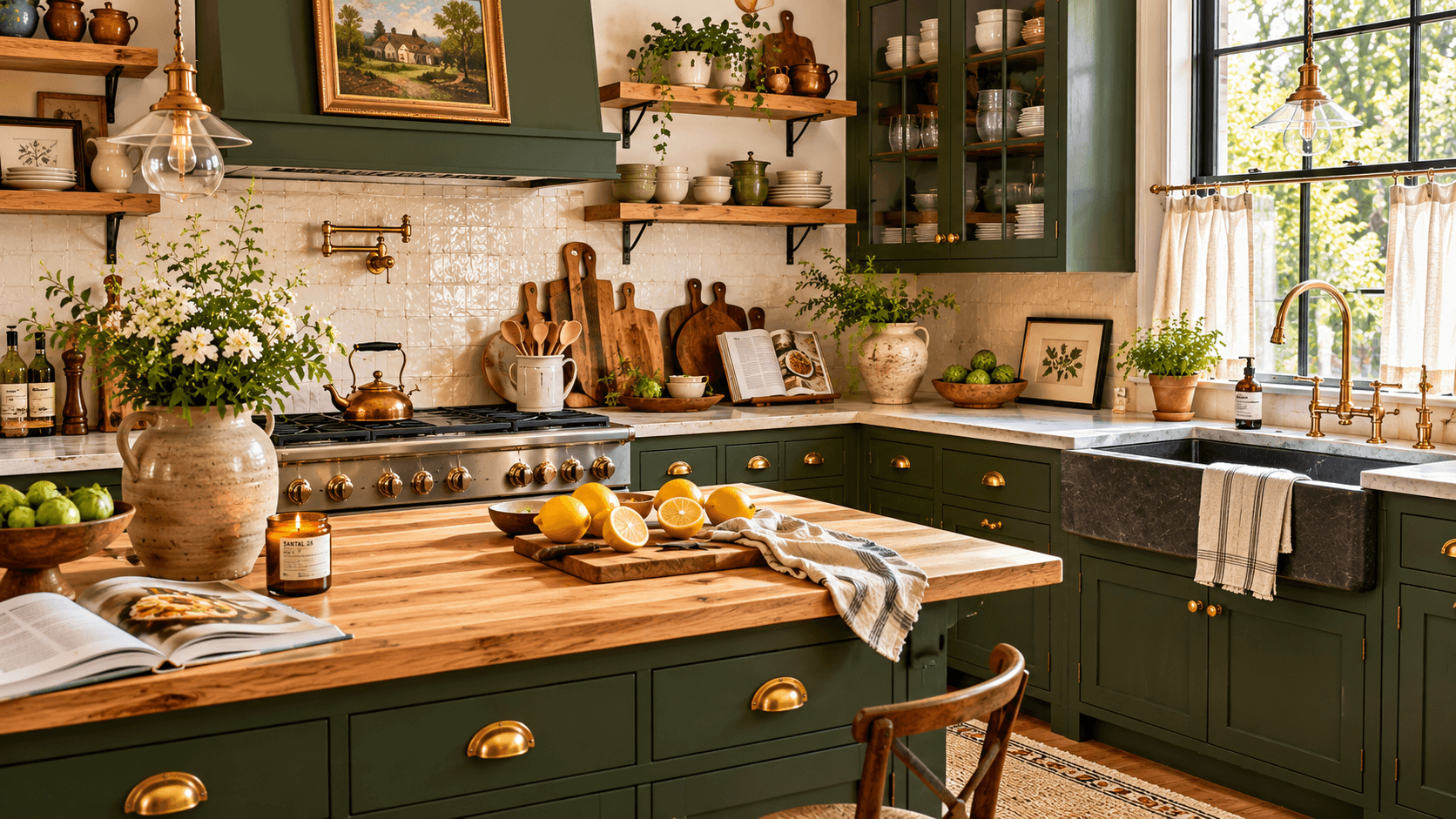
Deep green. Think forest floor, not emerald. Benjamin Moore's Essex Green or Sherwin-Williams Ripe Olive. This is probably the most forgiving entry point because green reads as natural, not dramatic, even when its dark.
Ink blue. Not navy, exactly. Darker. More bruised. Farrow and Ball's Hague Blue or Benjamin Moore's Midnight Navy. This one photographs beautifully but can feel heavy in a kitchen without good natural light, so know your room before you commit.
Warm charcoal. Not black. Not gray. That in-between that has some brown or green undertone. Benjamin Moore's Kendall Charcoal or Sherwin-Williams Iron Ore. This one works in almost every kitchen because it reads as shadow, not color.
I had a client last year with a 9x11 galley kitchen, zero windows on the south wall, and she wanted dark green lowers with charcoal uppers. I was nervous. She wasnt. We did it. And honestly the room felt bigger afterward, which makes no logical sense, but dark paint recedes. It tricks your eye into not seeing where the cabinet ends and the wall begins.
---
The Details That Make It Feel Collected
This is where the vintage-modern tension lives. You dont want everything to match. You want it to look like the kitchen was built in 1940, updated in 1985, and then you moved in and made it yours.
Hardware. Unlacquered brass pulls on the lowers. Glass knobs on the uppers. Mixing hardware is one of the easiest ways to break the "showroom" feeling. The brass will patina unevenly over time. The spots you touch most will darken first. Thats the whole point. If that gives you anxiety, this might not be your look. And thats fine.
Tile. Zellige-style tile has that handmade, slightly wobbly surface that catches light differently across every piece. A 3x8 or 2x6 in a creamy white or warm gray behind the stove is enough. You don't need to tile every wall. Just the one that gets the most visual attention.
Lighting. This is the part most kitchens get wrong. One overhead fixture, probably recessed cans, probably 5000K daylight bulbs that make everything look like a dentist's office. Instead:
Pendant lights over the island or sink, 2700K bulbs
Under-cabinet LED strips in warm white for task lighting
A wall sconce near the open shelving if you have the wiring for it
Three light sources minimum. Thats a room that feels alive after dark instead of fluorescent and flat.
---
Three Budget Tiers (Because Not Everyone Has a Movie Budget)
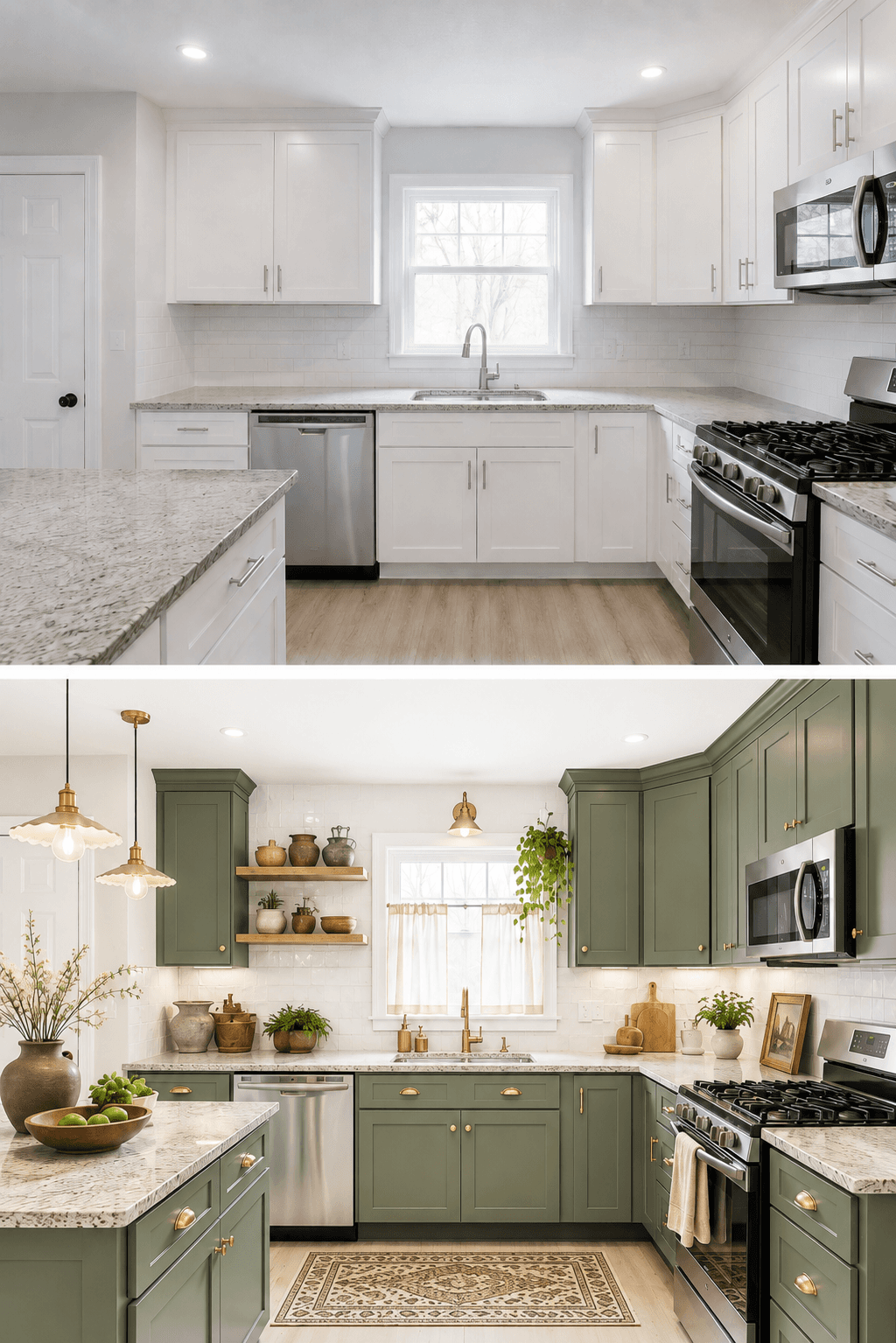
Tier 1: Paint Only ($100-300)
Paint the lower cabinets one of the colors above. Swap to 2700K warm bulbs in your existing fixtures. Add linen cafe curtains to one window. Done. This alone will shift the entire mood of the room more than you expect.
Tier 2: Paint + Hardware ($300-800)
Everything in Tier 1, plus swap all your cabinet hardware to unlacquered brass and glass knobs. Add one pendant light over the sink area. This tier is where most of my clients land and honestly its the best return on investment.
Tier 3: Paint + Tile + Lighting ($800-2500)
Everything above, plus a zellige-style backsplash behind the range, under-cabinet lighting, and open wood shelving on one wall to replace upper cabinets. Maybe a wall sconce. This is the full mood shift. This is the Practical Magic kitchen screenshot.
---
Thrift + Heirloom Styling: Open Shelves Done Right
Open shelving gets a bad reputation because most of the time its done wrong. Its either too sparse and gallery-like, or its crammed with everything that used to be in the cabinet and now just lives in the open looking stressed.
The rule I use with clients is this: if you use it every day or every week, it goes on the shelf. If you use it twice a year, it goes in a cabinet or a box or honestly maybe out of your house.
What works on open shelves:
Stoneware bowls and mugs in earthy tones. Mismatched is better than a set.
A ceramic crock with your wooden spoons.
Wood cutting boards leaned against the wall. Different sizes, different woods.
One cookbook you actually cook from. Open to a page you like. Not a stack of ten.
A small plant if you're the kind of person who remembers to water things. I am not, so I use dried herbs in a jar and it works just as well.
The key is negative space. Leave 30% of the shelf empty. Thats what makes it look intentional instead of cluttered.
This is exactly what I do for clients. Want me to design your room like this? Check out our Finish It Services or start with the Style Discovery to figure out your direction.
---
The Things Nobody Talks About
A few honest notes from doing this in actual kitchens, not just mood boards:
Dark cabinets show dust and fingerprints more than white ones. Thats real. A good microfiber cloth and a weekly wipe-down handles it, but if youre someone who wants zero-maintenance everything, dark paint will test your patience.
Unlacquered brass near a sink will patina faster and more unevenly than hardware farther away. Some of my clients love that. One client hated it so much she sealed hers with wax after three months. Both are valid choices.
Zellige tile is uneven on purpose. Your grout lines wont be perfect. Your installer might push back. Show them a reference photo and tell them thats the goal. I once had a tile installer text me a photo mid-job saying "is this right? it looks crooked." It was perfect.
And the biggest one: dark cottagecore kitchens look best when they're a little messy. A kettle on the stove, a lemon on the cutting board, a towel draped on the oven handle. This isn't a style that rewards minimalism. Its a style that rewards living.
---
Where to Start
If you've read this far and you're still thinking about it, start with paint. Just the lowers. Pick one of the three color families. Buy a sample. Tape it to the cabinet for a week. See how it feels at 7am and again at 9pm.
Thats how you know.
And if you want someone to walk through it with you, tell you what to paint and what to leave alone, figure out where the shelving goes and which hardware to pair with which color, thats what I do. Let's chat about it.
Kitchens are the room that gets the most hours of your life. Might as well make yours feel like the one you screenshot.
Dark Cottagecore Kitchen: How to Create a Moody, Cozy, Vintage-Modern Heart of the Home
*This blog contains affiliate links
When clients ask for a room inspired by movies or TV shows it is my favorite. Set designers have amazing budgets, so I love it when a client comes in with screenshots from something like Practical Magic or that one scene in The Holiday where Cameron Diaz is standing in the English cottage kitchen looking confused but the kitchen behind her is perfect. And honestly, that tracks. Nobody screenshots a kitchen from a pharmaceutical commercial. They screenshot the ones that look like someone actually lives there, probably someone who bakes and has opinions about butter.
The thing I always say about dark cottagecore is that it isn't really a style. Its a feeling. Its the kitchen that looks like it was assembled over twenty years even if you did it in a weekend. Collected, not decorated. Warm, not sterile. And a little moody, which always makes me nervous to say out loud because moody gets misunderstood as dark-for-dark's-sake.
Its not that. Its intentional warmth with depth.
---
Shop This Room
Before we get into the breakdown, here are the pieces that build this look. Every single one of these is something I've either used in a client project or have in my own kitchen.
Unlacquered brass cabinet pulls that patina over time, which is the whole point
Zellige-style handmade tile with that slightly imperfect, wavy finish
Glass cabinet knobs for the upper cabinets
Iron bracket open shelving for that one wall where you want to show your daily stuff
Linen cafe curtains because under-sink curtains are underrated and I will die on this hill
Vintage-style pendant light with a warm brass finish
Stoneware crock set for corralling wooden spoons and letting them breathe
A proper stovetop kettle because nothing ruins a cottagecore kitchen faster than a plastic electric kettle sitting on the counter
---
The Cabinets Set the Whole Mood
Lets start where the money is. Or isn't, depending on your situation.
The cabinet color is doing 80% of the work in a dark cottagecore kitchen. Not the backsplash. Not the hardware. The cabinets. They are the largest visual surface in the room, and if they're builder-grade white or that specific orange oak from 1993, no amount of styling is going to get you where you want to go.
Here are the color families that work:
Deep green. Think forest floor, not emerald. Benjamin Moore's Essex Green or Sherwin-Williams Ripe Olive. This is probably the most forgiving entry point because green reads as natural, not dramatic, even when its dark.
Ink blue. Not navy, exactly. Darker. More bruised. Farrow and Ball's Hague Blue or Benjamin Moore's Midnight Navy. This one photographs beautifully but can feel heavy in a kitchen without good natural light, so know your room before you commit.
Warm charcoal. Not black. Not gray. That in-between that has some brown or green undertone. Benjamin Moore's Kendall Charcoal or Sherwin-Williams Iron Ore. This one works in almost every kitchen because it reads as shadow, not color.
I had a client last year with a 9x11 galley kitchen, zero windows on the south wall, and she wanted dark green lowers with charcoal uppers. I was nervous. She wasnt. We did it. And honestly the room felt bigger afterward, which makes no logical sense, but dark paint recedes. It tricks your eye into not seeing where the cabinet ends and the wall begins.
---
The Details That Make It Feel Collected
This is where the vintage-modern tension lives. You dont want everything to match. You want it to look like the kitchen was built in 1940, updated in 1985, and then you moved in and made it yours.
Hardware. Unlacquered brass pulls on the lowers. Glass knobs on the uppers. Mixing hardware is one of the easiest ways to break the "showroom" feeling. The brass will patina unevenly over time. The spots you touch most will darken first. Thats the whole point. If that gives you anxiety, this might not be your look. And thats fine.
Tile. Zellige-style tile has that handmade, slightly wobbly surface that catches light differently across every piece. A 3x8 or 2x6 in a creamy white or warm gray behind the stove is enough. You don't need to tile every wall. Just the one that gets the most visual attention.
Lighting. This is the part most kitchens get wrong. One overhead fixture, probably recessed cans, probably 5000K daylight bulbs that make everything look like a dentist's office. Instead:
Pendant lights over the island or sink, 2700K bulbs
Under-cabinet LED strips in warm white for task lighting
A wall sconce near the open shelving if you have the wiring for it
Three light sources minimum. Thats a room that feels alive after dark instead of fluorescent and flat.
---
Three Budget Tiers (Because Not Everyone Has a Movie Budget)
Tier 1: Paint Only ($100-300)
Paint the lower cabinets one of the colors above. Swap to 2700K warm bulbs in your existing fixtures. Add linen cafe curtains to one window. Done. This alone will shift the entire mood of the room more than you expect.
Tier 2: Paint + Hardware ($300-800)
Everything in Tier 1, plus swap all your cabinet hardware to unlacquered brass and glass knobs. Add one pendant light over the sink area. This tier is where most of my clients land and honestly its the best return on investment.
Tier 3: Paint + Tile + Lighting ($800-2500)
Everything above, plus a zellige-style backsplash behind the range, under-cabinet lighting, and open wood shelving on one wall to replace upper cabinets. Maybe a wall sconce. This is the full mood shift. This is the Practical Magic kitchen screenshot.
---
Thrift + Heirloom Styling: Open Shelves Done Right
Open shelving gets a bad reputation because most of the time its done wrong. Its either too sparse and gallery-like, or its crammed with everything that used to be in the cabinet and now just lives in the open looking stressed.
The rule I use with clients is this: if you use it every day or every week, it goes on the shelf. If you use it twice a year, it goes in a cabinet or a box or honestly maybe out of your house.
What works on open shelves:
Stoneware bowls and mugs in earthy tones. Mismatched is better than a set.
A ceramic crock with your wooden spoons.
Wood cutting boards leaned against the wall. Different sizes, different woods.
One cookbook you actually cook from. Open to a page you like. Not a stack of ten.
A small plant if you're the kind of person who remembers to water things. I am not, so I use dried herbs in a jar and it works just as well.
The key is negative space. Leave 30% of the shelf empty. Thats what makes it look intentional instead of cluttered.
This is exactly what I do for clients. Want me to design your room like this? Check out our Finish It Services or start with the Style Discovery to figure out your direction.
---
The Things Nobody Talks About
A few honest notes from doing this in actual kitchens, not just mood boards:
Dark cabinets show dust and fingerprints more than white ones. Thats real. A good microfiber cloth and a weekly wipe-down handles it, but if youre someone who wants zero-maintenance everything, dark paint will test your patience.
Unlacquered brass near a sink will patina faster and more unevenly than hardware farther away. Some of my clients love that. One client hated it so much she sealed hers with wax after three months. Both are valid choices.
Zellige tile is uneven on purpose. Your grout lines wont be perfect. Your installer might push back. Show them a reference photo and tell them thats the goal. I once had a tile installer text me a photo mid-job saying "is this right? it looks crooked." It was perfect.
And the biggest one: dark cottagecore kitchens look best when they're a little messy. A kettle on the stove, a lemon on the cutting board, a towel draped on the oven handle. This isn't a style that rewards minimalism. Its a style that rewards living.
---
Where to Start
If you've read this far and you're still thinking about it, start with paint. Just the lowers. Pick one of the three color families. Buy a sample. Tape it to the cabinet for a week. See how it feels at 7am and again at 9pm.
Thats how you know.
And if you want someone to walk through it with you, tell you what to paint and what to leave alone, figure out where the shelving goes and which hardware to pair with which color, thats what I do. Let's chat about it.
Kitchens are the room that gets the most hours of your life. Might as well make yours feel like the one you screenshot.
Other Blogs
Other Similar Blogs
Your go-to destination for insightful articles, tips, and inspiration on all things landscaping and outdoor living
Other Blogs
Other Similar Blogs
Your go-to destination for insightful articles, tips, and inspiration on all things landscaping and outdoor living
Other Blogs
Other Similar Blogs
Your go-to destination for insightful articles, tips, and inspiration on all things landscaping and outdoor living
Join our newsletter list
Sign up to get the most recent blog articles in your email every week.