Author
Suzanne is an Owner/Designer
Author
Suzanne is an Owner/Designer
Neutral rooms are everywhere, and most of them feel like nobody lives there. Here is how to add color to your home with a clear direction, using five styles and the four seasonal palette options each so you can pick one and commit.
Neutral rooms are everywhere, and most of them feel like nobody lives there. Here is how to add color to your home with a clear direction, using five styles and the four seasonal palette options each so you can pick one and commit.
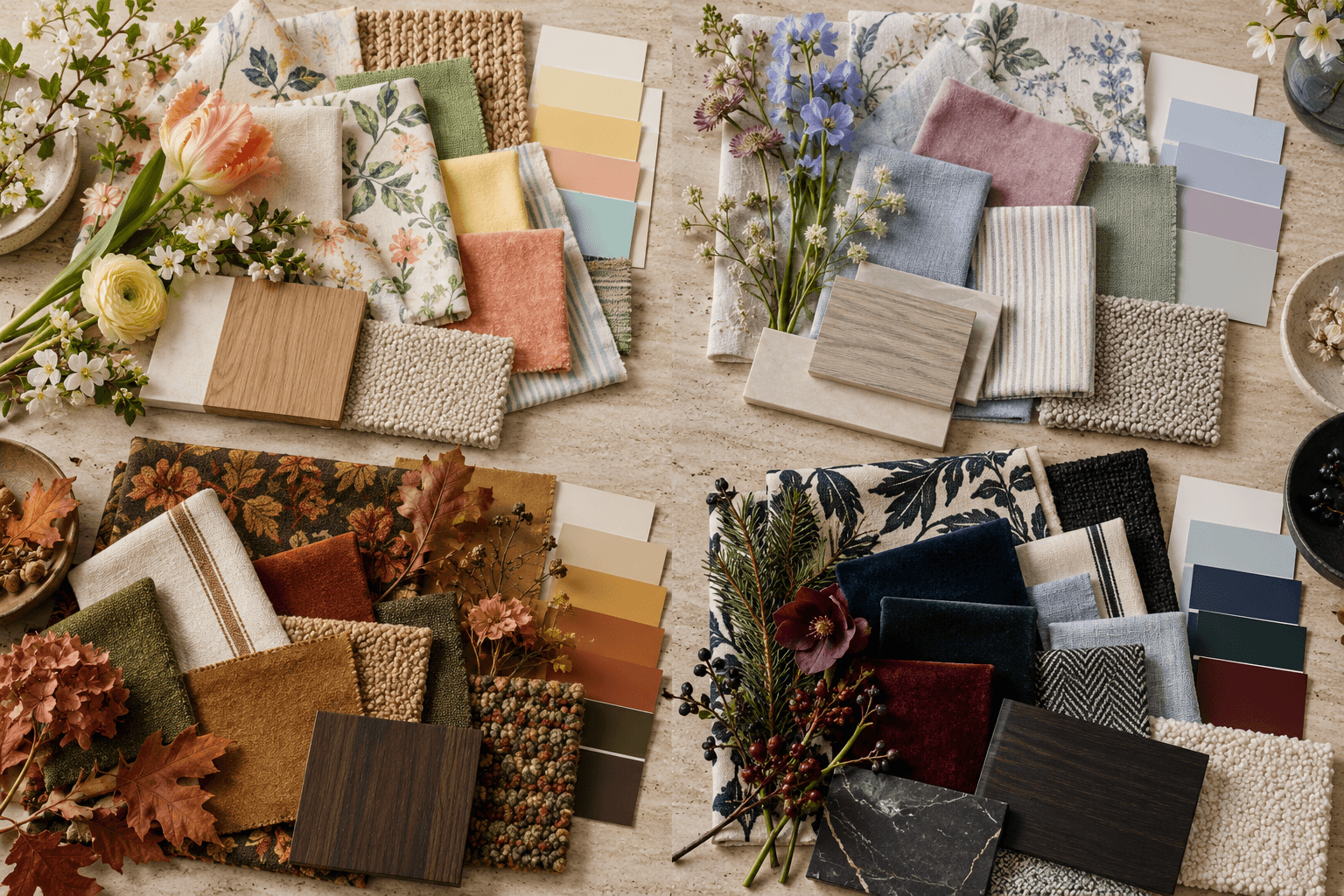
Have you noticed that everything has gone quiet lately? Cars are white, gray, or black. Packaging is beige. Websites are the color of oatmeal. And homes have followed right along, partly because real estate advice has trained all of us to keep things neutral for resale, which is sensible until the day you realize no one in your family can tell your bedroom apart from a hotel.
Here is the short answer. A neutral room does not feel impersonal because it lacks color. It feels impersonal because it lacks a direction. Pick a style point of view, pick three or four colors that support it, and repeat those colors in at least three places, and suddenly a beige room reads as intentional instead of unfinished.
Start With Your Closet
If you have no idea which colors are yours, go stand in your closet. What are you actually reaching for on a normal Tuesday? That is your palette, already tested on the only person whose opinion matters here.
Seasonal color analysis is a useful shortcut for the same reason. It sorts colors by warmth and clarity, so a soft summer tends to like dusty blue and blush while a true autumn gravitates toward rust and olive. You do not need to get religious about it. You just need a starting point so you are not choosing paint from a wall of two thousand chips with no filter.
And if your closet has also been swallowed by the neutral wave, that is fine. Take the Style Discovery quiz instead. It is free with the code FRIENDS, a $49 value, and it gives you a direction to test colors against.
1. Preppy: Tailored, Playful, and Patterned

Preppy is pattern with discipline. Checks, stripes, small florals, graphic art, and arrangements that are almost always symmetrical. A checked headboard, a matched pair of mirrors, patterned lampshades, and a tidy gallery wall do most of the work before a single accent color shows up.
The trick is that everything is mixed but nothing is random. Two lamps, not one. A rug that squares up to the bed. Trim that lines up.
Palette | How it reads | Where to put it |
|---|---|---|
Spring - Coral and yellow | Lively, sunny, great for a low-light room | Quilt, lumbar pillow, lampshades |
Summer - Soft blue and lavender | Gentle and calm, still crisp | Headboard check, curtain trim, art mats |
Autumn - Rust and olive | Earthy preppy, warmer and more grown up | Rug, bench cushion, ceramic bases |
Winter - Navy and green | Dramatic and library-ish | Headboard, drapery, framed prints |
Practical takeaway: find one patterned textile you love, pull three or four colors out of it, and repeat those colors around the room. The fabric does your color matching for you.
2. Traditional: Classic Details With Personality

Traditional leans on shapes you already recognize. A shaped upholstered headboard, matched lamps, a landscape painting, bordered bedding, curtains with a flat tape trim. The composition is orderly, and that order is what lets color get interesting without the room tipping over.
This is my favorite category for people who worry about resale, because the bones stay classic no matter what color you run through them.
Palette | How it reads | Where to put it |
|---|---|---|
Spring - Green and yellow | Fresh and garden-room cheerful | Bedding border, lampshades, art |
Summer - Blue and blush | Soft, romantic, easy to live with | Curtain trim, pillow shams, chair seat |
Autumn - Olive and rust | Warm, English, autumnal | Upholstered headboard, rug, throw |
Winter - Blue and burgundy | Richer, more formal, evening mood | Drapery, bench, framed art |
Practical takeaway: keep the bed neutral and put the color on the edges. Bedding borders, curtain trim, and a piped cushion give you a lot of color for very little commitment, and you can swap them in a year.
3. Organic Modern: Simple Shapes, Natural Texture

Organic modern gets typecast as greige, and that is not a rule, it is a habit. The style is really about simple forms, rounded edges, natural materials, and breathing room. A wood bed, a curved chair, a woven rug, a paper pendant, one or two restrained pieces of art.
None of that requires the room to be colorless. It requires the color to arrive in large, quiet blocks instead of scattered bright bits.
Palette | How it reads | Where to put it |
|---|---|---|
Spring - Green and cream | Grounded, plant-adjacent, easy | Upholstered chair, duvet, ceramics |
Summer - Dusty blue | Cool, restful, good for bright southern light | Bedding, drapery, headboard |
Autumn - Rust and ochre | Warm and sunbaked without going full terracotta | Rug, throw, pillows |
Winter - Charcoal blue | Quiet drama, excellent in a room with lots of glass | Feature wall, bed frame, drapery |
Practical takeaway: lead with one large textile or one upholstered piece in your color, then echo it in two or three small details. A green chair plus a green stripe in the rug plus one green vase looks planned. Fifteen small green things look like a gift shop.
If your room needs this kind of plan and you would rather not guess your way through it, that is the work I do. Layout first, then color, in that order.
4. Eclectic Vintage: Collected and Personal

This is the room built from wood furniture with some age to it, mismatched lighting, artwork that means something to you, and one or two graphic accents. It differs from preppy because nothing is coordinated on purpose, and it differs from boho because the layering is lighter. Fewer textiles, more objects.
Color here usually arrives through things you already own. A blue chair, a framed print, a striped rug. Those pieces are the palette, whether you planned it or not.
Palette | How it reads | Where to put it |
|---|---|---|
Spring - Mustard and olive | Seventies-adjacent, warm, a little wry | Chair upholstery, lampshade, art |
Summer - Soft blue and sage | Gentler and more current | Rug, bedding, painted case piece |
Autumn - Rust and olive | Cozy and thrift-store handsome | Throw, curtains, ceramics |
Winter - Charcoal and emerald | Moody and evening-friendly | Painted wall, velvet chair, art frames |
Practical takeaway: let one existing piece pick the colors. If you love a chair, pull its blue into a pillow and a lamp base and stop there.
5. Boho: Layered Color Beyond Terracotta

Boho is collected art, layered pattern, woven texture, plants, and objects with a story. A rattan headboard gives the bed structure, and then bold art, a patterned rug, baskets, and mixed bedding fill in the character.
The default boho palette has been terracotta and cream for about six years now. It works, but it is not the whole style. Boho takes cool colors just as well.
Palette | How it reads | Where to put it |
|---|---|---|
Spring - Coral and yellow | Warm, festival, high energy | Gallery art, quilt, pillows |
Summer - Dusty blue and blush | Soft, airy, calmer boho | Bedding, accent furniture, rug |
Autumn - Rust and ochre | The classic version, still good | Rug, baskets, throw |
Winter - Navy and plum | Deeper, jewel-toned, night-mood | Blankets, velvet pillows, art, florals |
Practical takeaway: repeat colors and vary pattern scale. A big-scale rug, a medium-scale quilt, and a small-scale pillow in overlapping colors read as layered. Three patterns at the same scale read as noise. If you already own a red rug you love, treat it as the anchor and build the rest around it instead of fighting it. Worth reading next if you want to go bolder in one move: my guide to color drenching a room in a single shade.
It Depends on Your Space
Small room: Put the color on the walls or the largest textile, not on six small objects. Scattered accents make a small room look busier. One saturated wall color with light bedding makes it look composed.
Large or open room: Repeat the same two colors in at least three separate zones so the room reads as one thought rather than three furniture groupings that happen to share a floor.
Renting: Bedding, curtains, rugs, lampshades, art, and peel-and-stick samples do everything. Skip the paint and put your budget into one large textile.
Owning: Paint is the cheapest color you will ever buy. Test big samples on two walls and live with them for three days before committing.
Low light, north-facing: Warm colors hold up. Coral, ochre, warm olive, butter yellow. Cool grays go flat and slightly sad.
Bright light, south or west: Cool and deep colors stay true. Dusty blue, emerald, charcoal blue, navy.
Kids and pets: Put color in washable and replaceable layers. Performance fabric on the seating, a patterned wool or indoor-outdoor rug that hides everything, and light-colored things above waist height only.
Tight budget: Two throw pillows, one art print, and one lampshade in the same color family will shift a room more than most people expect. Paint next, furniture last.
FAQ
How do I add color to a neutral room without repainting?
Start with the biggest soft surfaces you can change. Bedding, curtains, and a rug will shift the color story of a room more than any accessory, and none of them require a landlord conversation. Then repeat one of those colors in two smaller spots so it looks deliberate.
What colors go with beige walls?
Warm beige plays well with olive, rust, coral, terracotta, and navy. Cooler greige handles dusty blue, sage, blush, and charcoal blue better. Hold a large paint sample or fabric swatch against the wall in daylight before you decide, because beige is sneaky and reveals its undertone only next to something else.
Will adding color hurt my resale value?
Paint is the easiest thing in a home to change, so color on walls is a low-risk choice. Keep the permanent stuff, meaning tile, counters, and cabinetry, on the calmer side, and let the paint and textiles carry personality. Buyers remember rooms that felt good, not rooms that felt blank.
How do I figure out my color season?
Look at what you actually wear and what people compliment you in. Warm and muted points toward autumn, cool and soft toward summer, cool and clear toward winter, warm and clear toward spring. It is a starting filter, not a law, and you are allowed to break it for a rug you love.
How many colors should one room have?
Three is a comfortable working number, plus your neutrals and wood tones. One color leads, one supports, one shows up in small doses. More than that is possible in eclectic and boho rooms, but only if the colors repeat instead of appearing once each.
Neutral is not the problem. Undecided is the problem. Pick a direction, pick your three colors, and repeat them until the room reads as somebody's on purpose. If you would rather have that decided for you, tell me about your room and we will sort it out together.
Have you noticed that everything has gone quiet lately? Cars are white, gray, or black. Packaging is beige. Websites are the color of oatmeal. And homes have followed right along, partly because real estate advice has trained all of us to keep things neutral for resale, which is sensible until the day you realize no one in your family can tell your bedroom apart from a hotel.
Here is the short answer. A neutral room does not feel impersonal because it lacks color. It feels impersonal because it lacks a direction. Pick a style point of view, pick three or four colors that support it, and repeat those colors in at least three places, and suddenly a beige room reads as intentional instead of unfinished.
Start With Your Closet
If you have no idea which colors are yours, go stand in your closet. What are you actually reaching for on a normal Tuesday? That is your palette, already tested on the only person whose opinion matters here.
Seasonal color analysis is a useful shortcut for the same reason. It sorts colors by warmth and clarity, so a soft summer tends to like dusty blue and blush while a true autumn gravitates toward rust and olive. You do not need to get religious about it. You just need a starting point so you are not choosing paint from a wall of two thousand chips with no filter.
And if your closet has also been swallowed by the neutral wave, that is fine. Take the Style Discovery quiz instead. It is free with the code FRIENDS, a $49 value, and it gives you a direction to test colors against.
1. Preppy: Tailored, Playful, and Patterned
Preppy is pattern with discipline. Checks, stripes, small florals, graphic art, and arrangements that are almost always symmetrical. A checked headboard, a matched pair of mirrors, patterned lampshades, and a tidy gallery wall do most of the work before a single accent color shows up.
The trick is that everything is mixed but nothing is random. Two lamps, not one. A rug that squares up to the bed. Trim that lines up.
Palette | How it reads | Where to put it |
|---|---|---|
Spring - Coral and yellow | Lively, sunny, great for a low-light room | Quilt, lumbar pillow, lampshades |
Summer - Soft blue and lavender | Gentle and calm, still crisp | Headboard check, curtain trim, art mats |
Autumn - Rust and olive | Earthy preppy, warmer and more grown up | Rug, bench cushion, ceramic bases |
Winter - Navy and green | Dramatic and library-ish | Headboard, drapery, framed prints |
Practical takeaway: find one patterned textile you love, pull three or four colors out of it, and repeat those colors around the room. The fabric does your color matching for you.
2. Traditional: Classic Details With Personality
Traditional leans on shapes you already recognize. A shaped upholstered headboard, matched lamps, a landscape painting, bordered bedding, curtains with a flat tape trim. The composition is orderly, and that order is what lets color get interesting without the room tipping over.
This is my favorite category for people who worry about resale, because the bones stay classic no matter what color you run through them.
Palette | How it reads | Where to put it |
|---|---|---|
Spring - Green and yellow | Fresh and garden-room cheerful | Bedding border, lampshades, art |
Summer - Blue and blush | Soft, romantic, easy to live with | Curtain trim, pillow shams, chair seat |
Autumn - Olive and rust | Warm, English, autumnal | Upholstered headboard, rug, throw |
Winter - Blue and burgundy | Richer, more formal, evening mood | Drapery, bench, framed art |
Practical takeaway: keep the bed neutral and put the color on the edges. Bedding borders, curtain trim, and a piped cushion give you a lot of color for very little commitment, and you can swap them in a year.
3. Organic Modern: Simple Shapes, Natural Texture
Organic modern gets typecast as greige, and that is not a rule, it is a habit. The style is really about simple forms, rounded edges, natural materials, and breathing room. A wood bed, a curved chair, a woven rug, a paper pendant, one or two restrained pieces of art.
None of that requires the room to be colorless. It requires the color to arrive in large, quiet blocks instead of scattered bright bits.
Palette | How it reads | Where to put it |
|---|---|---|
Spring - Green and cream | Grounded, plant-adjacent, easy | Upholstered chair, duvet, ceramics |
Summer - Dusty blue | Cool, restful, good for bright southern light | Bedding, drapery, headboard |
Autumn - Rust and ochre | Warm and sunbaked without going full terracotta | Rug, throw, pillows |
Winter - Charcoal blue | Quiet drama, excellent in a room with lots of glass | Feature wall, bed frame, drapery |
Practical takeaway: lead with one large textile or one upholstered piece in your color, then echo it in two or three small details. A green chair plus a green stripe in the rug plus one green vase looks planned. Fifteen small green things look like a gift shop.
If your room needs this kind of plan and you would rather not guess your way through it, that is the work I do. Layout first, then color, in that order.
4. Eclectic Vintage: Collected and Personal
This is the room built from wood furniture with some age to it, mismatched lighting, artwork that means something to you, and one or two graphic accents. It differs from preppy because nothing is coordinated on purpose, and it differs from boho because the layering is lighter. Fewer textiles, more objects.
Color here usually arrives through things you already own. A blue chair, a framed print, a striped rug. Those pieces are the palette, whether you planned it or not.
Palette | How it reads | Where to put it |
|---|---|---|
Spring - Mustard and olive | Seventies-adjacent, warm, a little wry | Chair upholstery, lampshade, art |
Summer - Soft blue and sage | Gentler and more current | Rug, bedding, painted case piece |
Autumn - Rust and olive | Cozy and thrift-store handsome | Throw, curtains, ceramics |
Winter - Charcoal and emerald | Moody and evening-friendly | Painted wall, velvet chair, art frames |
Practical takeaway: let one existing piece pick the colors. If you love a chair, pull its blue into a pillow and a lamp base and stop there.
5. Boho: Layered Color Beyond Terracotta
Boho is collected art, layered pattern, woven texture, plants, and objects with a story. A rattan headboard gives the bed structure, and then bold art, a patterned rug, baskets, and mixed bedding fill in the character.
The default boho palette has been terracotta and cream for about six years now. It works, but it is not the whole style. Boho takes cool colors just as well.
Palette | How it reads | Where to put it |
|---|---|---|
Spring - Coral and yellow | Warm, festival, high energy | Gallery art, quilt, pillows |
Summer - Dusty blue and blush | Soft, airy, calmer boho | Bedding, accent furniture, rug |
Autumn - Rust and ochre | The classic version, still good | Rug, baskets, throw |
Winter - Navy and plum | Deeper, jewel-toned, night-mood | Blankets, velvet pillows, art, florals |
Practical takeaway: repeat colors and vary pattern scale. A big-scale rug, a medium-scale quilt, and a small-scale pillow in overlapping colors read as layered. Three patterns at the same scale read as noise. If you already own a red rug you love, treat it as the anchor and build the rest around it instead of fighting it. Worth reading next if you want to go bolder in one move: my guide to color drenching a room in a single shade.
It Depends on Your Space
Small room: Put the color on the walls or the largest textile, not on six small objects. Scattered accents make a small room look busier. One saturated wall color with light bedding makes it look composed.
Large or open room: Repeat the same two colors in at least three separate zones so the room reads as one thought rather than three furniture groupings that happen to share a floor.
Renting: Bedding, curtains, rugs, lampshades, art, and peel-and-stick samples do everything. Skip the paint and put your budget into one large textile.
Owning: Paint is the cheapest color you will ever buy. Test big samples on two walls and live with them for three days before committing.
Low light, north-facing: Warm colors hold up. Coral, ochre, warm olive, butter yellow. Cool grays go flat and slightly sad.
Bright light, south or west: Cool and deep colors stay true. Dusty blue, emerald, charcoal blue, navy.
Kids and pets: Put color in washable and replaceable layers. Performance fabric on the seating, a patterned wool or indoor-outdoor rug that hides everything, and light-colored things above waist height only.
Tight budget: Two throw pillows, one art print, and one lampshade in the same color family will shift a room more than most people expect. Paint next, furniture last.
FAQ
How do I add color to a neutral room without repainting?
Start with the biggest soft surfaces you can change. Bedding, curtains, and a rug will shift the color story of a room more than any accessory, and none of them require a landlord conversation. Then repeat one of those colors in two smaller spots so it looks deliberate.
What colors go with beige walls?
Warm beige plays well with olive, rust, coral, terracotta, and navy. Cooler greige handles dusty blue, sage, blush, and charcoal blue better. Hold a large paint sample or fabric swatch against the wall in daylight before you decide, because beige is sneaky and reveals its undertone only next to something else.
Will adding color hurt my resale value?
Paint is the easiest thing in a home to change, so color on walls is a low-risk choice. Keep the permanent stuff, meaning tile, counters, and cabinetry, on the calmer side, and let the paint and textiles carry personality. Buyers remember rooms that felt good, not rooms that felt blank.
How do I figure out my color season?
Look at what you actually wear and what people compliment you in. Warm and muted points toward autumn, cool and soft toward summer, cool and clear toward winter, warm and clear toward spring. It is a starting filter, not a law, and you are allowed to break it for a rug you love.
How many colors should one room have?
Three is a comfortable working number, plus your neutrals and wood tones. One color leads, one supports, one shows up in small doses. More than that is possible in eclectic and boho rooms, but only if the colors repeat instead of appearing once each.
Neutral is not the problem. Undecided is the problem. Pick a direction, pick your three colors, and repeat them until the room reads as somebody's on purpose. If you would rather have that decided for you, tell me about your room and we will sort it out together.
Other Blogs
Other Similar Blogs
Your go-to destination for insightful articles, tips, and inspiration on all things landscaping and outdoor living
Other Blogs
Other Similar Blogs
Your go-to destination for insightful articles, tips, and inspiration on all things landscaping and outdoor living
Other Blogs
Other Similar Blogs
Your go-to destination for insightful articles, tips, and inspiration on all things landscaping and outdoor living


Join our newsletter list
Sign up to get the most recent blog articles in your email every week.