Author
Suzanne is an Owner/Designer
Author
Suzanne is an Owner/Designer
Brutalist-inspired furniture is everywhere right now, and it works best when you pair heavy forms with real color and soft texture. Here's how to get the look warm, livable, and kid-proof instead of cold and echoey.
Brutalist-inspired furniture is everywhere right now, and it works best when you pair heavy forms with real color and soft texture. Here's how to get the look warm, livable, and kid-proof instead of cold and echoey.
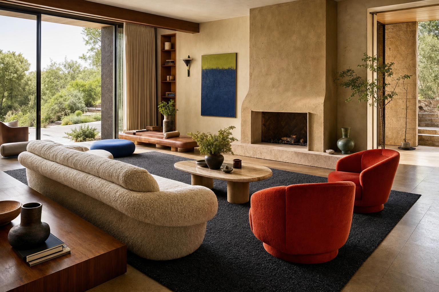
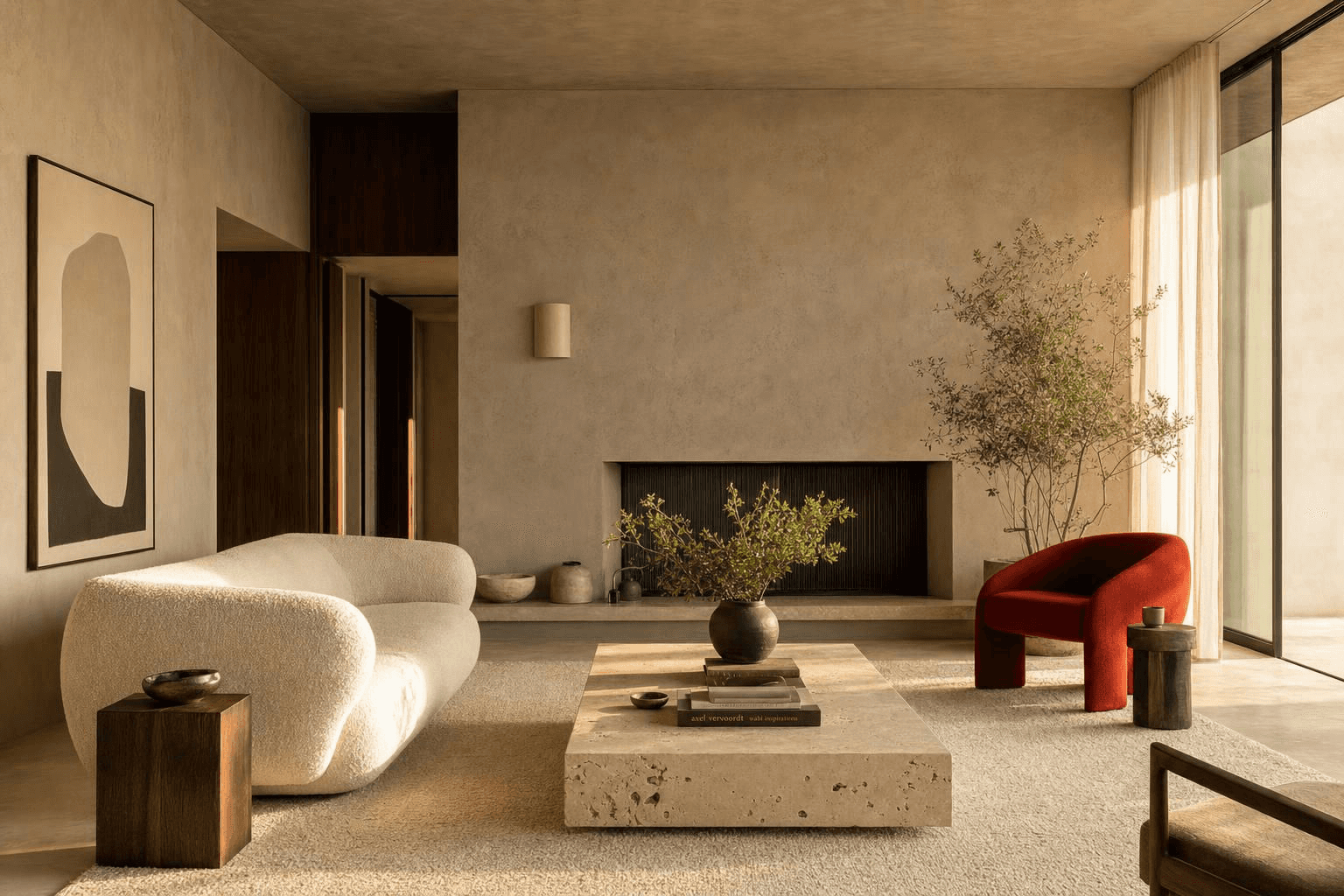
Today's brutalism is subtle, which feels like a joke when you say it out loud. Commit to brutalism as a whole-room style and it gets obvious and heavy fast. But flip through any current interiors magazine and at least one piece of furniture in every photo has brutalist roots.
The modern organic movement leans hard into it. It just graduated from cold sleek concrete into warm ceramic tones and a lot of texture. And now color is showing up, and I am fully on board.
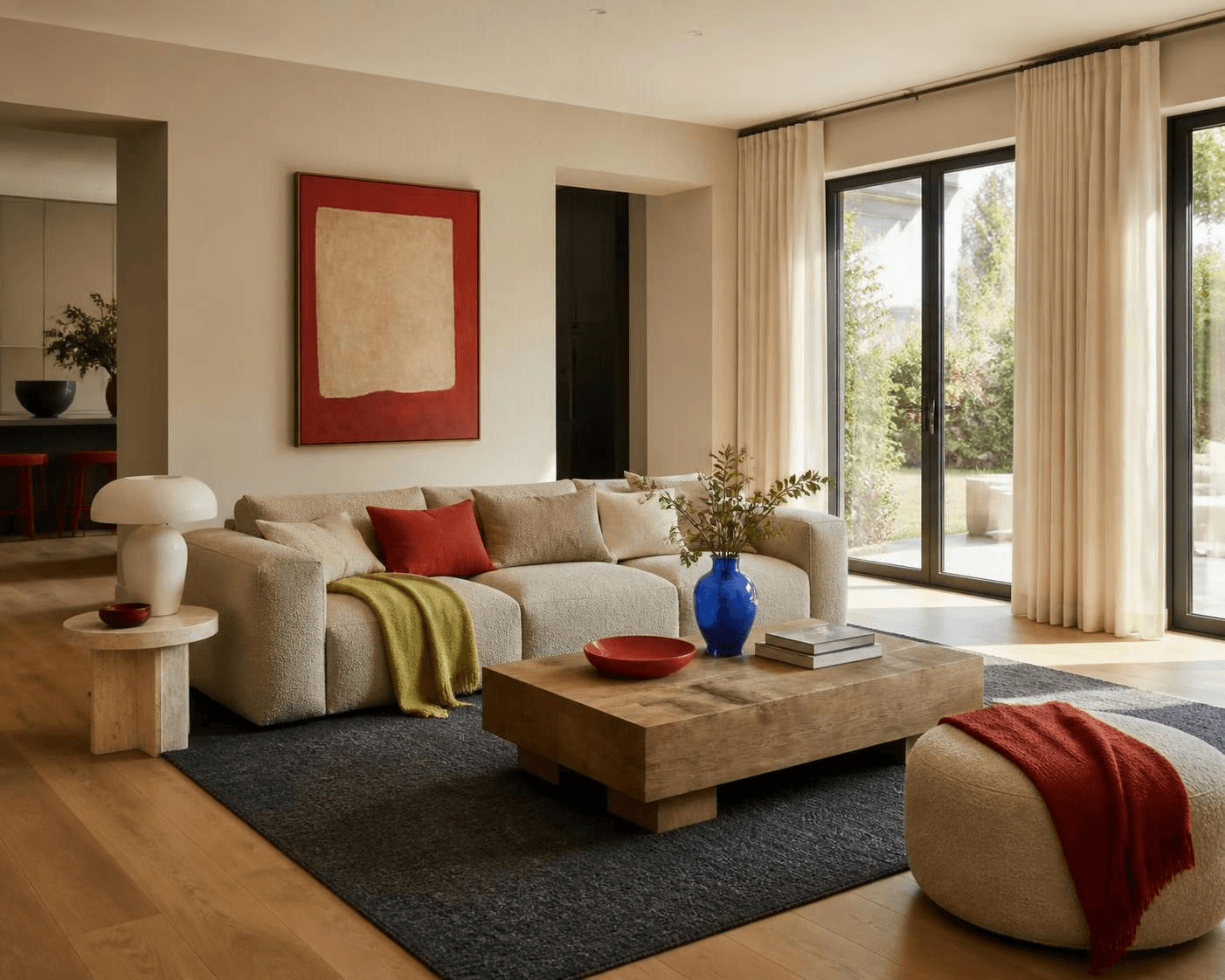
Here's the short version. Colorful brutalism works when you use heavy, sculptural forms as the structure of the room, then bring in saturated color and soft texture to keep it human. Mass alone reads like a parking garage. Mass plus a tomato red pillow and a wool throw reads like a room someone actually lives in.
Where This Look Actually Comes From
Brutalism is an architectural movement from the mid-twentieth century. The name comes from the French beton brut, meaning raw concrete, and the buildings are known for exactly that: concrete left unfinished, structure left visible, and big blocky masses stacked in ways you can read from across the street.
Real examples you can go look at include the Barbican Estate and the National Theatre in London, Boston City Hall, and Le Corbusier's Unite d'Habitation in Marseille. People tend to either love them or want them gone. There isn't much middle ground.
What interiors borrow is not the concrete. It's the geometry. Thick slabs, cylinders, cubes, arches, and furniture that looks like it was carved rather than assembled. A coffee table that is one solid chunk. A lamp base that looks like a column. A fireplace surround with a hearth thick enough to sit on.
Strip out the gray and you're left with something that plays shockingly well with warm plaster, oak, and color.
Shop This Room
As an Amazon Associate, I earn from qualifying purchases. It doesn't change what I recommend.
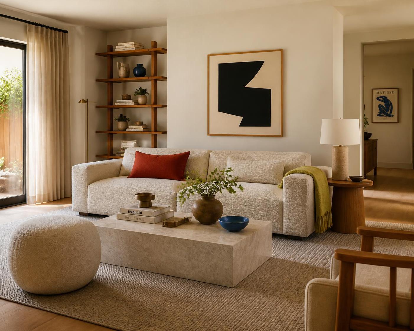
the coffee table that acts like architecture sits at the center of the seating group and does the heavy lifting so nothing else has to.
the lamp that looks carved, not bought goes on a console or side table and adds mass at eye level without adding weight to the floor.
the sofa that survives a juice box anchors the main wall, with a low profile and a wide arm you can actually perch on.
the rug that hides everything goes under the full seating group and quietly absorbs sound along with crumbs.
the red that wakes the whole room up lives on the sofa and is often the only saturated thing you need.
the cobalt vase with real presence sits on the floor beside the fireplace or in an empty corner that keeps feeling unfinished.
the throw that softens a hard edge drapes over the arm of anything stone-adjacent and instantly takes the chill off.
the round pouf with no corners pulls into the conversation circle for extra seating and is the piece I'd add first in a house with toddlers.
the curtains that quiet a room mount high and wide on the window wall, and they matter more here than in almost any other style.
The Three-Part Formula
Every version of this look that works uses the same three ingredients, and the ratio matters more than the shopping list.
Heavy forms. One or two pieces with real visual mass. A block table, a plinth base, a thick shelf. This is the structure.
Saturated color. A real color, used with conviction, in a small amount. Not beige with a hint of blush.
Soft texture. Boucle, wool, linen, sheepskin, anything nubby. This is the part people skip, and it's the reason their room feels like a lobby.
If you drop any one of the three, the whole thing falls over. Heavy plus color with no texture is aggressive. Heavy plus texture with no color is a very expensive-looking waiting area. Color plus texture with no mass is just a normal cozy room, which is fine, but it isn't this.
Furniture With Mass
Mass is about how much visual weight a piece carries, not how much it weighs on a scale. A solid cube with a shadow gap at the base reads heavy. A table with four thin legs reads light, even if it's made of the same material.
Good places to add mass:
A coffee table with a slab or plinth base instead of legs
A side table that is one carved cylinder
Table and floor lamps with plaster, stone, or thick ceramic bases
A sofa with wide flat arms and a low, grounded profile
A fireplace hearth or a single floating shelf with visible thickness
Here's the rule I hold myself to: one dominant mass piece per seating zone, plus one or two supporting ones. Three block tables in a room the size of a Durham bungalow living room is not a style. It's an obstacle course.
If you like this kind of contrast between heavy and light, the same thinking runs through the white oak and black warm minimalist look, and the scale conversation in this warm transitional living room breakdown applies directly.
Color Pairings That Earn Their Keep
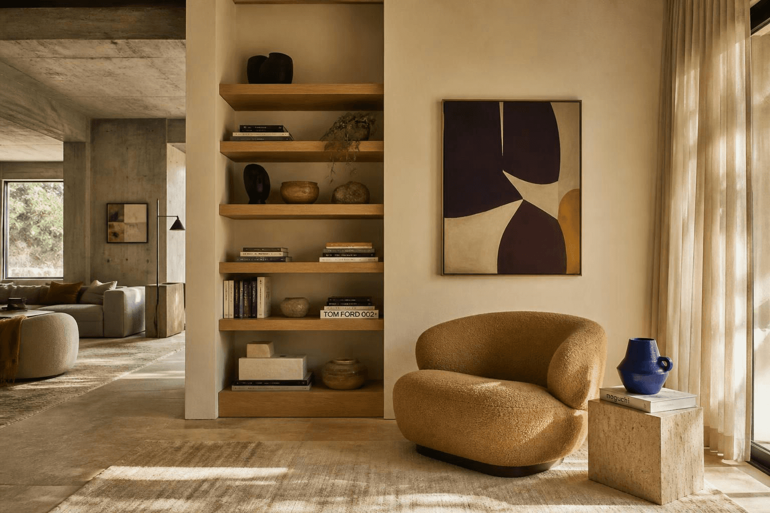
Warm gray, plaster ivory, and oak are the neutrals doing the heavy lifting. The color is a guest, not a roommate. Here's how the common pairings behave.
Color | Pairs with | What it does | Best used as |
|---|---|---|---|
Tomato red | Warm gray, oak, ivory | Adds heat and humanity instantly | Pillows, a single chair, art |
Cobalt blue | Cool concrete gray, black, white | Sharpens the room, reads graphic | Floor vase, ceramics, one wall |
Chartreuse | Plaster, camel, soft black | Feels modern and a little odd in a good way | Throw, small art, a stool |
Ochre or mustard | Warm gray, terracotta, oak | Softest option, very forgiving | Upholstery, curtains, large rug |
Aubergine | Ivory, brass, charcoal | Moody and rich without going dark | Accent chair, drapery, built-ins |
If you want to take the color further than an accent, drenching an alcove or the back of a built-in works beautifully against heavy forms. There's a full breakdown of how deep purple behaves in a room in this piece on aubergine and purple, and the logic transfers to any saturated shade.
Not sure which direction is actually yours? Take the Style Discovery quiz with the code FRIENDS and it's free, a $49 value. It's the fastest way to find out whether you want the bold version or the quiet one.
Quiet Brutalism vs. Colorful Brutalism
Same room. Same layout. Same furniture. The only change is the accent layer.
Quiet Brutalism | Colorful Brutalism | |
|---|---|---|
Palette | Ivory, oat, warm gray, soft black | Same base plus one or two saturated colors |
Feel | Calm, gallery-like, contemplative | Energetic, personal, a little playful |
Art | Texture and tone, minimal frames | Graphic, high contrast, larger scale |
Risk | Can drift cold and echoey | Can tip loud if you use more than two colors |
Best for | Bedrooms, offices, north-facing rooms | Living rooms, dining, entries, playrooms |
Swap cost | Low, it's all pillows and objects | Low, same objects in different colors |
That last row is the point. You can live in the quiet version for a season, swap four items, and have the bold version by the weekend. The layout carries both.
It Depends on Your Space
Small room. Use one mass piece, not three, and put it at the center rather than along a wall. A block coffee table on a large rug grounds a small room. A wall of heavy shelving shrinks it.
Large or open-plan room. You need more mass than you think, or the furniture floats. Go bigger on the coffee table and rug before you add more pieces.
Renting. Everything here is portable. Buy the lamp, the table, the pouf, and the pillows. Skip the plaster walls. A heavy floor vase and a single carved side table get you most of the way there.
Low light or north-facing. Push warm. Plaster ivory, camel, ochre, oak. Cool concrete gray in a dim room reads damp. Layered lighting matters even more here, and this guide to lighting placement covers where fixtures should actually land.
Bright southern light. You can handle the cooler grays and the cobalt without the room going grim.
Kids and pets. Rounded and chamfered edges over sharp 90-degree stone corners, performance fabric on anything upholstered, and a pouf instead of a hard stool. Check weight and tip-over guidance from the manufacturer on any tall or heavy piece, and anchor what needs anchoring.
Tight budget. The lamp and the pillows deliver the most look per dollar. The stone table is the last thing to buy, not the first.
If your room needs an actual plan before it needs a shopping list, that's the part I do. Here's how I work with clients, and you can see the scope of what's included on the services page.

Where This Goes Wrong
Almost every failed version of this look fails for one of three reasons.
It's cold. Too much gray, not enough texture. Fix it with wool, linen, and one warm wood tone. Cheapest fix in the list.
It echoes. Hard surfaces, high ceilings, no soft goods. A large rug with a thick pad and floor-length curtains solve most of it. If you're deciding what to hang, this guide to window covering types is a good starting point.
It blocks circulation. This is the one nobody names as a design problem, but it's the real one. Heavy pieces are hard to move, so when they land wrong, people just live around them for years. Keep a clear walking lane through the room, generally somewhere around 30 to 36 inches for a main path, and leave enough room between the sofa and the coffee table to get by comfortably. Treat those as starting points and adjust to your actual room and door swings.
Mass is a commitment. Plan the path first, then buy the slab.

FAQ
What is colorful brutalism in interior design?
It's a softened, warmed-up take on brutalist architecture, using chunky sculptural furniture and raw-looking materials as the base, then adding saturated color and soft texture. The goal is mass without coldness. Think travertine and plaster with a tomato red pillow, not a gray concrete bunker.
Is brutalist furniture comfortable to live with?
The upholstered pieces are, as long as you choose low-arm, deep-seat shapes rather than hard-edged frames. The stone and plaster pieces are decorative anchors, not seating. Mix them so you have plenty of soft surfaces for actual sitting.
What colors go with concrete gray in a room?
Tomato red, cobalt blue, chartreuse, ochre, and aubergine all hold their own against gray without fighting it. Pick one or two and repeat each in at least two places. More than two saturated colors and the heavy forms stop reading as intentional.
How do I make a brutalist-style room feel less cold?
Add texture and warmth before you add anything else. A wool rug with a pad, floor-length linen curtains, a nubby throw, and a warm wood tone will change the room more than any new furniture. Warm-toned bulbs help too.
Can renters do this look?
Yes, and easily. Everything that makes it work is furniture and objects rather than finishes. A carved side table, a plaster lamp, a heavy floor vase, and a few colorful textiles travel with you.
Heavy forms make a room feel intentional. Color and texture make it feel like yours. Get the layout right first and the rest is mostly shopping.
If you want help deciding where the mass goes before you commit to something you can't move alone, let's talk.
More Inspiration
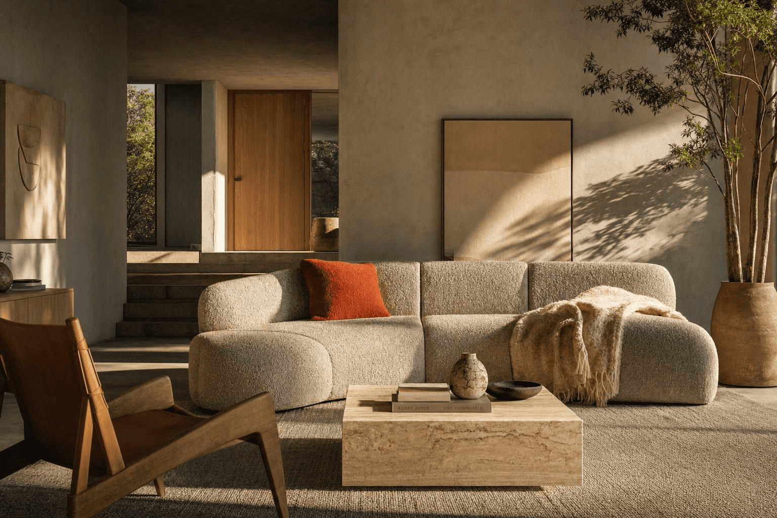

Today's brutalism is subtle, which feels like a joke when you say it out loud. Commit to brutalism as a whole-room style and it gets obvious and heavy fast. But flip through any current interiors magazine and at least one piece of furniture in every photo has brutalist roots.
The modern organic movement leans hard into it. It just graduated from cold sleek concrete into warm ceramic tones and a lot of texture. And now color is showing up, and I am fully on board.
Here's the short version. Colorful brutalism works when you use heavy, sculptural forms as the structure of the room, then bring in saturated color and soft texture to keep it human. Mass alone reads like a parking garage. Mass plus a tomato red pillow and a wool throw reads like a room someone actually lives in.
Where This Look Actually Comes From
Brutalism is an architectural movement from the mid-twentieth century. The name comes from the French beton brut, meaning raw concrete, and the buildings are known for exactly that: concrete left unfinished, structure left visible, and big blocky masses stacked in ways you can read from across the street.
Real examples you can go look at include the Barbican Estate and the National Theatre in London, Boston City Hall, and Le Corbusier's Unite d'Habitation in Marseille. People tend to either love them or want them gone. There isn't much middle ground.
What interiors borrow is not the concrete. It's the geometry. Thick slabs, cylinders, cubes, arches, and furniture that looks like it was carved rather than assembled. A coffee table that is one solid chunk. A lamp base that looks like a column. A fireplace surround with a hearth thick enough to sit on.
Strip out the gray and you're left with something that plays shockingly well with warm plaster, oak, and color.
Shop This Room
As an Amazon Associate, I earn from qualifying purchases. It doesn't change what I recommend.
the coffee table that acts like architecture sits at the center of the seating group and does the heavy lifting so nothing else has to.
the lamp that looks carved, not bought goes on a console or side table and adds mass at eye level without adding weight to the floor.
the sofa that survives a juice box anchors the main wall, with a low profile and a wide arm you can actually perch on.
the rug that hides everything goes under the full seating group and quietly absorbs sound along with crumbs.
the red that wakes the whole room up lives on the sofa and is often the only saturated thing you need.
the cobalt vase with real presence sits on the floor beside the fireplace or in an empty corner that keeps feeling unfinished.
the throw that softens a hard edge drapes over the arm of anything stone-adjacent and instantly takes the chill off.
the round pouf with no corners pulls into the conversation circle for extra seating and is the piece I'd add first in a house with toddlers.
the curtains that quiet a room mount high and wide on the window wall, and they matter more here than in almost any other style.
The Three-Part Formula
Every version of this look that works uses the same three ingredients, and the ratio matters more than the shopping list.
Heavy forms. One or two pieces with real visual mass. A block table, a plinth base, a thick shelf. This is the structure.
Saturated color. A real color, used with conviction, in a small amount. Not beige with a hint of blush.
Soft texture. Boucle, wool, linen, sheepskin, anything nubby. This is the part people skip, and it's the reason their room feels like a lobby.
If you drop any one of the three, the whole thing falls over. Heavy plus color with no texture is aggressive. Heavy plus texture with no color is a very expensive-looking waiting area. Color plus texture with no mass is just a normal cozy room, which is fine, but it isn't this.
Furniture With Mass
Mass is about how much visual weight a piece carries, not how much it weighs on a scale. A solid cube with a shadow gap at the base reads heavy. A table with four thin legs reads light, even if it's made of the same material.
Good places to add mass:
A coffee table with a slab or plinth base instead of legs
A side table that is one carved cylinder
Table and floor lamps with plaster, stone, or thick ceramic bases
A sofa with wide flat arms and a low, grounded profile
A fireplace hearth or a single floating shelf with visible thickness
Here's the rule I hold myself to: one dominant mass piece per seating zone, plus one or two supporting ones. Three block tables in a room the size of a Durham bungalow living room is not a style. It's an obstacle course.
If you like this kind of contrast between heavy and light, the same thinking runs through the white oak and black warm minimalist look, and the scale conversation in this warm transitional living room breakdown applies directly.
Color Pairings That Earn Their Keep
Warm gray, plaster ivory, and oak are the neutrals doing the heavy lifting. The color is a guest, not a roommate. Here's how the common pairings behave.
Color | Pairs with | What it does | Best used as |
|---|---|---|---|
Tomato red | Warm gray, oak, ivory | Adds heat and humanity instantly | Pillows, a single chair, art |
Cobalt blue | Cool concrete gray, black, white | Sharpens the room, reads graphic | Floor vase, ceramics, one wall |
Chartreuse | Plaster, camel, soft black | Feels modern and a little odd in a good way | Throw, small art, a stool |
Ochre or mustard | Warm gray, terracotta, oak | Softest option, very forgiving | Upholstery, curtains, large rug |
Aubergine | Ivory, brass, charcoal | Moody and rich without going dark | Accent chair, drapery, built-ins |
If you want to take the color further than an accent, drenching an alcove or the back of a built-in works beautifully against heavy forms. There's a full breakdown of how deep purple behaves in a room in this piece on aubergine and purple, and the logic transfers to any saturated shade.
Not sure which direction is actually yours? Take the Style Discovery quiz with the code FRIENDS and it's free, a $49 value. It's the fastest way to find out whether you want the bold version or the quiet one.
Quiet Brutalism vs. Colorful Brutalism
Same room. Same layout. Same furniture. The only change is the accent layer.
Quiet Brutalism | Colorful Brutalism | |
|---|---|---|
Palette | Ivory, oat, warm gray, soft black | Same base plus one or two saturated colors |
Feel | Calm, gallery-like, contemplative | Energetic, personal, a little playful |
Art | Texture and tone, minimal frames | Graphic, high contrast, larger scale |
Risk | Can drift cold and echoey | Can tip loud if you use more than two colors |
Best for | Bedrooms, offices, north-facing rooms | Living rooms, dining, entries, playrooms |
Swap cost | Low, it's all pillows and objects | Low, same objects in different colors |
That last row is the point. You can live in the quiet version for a season, swap four items, and have the bold version by the weekend. The layout carries both.
It Depends on Your Space
Small room. Use one mass piece, not three, and put it at the center rather than along a wall. A block coffee table on a large rug grounds a small room. A wall of heavy shelving shrinks it.
Large or open-plan room. You need more mass than you think, or the furniture floats. Go bigger on the coffee table and rug before you add more pieces.
Renting. Everything here is portable. Buy the lamp, the table, the pouf, and the pillows. Skip the plaster walls. A heavy floor vase and a single carved side table get you most of the way there.
Low light or north-facing. Push warm. Plaster ivory, camel, ochre, oak. Cool concrete gray in a dim room reads damp. Layered lighting matters even more here, and this guide to lighting placement covers where fixtures should actually land.
Bright southern light. You can handle the cooler grays and the cobalt without the room going grim.
Kids and pets. Rounded and chamfered edges over sharp 90-degree stone corners, performance fabric on anything upholstered, and a pouf instead of a hard stool. Check weight and tip-over guidance from the manufacturer on any tall or heavy piece, and anchor what needs anchoring.
Tight budget. The lamp and the pillows deliver the most look per dollar. The stone table is the last thing to buy, not the first.
If your room needs an actual plan before it needs a shopping list, that's the part I do. Here's how I work with clients, and you can see the scope of what's included on the services page.
Where This Goes Wrong
Almost every failed version of this look fails for one of three reasons.
It's cold. Too much gray, not enough texture. Fix it with wool, linen, and one warm wood tone. Cheapest fix in the list.
It echoes. Hard surfaces, high ceilings, no soft goods. A large rug with a thick pad and floor-length curtains solve most of it. If you're deciding what to hang, this guide to window covering types is a good starting point.
It blocks circulation. This is the one nobody names as a design problem, but it's the real one. Heavy pieces are hard to move, so when they land wrong, people just live around them for years. Keep a clear walking lane through the room, generally somewhere around 30 to 36 inches for a main path, and leave enough room between the sofa and the coffee table to get by comfortably. Treat those as starting points and adjust to your actual room and door swings.
Mass is a commitment. Plan the path first, then buy the slab.
FAQ
What is colorful brutalism in interior design?
It's a softened, warmed-up take on brutalist architecture, using chunky sculptural furniture and raw-looking materials as the base, then adding saturated color and soft texture. The goal is mass without coldness. Think travertine and plaster with a tomato red pillow, not a gray concrete bunker.
Is brutalist furniture comfortable to live with?
The upholstered pieces are, as long as you choose low-arm, deep-seat shapes rather than hard-edged frames. The stone and plaster pieces are decorative anchors, not seating. Mix them so you have plenty of soft surfaces for actual sitting.
What colors go with concrete gray in a room?
Tomato red, cobalt blue, chartreuse, ochre, and aubergine all hold their own against gray without fighting it. Pick one or two and repeat each in at least two places. More than two saturated colors and the heavy forms stop reading as intentional.
How do I make a brutalist-style room feel less cold?
Add texture and warmth before you add anything else. A wool rug with a pad, floor-length linen curtains, a nubby throw, and a warm wood tone will change the room more than any new furniture. Warm-toned bulbs help too.
Can renters do this look?
Yes, and easily. Everything that makes it work is furniture and objects rather than finishes. A carved side table, a plaster lamp, a heavy floor vase, and a few colorful textiles travel with you.
Heavy forms make a room feel intentional. Color and texture make it feel like yours. Get the layout right first and the rest is mostly shopping.
If you want help deciding where the mass goes before you commit to something you can't move alone, let's talk.
More Inspiration
Other Blogs
Other Similar Blogs
Your go-to destination for insightful articles, tips, and inspiration on all things landscaping and outdoor living
Other Blogs
Other Similar Blogs
Your go-to destination for insightful articles, tips, and inspiration on all things landscaping and outdoor living
Other Blogs
Other Similar Blogs
Your go-to destination for insightful articles, tips, and inspiration on all things landscaping and outdoor living



Join our newsletter list
Sign up to get the most recent blog articles in your email every week.