Author
Suzanne is an Owner/Designer
Author
Suzanne is an Owner/Designer
White oak and black is one of the most searched interior looks right now, and one of the easiest to get wrong. Here's how to get the contrast right without losing all the warmth.
White oak and black is one of the most searched interior looks right now, and one of the easiest to get wrong. Here's how to get the contrast right without losing all the warmth.
White Oak and Black Design: A High-Contrast Warm Minimalist Look That Still Feels Lived-In
*Blog contains affiliate links
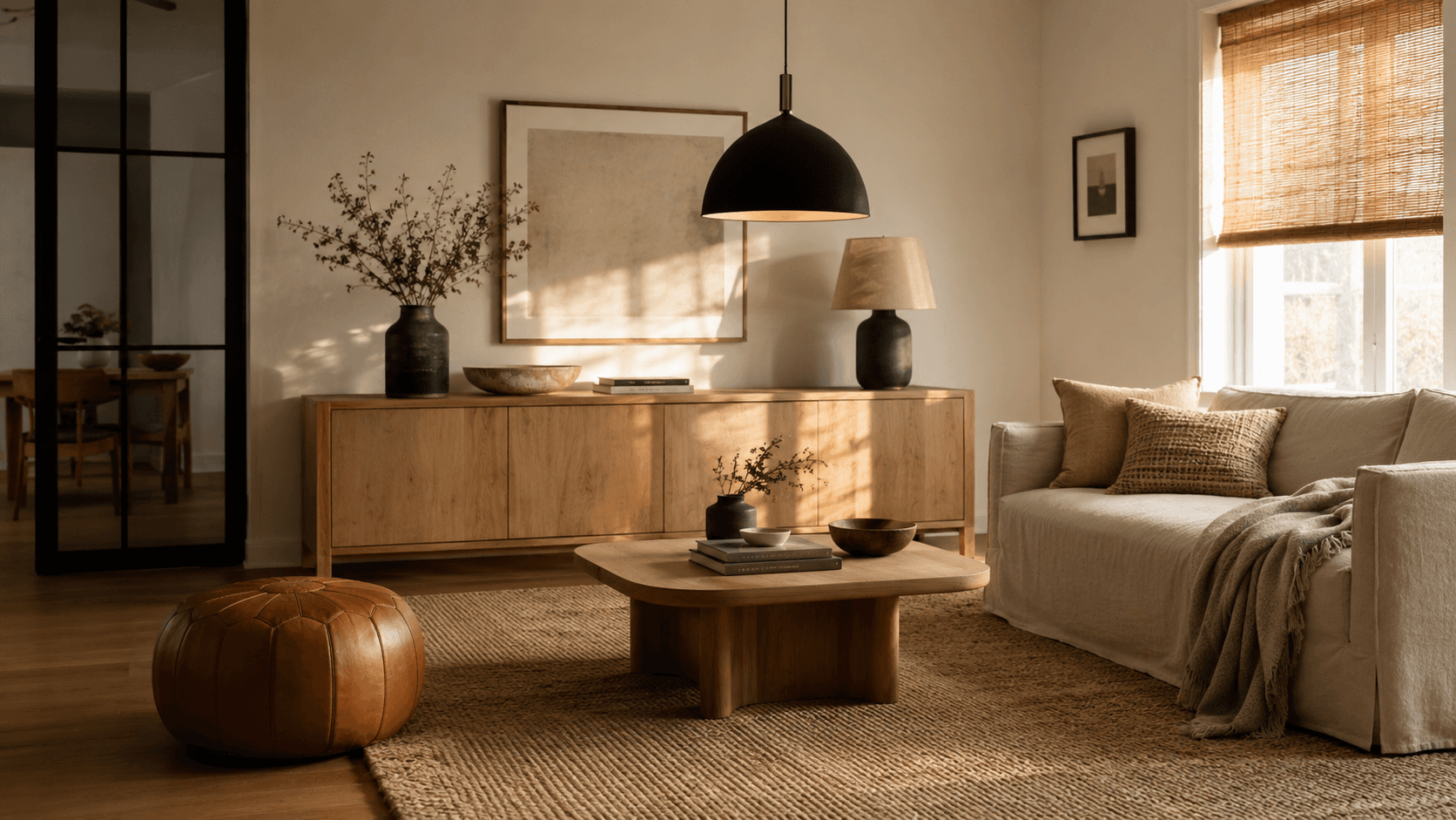
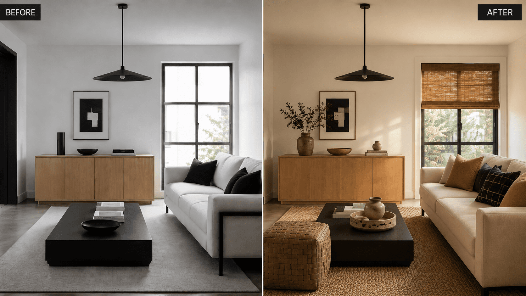
I keep coming back to this combination. Not because it's trending, though it is. But because every time I walk into a room where someone's paired warm white oak with matte black hardware and it actually works, there's this moment where the whole room just clicks into focus.
Like putting on glasses for the first time.
The thing is, most of the rooms I see trying this look don't land. They end up feeling like a coworking lobby or a real estate listing where someone staged everything in forty-five minutes. And that's not a decor problem. It's a ratio problem.
So here's what I've learned about making white oak and black feel like a room you'd actually want to sit in.
Shop This Room
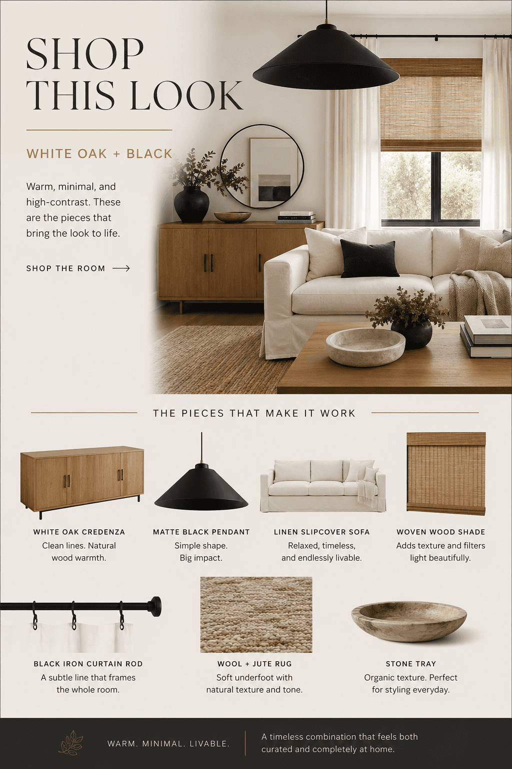
These are the kinds of pieces that make this look work. Not exact matches, because that's not the point. More like the right family of objects.
---
The Look, Defined
White oak and black. You've seen it everywhere. Pinterest boards, new builds, every other Airbnb in Austin.
The idea is simple. Warm wood tones against crisp black accents. Modern but grounded. Clean but not clinical.
When it works, it feels like someone who has strong opinions but is also really easy to be around. There's structure, there's clarity, and there's still warmth.
When it doesn't work, it feels like a WeWork.
The difference is almost never about which products you picked. It's about where you put the black and where you put the oak. And how much softness you let in between.
Where the Black Goes
This is the part most rooms get wrong. They scatter black evenly across the room, a black shelf here, a black frame there, a black vase, a black lamp, a black throw pillow. And suddenly the room feels like it's trying too hard to be "moody."
Black works best when it plays a structural role.
Think of it as the frame, not the painting.
Black should go on:
Light fixtures. Pendants, sconces, floor lamps. This is the easiest and most impactful place.
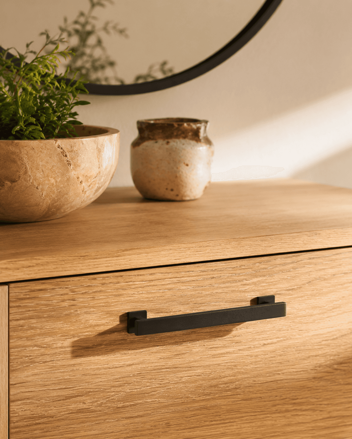
Hardware. Cabinet pulls, door handles, curtain rods.
Legs and bases. The metal base of a coffee table. The legs of a dining chair. A simple black metal side table.
Frames. Mirror frames, art frames, window trim if you're feeling bold.
Black is the punctuation. It tells your eye where to pause.
Where the Oak Goes
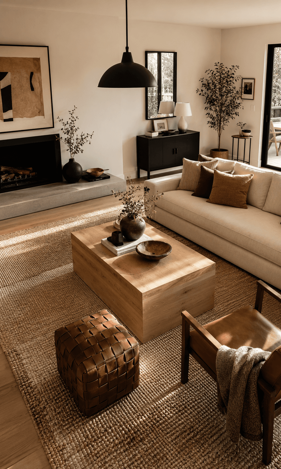
Oak gets the volume. The big horizontal surfaces. The pieces your eye rests on.
The credenza or media console
The dining table
The coffee table
Open shelving
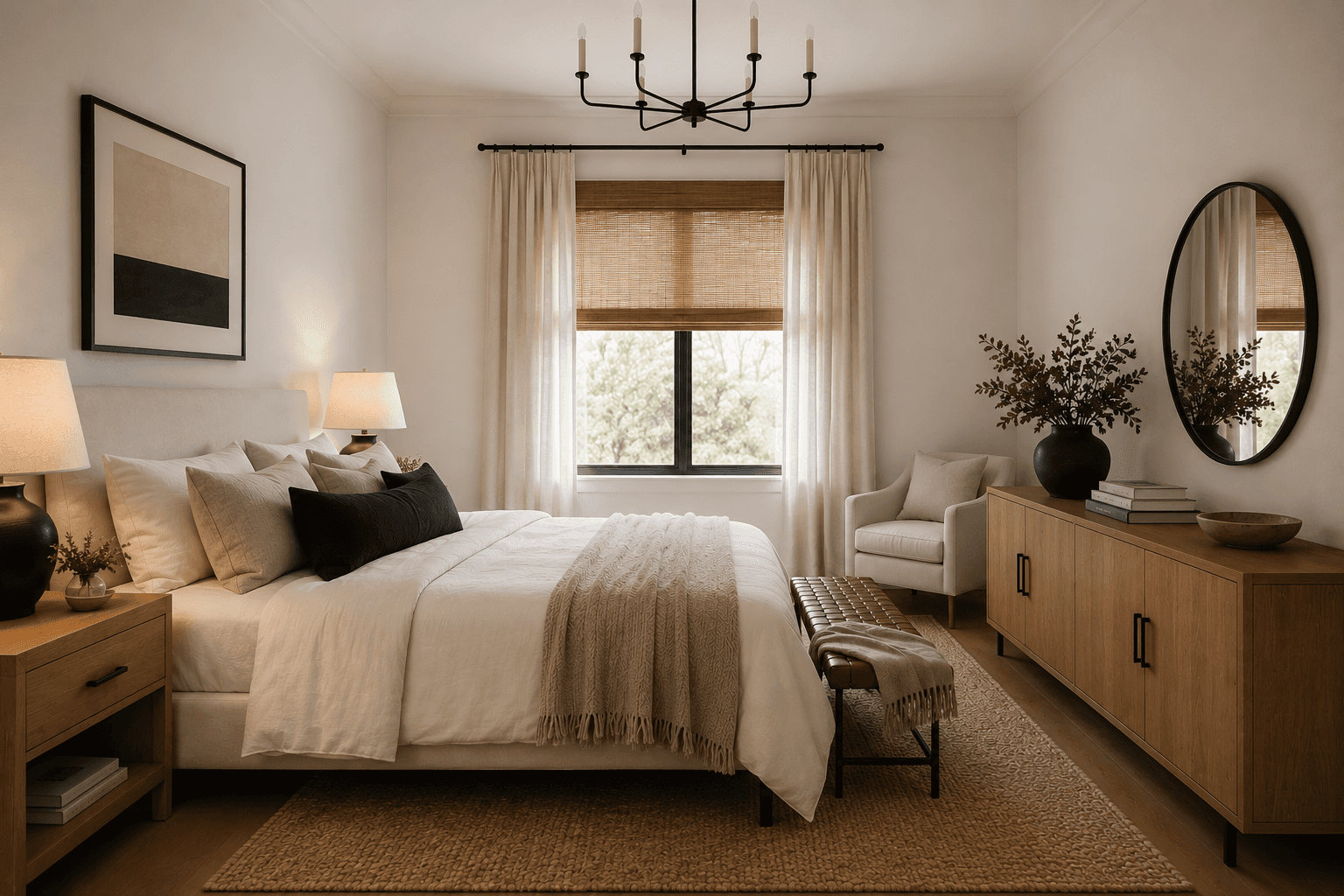
The bed frame
Oak is the body of the room. It carries the warmth. If you give too much surface area to black, the room starts to feel heavy and cold, like sitting inside a charcoal sketch.
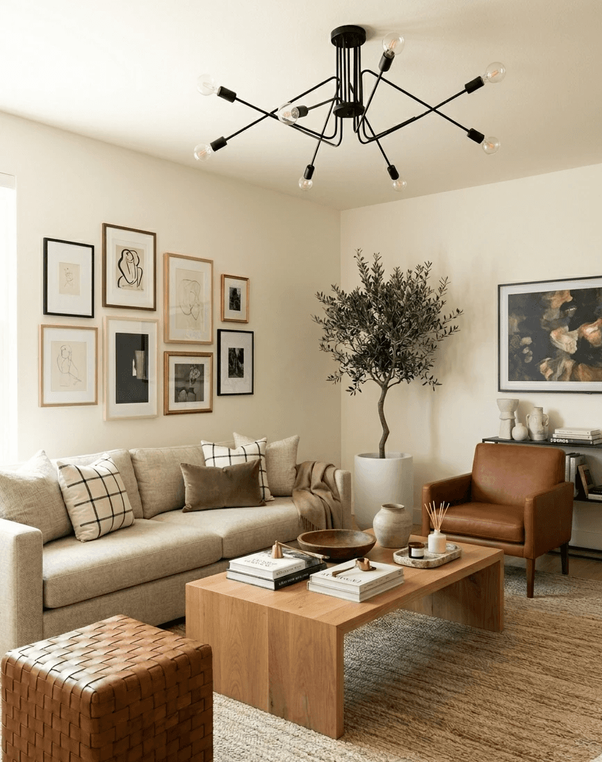
I usually tell clients to think of it as roughly 70% warm wood and warm neutrals, 20% black, 10% texture and accent. That's not a science. It's a feeling. But it keeps the room from tipping.
A white oak coffee table with a rounded edge does more work in this palette than almost any other single piece. It softens the geometry that all the black lines create.
The Mistake: Going Too Modern
Here's where I see the look go sideways most often.
Someone commits to white oak and black, and then they lean all the way into modern. Every surface is smooth. Every edge is sharp. The rug is flat-weave and precise. The lighting is geometric and thin. The sofa is structured and tight.
And the room looks incredible in a photo and terrible to sit in.
It reads as a lobby. Or a set. Or a very expensive waiting room.
The problem isn't the palette. The problem is that nothing in the room has any give. Nothing looks like it's been touched or used or settled into.
High contrast needs softness to survive in a home.
How to Soften It
This is the real work. Not picking the right shade of black (matte, always matte). But introducing enough texture and warmth that the room doesn't feel like it's holding its breath.
Here's what I reach for:
Linen everything. Linen curtain panels in a warm white on that black curtain rod. A linen throw blanket draped over the arm of the sofa. Linen doesn't try to be perfect. It wrinkles and drapes and that's the whole point.
Warm white paint, not bright white. This matters more than you'd think. A warm white (think Benjamin Moore White Dove or Swiss Coffee) keeps the walls from competing with the black. Cool white next to matte black feels like a doctor's office. Warm white feels like morning light.
Warm lighting. 2700K bulbs. Not negotiable. And honestly, a table lamp with a linen shade does more to warm up this palette than any candle or throw pillow ever could.
Woven shades. I keep recommending woven wood or bamboo roller shades and I will not stop. They add a layer of natural texture that breaks up the oak-and-black crispness without introducing a new color. They filter light beautifully. They make a window feel finished without being fussy.
Texture Is Doing the Heavy Lifting
In a room with this few colors, texture is your entire personality.
You need:
Something woven (the shade, a basket, a woven leather bench or ottoman)
Something stone (a tray, a coaster set, a small marble bowl with warm veining). Not cool Carrara. Something with movement and warmth in the grain.
Something soft and slightly imperfect (a handwoven wool pillow, a chunky knit, a rug that isn't trying to be flat)
Something with patina or age (a cognac leather accent chair that looks like it's been sat in, a vintage wooden bowl, a ceramic vase that's clearly handmade)
This is where the room goes from "designed" to "lived in." And that shift is everything.
---
This is exactly what I do for clients. Not just picking products, but figuring out the ratio, the layout, where the eye goes and where it rests. Want me to design your room like this? Let's Chat
---
Layout: How to Arrange a High-Contrast Room
Here's something that doesn't get talked about enough. In a room with strong visual contrast, where you place things matters even more than usual. Because the black elements draw the eye harder than neutral ones do. They're the loudest voices in the room.
So you want to distribute them intentionally.
A few rules I follow:
Triangulate your black. If you have a black pendant light, place your next black element (a framed mirror, a side table) so it forms a visual triangle across the room. This keeps the eye moving instead of clumping.
Don't line black up on one wall. I've seen rooms where all the black elements ended up on the same wall. Black lamp, black frames, black shelf brackets. And the rest of the room felt washed out. Spread it around. Let it anchor corners and edges.
Give oak the center of the room. Your coffee table, your rug, your sofa. The middle of the room should feel warm and soft. The black comes in at the periphery, at the top (lighting), and at the edges (hardware, frames, legs).
A Note on the Rug
In a white oak and black room, the rug can make or break everything.
Too dark, and the floor disappears. Too white, and it looks like it's scared of the furniture.
What works: a warm-toned wool or jute rug with some visible texture. Something that reads as "ground" rather than "statement." You want it to feel like a field, not a feature.
I tend to avoid anything with a strong geometric pattern in this palette. The black elements are already providing all the geometry you need. The rug's job is to be soft and quiet and warm underfoot.
What About Cognac Leather
You were going to ask.
Yes. A cognac leather accent piece is almost always the right call in a white oak and black room. It sits perfectly between the warm and the dark. It ages well. It adds richness without adding another "color."
A cognac leather chair in the corner. A leather pouf next to the coffee table. Even a leather-wrapped tray on the credenza. It's the bridge tone that holds the whole palette together.
Not too much. One, maybe two pieces. More than that and you've wandered into a different look entirely.
The Whole Point
White oak and black isn't really about contrast. I mean it is, visually. But what makes the look work in a real room is that it's about clarity.
It's a room that knows what it's doing. It's not trying to be everything. It picked a lane and committed, and then softened the edges just enough to make it human.
That's the part that's hard to get from a product roundup. The products matter, sure. A good matte black floor lamp next to a white oak end table next to a linen sofa. That combination will always look good.
But the arrangement, the ratio, the choice of what to leave out. That's where the room starts to feel like it belongs to someone.
If you're working on a room like this and want a second set of eyes, that's literally what I do. Not decorating. Designing. Layout, flow, function, and then the pieces that make it make sense.
Style Discovery is the best place to start. Or just work with me and we'll figure it out together.
White Oak and Black Design: A High-Contrast Warm Minimalist Look That Still Feels Lived-In
*Blog contains affiliate links
I keep coming back to this combination. Not because it's trending, though it is. But because every time I walk into a room where someone's paired warm white oak with matte black hardware and it actually works, there's this moment where the whole room just clicks into focus.
Like putting on glasses for the first time.
The thing is, most of the rooms I see trying this look don't land. They end up feeling like a coworking lobby or a real estate listing where someone staged everything in forty-five minutes. And that's not a decor problem. It's a ratio problem.
So here's what I've learned about making white oak and black feel like a room you'd actually want to sit in.
Shop This Room
These are the kinds of pieces that make this look work. Not exact matches, because that's not the point. More like the right family of objects.
---
The Look, Defined
White oak and black. You've seen it everywhere. Pinterest boards, new builds, every other Airbnb in Austin.
The idea is simple. Warm wood tones against crisp black accents. Modern but grounded. Clean but not clinical.
When it works, it feels like someone who has strong opinions but is also really easy to be around. There's structure, there's clarity, and there's still warmth.
When it doesn't work, it feels like a WeWork.
The difference is almost never about which products you picked. It's about where you put the black and where you put the oak. And how much softness you let in between.
Where the Black Goes
This is the part most rooms get wrong. They scatter black evenly across the room, a black shelf here, a black frame there, a black vase, a black lamp, a black throw pillow. And suddenly the room feels like it's trying too hard to be "moody."
Black works best when it plays a structural role.
Think of it as the frame, not the painting.
Black should go on:
Light fixtures. Pendants, sconces, floor lamps. This is the easiest and most impactful place.
Hardware. Cabinet pulls, door handles, curtain rods.
Legs and bases. The metal base of a coffee table. The legs of a dining chair. A simple black metal side table.
Frames. Mirror frames, art frames, window trim if you're feeling bold.
Black is the punctuation. It tells your eye where to pause.
Where the Oak Goes
Oak gets the volume. The big horizontal surfaces. The pieces your eye rests on.
The credenza or media console
The dining table
The coffee table
Open shelving
The bed frame
Oak is the body of the room. It carries the warmth. If you give too much surface area to black, the room starts to feel heavy and cold, like sitting inside a charcoal sketch.
I usually tell clients to think of it as roughly 70% warm wood and warm neutrals, 20% black, 10% texture and accent. That's not a science. It's a feeling. But it keeps the room from tipping.
A white oak coffee table with a rounded edge does more work in this palette than almost any other single piece. It softens the geometry that all the black lines create.
The Mistake: Going Too Modern
Here's where I see the look go sideways most often.
Someone commits to white oak and black, and then they lean all the way into modern. Every surface is smooth. Every edge is sharp. The rug is flat-weave and precise. The lighting is geometric and thin. The sofa is structured and tight.
And the room looks incredible in a photo and terrible to sit in.
It reads as a lobby. Or a set. Or a very expensive waiting room.
The problem isn't the palette. The problem is that nothing in the room has any give. Nothing looks like it's been touched or used or settled into.
High contrast needs softness to survive in a home.
How to Soften It
This is the real work. Not picking the right shade of black (matte, always matte). But introducing enough texture and warmth that the room doesn't feel like it's holding its breath.
Here's what I reach for:
Linen everything. Linen curtain panels in a warm white on that black curtain rod. A linen throw blanket draped over the arm of the sofa. Linen doesn't try to be perfect. It wrinkles and drapes and that's the whole point.
Warm white paint, not bright white. This matters more than you'd think. A warm white (think Benjamin Moore White Dove or Swiss Coffee) keeps the walls from competing with the black. Cool white next to matte black feels like a doctor's office. Warm white feels like morning light.
Warm lighting. 2700K bulbs. Not negotiable. And honestly, a table lamp with a linen shade does more to warm up this palette than any candle or throw pillow ever could.
Woven shades. I keep recommending woven wood or bamboo roller shades and I will not stop. They add a layer of natural texture that breaks up the oak-and-black crispness without introducing a new color. They filter light beautifully. They make a window feel finished without being fussy.
Texture Is Doing the Heavy Lifting
In a room with this few colors, texture is your entire personality.
You need:
Something woven (the shade, a basket, a woven leather bench or ottoman)
Something stone (a tray, a coaster set, a small marble bowl with warm veining). Not cool Carrara. Something with movement and warmth in the grain.
Something soft and slightly imperfect (a handwoven wool pillow, a chunky knit, a rug that isn't trying to be flat)
Something with patina or age (a cognac leather accent chair that looks like it's been sat in, a vintage wooden bowl, a ceramic vase that's clearly handmade)
This is where the room goes from "designed" to "lived in." And that shift is everything.
---
This is exactly what I do for clients. Not just picking products, but figuring out the ratio, the layout, where the eye goes and where it rests. Want me to design your room like this? Let's Chat
---
Layout: How to Arrange a High-Contrast Room
Here's something that doesn't get talked about enough. In a room with strong visual contrast, where you place things matters even more than usual. Because the black elements draw the eye harder than neutral ones do. They're the loudest voices in the room.
So you want to distribute them intentionally.
A few rules I follow:
Triangulate your black. If you have a black pendant light, place your next black element (a framed mirror, a side table) so it forms a visual triangle across the room. This keeps the eye moving instead of clumping.
Don't line black up on one wall. I've seen rooms where all the black elements ended up on the same wall. Black lamp, black frames, black shelf brackets. And the rest of the room felt washed out. Spread it around. Let it anchor corners and edges.
Give oak the center of the room. Your coffee table, your rug, your sofa. The middle of the room should feel warm and soft. The black comes in at the periphery, at the top (lighting), and at the edges (hardware, frames, legs).
A Note on the Rug
In a white oak and black room, the rug can make or break everything.
Too dark, and the floor disappears. Too white, and it looks like it's scared of the furniture.
What works: a warm-toned wool or jute rug with some visible texture. Something that reads as "ground" rather than "statement." You want it to feel like a field, not a feature.
I tend to avoid anything with a strong geometric pattern in this palette. The black elements are already providing all the geometry you need. The rug's job is to be soft and quiet and warm underfoot.
What About Cognac Leather
You were going to ask.
Yes. A cognac leather accent piece is almost always the right call in a white oak and black room. It sits perfectly between the warm and the dark. It ages well. It adds richness without adding another "color."
A cognac leather chair in the corner. A leather pouf next to the coffee table. Even a leather-wrapped tray on the credenza. It's the bridge tone that holds the whole palette together.
Not too much. One, maybe two pieces. More than that and you've wandered into a different look entirely.
The Whole Point
White oak and black isn't really about contrast. I mean it is, visually. But what makes the look work in a real room is that it's about clarity.
It's a room that knows what it's doing. It's not trying to be everything. It picked a lane and committed, and then softened the edges just enough to make it human.
That's the part that's hard to get from a product roundup. The products matter, sure. A good matte black floor lamp next to a white oak end table next to a linen sofa. That combination will always look good.
But the arrangement, the ratio, the choice of what to leave out. That's where the room starts to feel like it belongs to someone.
If you're working on a room like this and want a second set of eyes, that's literally what I do. Not decorating. Designing. Layout, flow, function, and then the pieces that make it make sense.
Style Discovery is the best place to start. Or just work with me and we'll figure it out together.
Other Blogs
Other Similar Blogs
Your go-to destination for insightful articles, tips, and inspiration on all things landscaping and outdoor living
Other Blogs
Other Similar Blogs
Your go-to destination for insightful articles, tips, and inspiration on all things landscaping and outdoor living
Other Blogs
Other Similar Blogs
Your go-to destination for insightful articles, tips, and inspiration on all things landscaping and outdoor living