
Author
Suzanne is an Owner/Designer
Author
Suzanne is an Owner/Designer
A modern Mexican kitchen is about warm materials, one confident hit of pattern, and a layout that still cooks well. Here is how I decide where the tile goes, which cabinet colors pair with Talavera, and what to skip.
A modern Mexican kitchen is about warm materials, one confident hit of pattern, and a layout that still cooks well. Here is how I decide where the tile goes, which cabinet colors pair with Talavera, and what to skip.
Modern Mexican Kitchen Ideas: Tile, Wood, Color, and a Layout That Works
I love Mexican design, its bold colors and sweeping patterns. It is intentional and nostalgic. The moment you step in you know the food is going to be amazing... which is not true of all beautiful kitchens. The all-white kitchens tend to be lacking flavor in design as well as their food (shots fired!). Everyone knows the eyes eat first, so a brightly patterned or colored Mexican kitchen sets the palate for the meals loved and enjoyed there.
So, what actually makes a kitchen modern Mexican? It is a warm, handmade material palette (clay, wood, plaster, iron) with one confident hit of pattern and one saturated color, set on top of a clean, simple layout. The modern part comes from restraint in the architecture, not from cooling the colors down.
Get the bones right first, then add the personality. That order matters more than any tile you pick.
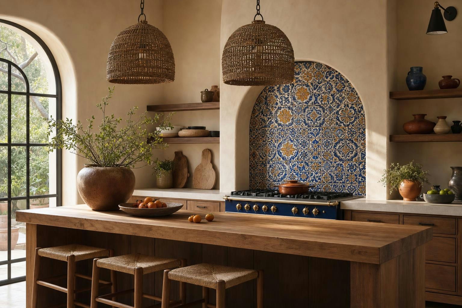
The Five Elements That Make a Kitchen Read Modern Mexican
You do not need all five. You need at least three, and you need them to look handmade rather than printed.
Hand-painted tile or cement tile
Talavera poblana is the real reference point here. It is tin-glazed earthenware made in and around Puebla, Mexico, with a protected designation of origin, and the traditional palette leans cobalt blue on white with yellow, green, and ochre. Cement tile is a different animal entirely: pigment pressed into cement rather than fired glaze, which means a softer matte surface that needs sealing and resealing.
Both work. Glazed tile is easier to wipe behind a cooktop. Cement tile is gorgeous on a floor and more forgiving of foot traffic than people expect.
Warm wood with visible character
Think parota or mesquite slabs, rough-sawn beams, a wood island top, or simple slab-front cabinets in warm oak. Grain and knots are the point. A flawless, uniform wood veneer reads corporate in this style.
Plaster or limewash walls
This is the cheapest way to get the whole room to feel older and softer. Limewash gives you that cloudy, uneven depth that flat paint cannot fake, and it sits beautifully next to glossy tile.
Hand-forged and clay details
Blackened iron pulls, a punched tin mirror, unlacquered brass, copper from Santa Clara del Cobre, unglazed clay pots, barro negro pieces from Oaxaca, a basalt molcajete that actually gets used. These are the objects that make a kitchen feel lived in rather than shopped for.
One saturated accent color
Cobalt, terracotta, ochre, or a deep olive. Pick one to lead. The mistake is treating all four as equals.
Shop This Room
As an Amazon Associate, I earn from qualifying purchases. It doesn't change what I recommend.
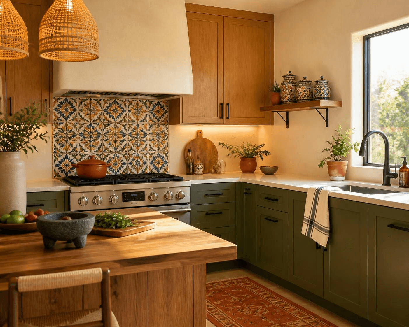
the woven pendants that warm up the whole island - Hang two over the island so the texture reads at eye level, not just overhead.
the blackened iron pulls that make stock cabinets look custom - Swap these on every door and drawer. Best dollar-per-impact change in the room.
the limewash that softens flat builder walls - Use it on the range wall and any wall without upper cabinets.
the clay bean pot that lives on the stove - Leave it out on a back burner. It signals real cooking better than any sign ever will.
the parota board you lean against the backsplash - A thick slab standing upright behind the cooktop adds wood exactly where you need it.
the molcajete that earns its counter space - Park it near the prep zone on the island. Heavy, dark, and useful.
the tile-pattern canisters for the open shelf - A small way to echo the backsplash if you went subtle on tile.
the terracotta runner that hides crumbs - Goes in front of the sink. Washable matters more than pretty here.
the iron brackets for honest open shelving - Pair with a single thick wood shelf and stop at one.
the warm under-cabinet lights that keep colors true - Cool white light turns terracotta muddy. Stay warm.
Where to Put the Pattern
This is the real decision, and most people get it backward by putting pattern everywhere at 40 percent intensity instead of one place at 100 percent.
Pick one surface to carry the pattern. Everything else stays quiet.
Where the pattern goes | Best when | Watch out for |
|---|---|---|
Full backsplash, counter to ceiling | You have a hood and few upper cabinets on that wall | Pattern gets chopped up by outlets and cabinet runs |
Niche or band behind the cooktop only | You want a focal point and a modest budget | Needs to be framed cleanly or it reads like an afterthought |
Range hood face | You want a sculptural moment with easy-clean walls elsewhere | Custom fabrication cost and grease near the burners |
Floor | Open plan where the kitchen needs to feel like its own room | Cement tile needs sealing, and pattern under an island gets hidden |
Nowhere on tile, pattern in textiles and ceramics instead | Renters, or anyone unsure about committing | Can read underdressed if the color palette is also timid |
My default in a Triangle-area kitchen with standard 9 foot ceilings is the cooktop wall only, floor to hood, with plain tile or plaster on the rest. The pattern gets a frame, the wipe-down surfaces stay simple, and the tile budget stays sane.
Cabinet Colors That Pair With Talavera
Talavera already brings blue, white, and usually a yellow or green. Your cabinets should either step back or step firmly into one of those colors.
Four palettes that consistently work:
Warm white or bone uppers with terracotta-stained wood lowers. The tile leads. Everything else recedes.
Deep olive green on all cabinets with cobalt-heavy tile. Feels old and European and Mexican at once.
Natural warm oak throughout with a bold floor tile. Very current, reads modern before it reads regional.
Cobalt lowers with plaster walls and almost no pattern anywhere. Color carries the whole room.
What I avoid is cool gray. Gray fights every warm pigment in this palette and makes hand-painted tile look like a leftover from a different project. If your cabinets are already cool-toned and you are not painting them, lean into brass, wood, and clay accessories to pull the room warmer, and keep the tile simpler.
Not sure which of those four is actually you? Take the Style Discovery quiz free with the code FRIENDS, a $49 value. It is a faster way to figure out your real preferences than scrolling saved images for another three weeks.
[IMAGE: VIGNETTE] Close view of a single thick oak shelf with stacked hand-thrown bowls, a clay pitcher, and the edge of the patterned tile.
Open Shelving, Done Right
Open shelving fits this style because the dishes are worth seeing. Hand-thrown bowls, glazed plates, and clay pitchers do real decorating work.
It also collects grease and dust, so I limit it. One or two shelves on a wall away from the cooktop, holding things you use weekly. Daily-use items stay behind doors.
Group by color and material, not by set. Three stacks of bowls in three related glazes look intentional. Twelve mismatched mugs look like a cabinet threw up.
If you need more storage thinking before you start removing doors, my notes on what to include in pantry cabinets and built-in storage apply directly here.
Lighting
Woven palm or rattan pendants and blackened iron fixtures are the two directions I keep coming back to. Woven adds warmth and texture without adding another pattern. Iron adds structure and handles a busy backsplash without competing.
Keep bulbs warm, in the 2700K to 3000K range, so terracotta and ochre stay rich instead of turning brown.
Layer three sources: overhead for general light, pendants over the island, and under-cabinet task lighting at the counters. If placement is the part you are unsure about, I walk through it in this guide to lighting spacing and placement.
A few things that finish the lighting layer nicely:
woven pendant shades with an open weave for light that filters rather than blocks
warm dimmable LED bulbs so the room can shift from prep to dinner
a small unlacquered brass sconce over an open shelf or a window wall
Layout First, Style Second
Here is where my engineering brain takes over. No amount of beautiful tile fixes a kitchen where you cannot set down a hot pan.
The work triangle between sink, cooktop, and refrigerator is still the most useful check. The commonly cited guideline puts each leg somewhere between 4 and 9 feet, with the three legs totaling roughly 13 to 26 feet. Treat that as general guidance, not gospel, and let your actual cooking habits and your local code decide the final plan.
Landing zones matter just as much. A general rule of thumb is around 15 inches of clear counter beside the refrigerator and on both sides of the cooktop, plus real counter next to the sink. Check your appliance manuals, because clearance requirements for a range or hood come from the manufacturer and the code, not from a blog.
Walkways: about 42 inches for a single cook, closer to 48 when two people work at once or when an island has seating.
Style layers on top of that skeleton. Pattern, color, and texture cannot rescue a bad triangle, and a good triangle survives almost any color you throw at it. If your kitchen needs the plan before it needs the pretty, that is exactly the work I do, and you can tell me about your kitchen here.
Subtle Versus Bold: One Kitchen, Two Volumes
The same kitchen can dial this style up or down without changing the layout at all.
The subtle version: warm white backsplash tile with a narrow patterned band behind the cooktop, olive lower cabinets, plaster walls, wood island top, woven pendants, ceramics doing the color work. It reads warm and slightly European. Guests notice the calm first.
The bold version: patterned tile covering the entire range wall, cobalt lower cabinets, terracotta floor, everything else stripped back to plain. It reads unmistakably Mexican and modern at the same time.
Both are correct. Which one you pick depends on how much visual volume you personally enjoy living with, and how much of the room you see from your sofa.
[IMAGE: ALT 1] The same kitchen in its subtle version, with pattern limited to a narrow band behind the cooktop and olive lower cabinets.
[IMAGE: ALT 2] The same kitchen in its bold version, with full patterned tile across the range wall and cobalt lower cabinets.
It Depends on Your Space
If your kitchen is small: put the pattern on one vertical surface only and keep the floor plain. Busy floors in a galley make the room feel shorter. Warm white walls plus wood and one patterned niche gets you there.
If your kitchen is large and open: pattern on the floor can define the kitchen as its own zone inside a big room. This is the one case where I will put the busy surface underfoot.
If you rent: skip tile entirely. Limewash-look peel and stick, a washable runner, woven pendant shades that swap onto existing fixtures, ceramics on open shelves, and a removable tile-look backsplash panel will carry it. Test removability on a hidden spot first.
If the light is low or north-facing: lean terracotta, ochre, and warm wood, and go lighter on cobalt. Blue drinks light in a dim kitchen.
If the light is bright and south-facing: you can handle deep cobalt or olive cabinets without the room feeling heavy.
If you have kids and pets: glazed tile over cement tile, satin or semi-gloss paint over flat, washable rugs, and rounded island corners if you are building. Unsealed cement tile and a toddler with a juice cup is a bad combination.
If the budget is tight: hardware, paint, bulbs, textiles, and ceramics. That list alone will shift the whole feeling of the room without a contractor.
Common Mistakes
Too many patterns. Patterned floor plus patterned backsplash plus patterned textiles equals visual noise. One hero, then solids.
Theme-y decor. Sombreros on the wall, chili pepper canisters, cactus signage. That is costume, not design. Real Mexican craft (clay, copper, woven palm, hand-painted ceramics) does the job with dignity.
Flattening the culture into a cliche. Mexican design is regional and specific. Talavera from Puebla, Saltillo tile from Coahuila, barro negro from Oaxaca, copper from Michoacán, equipal seating from Jalisco. Buying from actual makers where you can is both more ethical and more interesting than buying a themed collection.
Cool light. A 5000K bulb will drain every warm pigment you paid for.
Decorating before planning. Pattern on a wall does not fix nine inches of counter beside the range.
Budget Versus Splurge
Element | Budget move | Splurge move | My take |
|---|---|---|---|
Backsplash | Plain tile with a small patterned band | Full wall of authentic hand-painted Talavera | Splurge on a small area of the real thing over a big area of the printed lookalike |
Cabinets | Paint existing boxes, new hardware | Custom wood slab fronts | Paint plus iron pulls gets you 80 percent there |
Flooring | Warm large-format porcelain | Sealed cement tile or real Saltillo | Only splurge if the kitchen is visible from the main living area |
Counters | Warm-toned quartz | Soapstone or honed local stone | Middle ground is fine. It is not the star here |
Lighting | Woven shades on existing fixtures | Hand-forged iron pendants | Worth the splurge. Fixtures are jewelry at eye level |
Accessories | Thrifted ceramics and clay | Pieces bought directly from artisans | Buy slowly. Collected beats coordinated |
For where this fits alongside the rest of the house, start with the modern Mexican interior design room-by-room guide. And if you want to see how I price planning and full design work, it is all laid out on the services page.
FAQ
What colors are used in Mexican kitchens?
Cobalt blue, terracotta, ochre yellow, deep olive green, and warm white are the core palette, usually with black iron and brass or copper metals. The traditional Talavera range is cobalt on white with yellow, green, and ochre accents. Pick one color to lead and use the others in small doses.
Can a Mexican kitchen look modern?
Yes, and it usually looks better that way. Keep the cabinetry simple and flat, keep the walls plain plaster or limewash, then let one patterned surface and the handmade objects carry the style. Modern here means editing, not toning down the color.
Is Talavera tile good for a kitchen backsplash?
It is, because it is glazed and wipes clean. Authentic Talavera from the Puebla region is hand-painted, so expect variation between tiles, which is part of the appeal. Ask your installer about the grout color and layout before ordering, and follow the manufacturer's care guidance.
What is the difference between Talavera and cement tile?
Talavera is fired, tin-glazed earthenware with a glossy painted surface. Cement tile is pigment pressed into unfired cement, giving a matte look that needs sealing and periodic maintenance. Glazed tile is the easier choice for walls behind a cooktop, and cement tile shines on floors.
How do I get this look without a renovation?
Limewash or warm paint, new cabinet hardware, warm bulbs, woven pendant shades, a washable terracotta runner, and real ceramics on an open shelf. That combination shifts the feeling of a kitchen significantly in a weekend without touching tile or cabinets.
Ready to put a real plan behind the pretty? Let's talk about your kitchen and get the layout working before the tile goes up.
"
Modern Mexican Kitchen Ideas: Tile, Wood, Color, and a Layout That Works
I love Mexican design, its bold colors and sweeping patterns. It is intentional and nostalgic. The moment you step in you know the food is going to be amazing... which is not true of all beautiful kitchens. The all-white kitchens tend to be lacking flavor in design as well as their food (shots fired!). Everyone knows the eyes eat first, so a brightly patterned or colored Mexican kitchen sets the palate for the meals loved and enjoyed there.
So, what actually makes a kitchen modern Mexican? It is a warm, handmade material palette (clay, wood, plaster, iron) with one confident hit of pattern and one saturated color, set on top of a clean, simple layout. The modern part comes from restraint in the architecture, not from cooling the colors down.
Get the bones right first, then add the personality. That order matters more than any tile you pick.
The Five Elements That Make a Kitchen Read Modern Mexican
You do not need all five. You need at least three, and you need them to look handmade rather than printed.
Hand-painted tile or cement tile
Talavera poblana is the real reference point here. It is tin-glazed earthenware made in and around Puebla, Mexico, with a protected designation of origin, and the traditional palette leans cobalt blue on white with yellow, green, and ochre. Cement tile is a different animal entirely: pigment pressed into cement rather than fired glaze, which means a softer matte surface that needs sealing and resealing.
Both work. Glazed tile is easier to wipe behind a cooktop. Cement tile is gorgeous on a floor and more forgiving of foot traffic than people expect.
Warm wood with visible character
Think parota or mesquite slabs, rough-sawn beams, a wood island top, or simple slab-front cabinets in warm oak. Grain and knots are the point. A flawless, uniform wood veneer reads corporate in this style.
Plaster or limewash walls
This is the cheapest way to get the whole room to feel older and softer. Limewash gives you that cloudy, uneven depth that flat paint cannot fake, and it sits beautifully next to glossy tile.
Hand-forged and clay details
Blackened iron pulls, a punched tin mirror, unlacquered brass, copper from Santa Clara del Cobre, unglazed clay pots, barro negro pieces from Oaxaca, a basalt molcajete that actually gets used. These are the objects that make a kitchen feel lived in rather than shopped for.
One saturated accent color
Cobalt, terracotta, ochre, or a deep olive. Pick one to lead. The mistake is treating all four as equals.
Shop This Room
As an Amazon Associate, I earn from qualifying purchases. It doesn't change what I recommend.
the woven pendants that warm up the whole island - Hang two over the island so the texture reads at eye level, not just overhead.
the blackened iron pulls that make stock cabinets look custom - Swap these on every door and drawer. Best dollar-per-impact change in the room.
the limewash that softens flat builder walls - Use it on the range wall and any wall without upper cabinets.
the clay bean pot that lives on the stove - Leave it out on a back burner. It signals real cooking better than any sign ever will.
the parota board you lean against the backsplash - A thick slab standing upright behind the cooktop adds wood exactly where you need it.
the molcajete that earns its counter space - Park it near the prep zone on the island. Heavy, dark, and useful.
the tile-pattern canisters for the open shelf - A small way to echo the backsplash if you went subtle on tile.
the terracotta runner that hides crumbs - Goes in front of the sink. Washable matters more than pretty here.
the iron brackets for honest open shelving - Pair with a single thick wood shelf and stop at one.
the warm under-cabinet lights that keep colors true - Cool white light turns terracotta muddy. Stay warm.
Where to Put the Pattern
This is the real decision, and most people get it backward by putting pattern everywhere at 40 percent intensity instead of one place at 100 percent.
Pick one surface to carry the pattern. Everything else stays quiet.
Where the pattern goes | Best when | Watch out for |
|---|---|---|
Full backsplash, counter to ceiling | You have a hood and few upper cabinets on that wall | Pattern gets chopped up by outlets and cabinet runs |
Niche or band behind the cooktop only | You want a focal point and a modest budget | Needs to be framed cleanly or it reads like an afterthought |
Range hood face | You want a sculptural moment with easy-clean walls elsewhere | Custom fabrication cost and grease near the burners |
Floor | Open plan where the kitchen needs to feel like its own room | Cement tile needs sealing, and pattern under an island gets hidden |
Nowhere on tile, pattern in textiles and ceramics instead | Renters, or anyone unsure about committing | Can read underdressed if the color palette is also timid |
My default in a Triangle-area kitchen with standard 9 foot ceilings is the cooktop wall only, floor to hood, with plain tile or plaster on the rest. The pattern gets a frame, the wipe-down surfaces stay simple, and the tile budget stays sane.
Cabinet Colors That Pair With Talavera
Talavera already brings blue, white, and usually a yellow or green. Your cabinets should either step back or step firmly into one of those colors.
Four palettes that consistently work:
Warm white or bone uppers with terracotta-stained wood lowers. The tile leads. Everything else recedes.
Deep olive green on all cabinets with cobalt-heavy tile. Feels old and European and Mexican at once.
Natural warm oak throughout with a bold floor tile. Very current, reads modern before it reads regional.
Cobalt lowers with plaster walls and almost no pattern anywhere. Color carries the whole room.
What I avoid is cool gray. Gray fights every warm pigment in this palette and makes hand-painted tile look like a leftover from a different project. If your cabinets are already cool-toned and you are not painting them, lean into brass, wood, and clay accessories to pull the room warmer, and keep the tile simpler.
Not sure which of those four is actually you? Take the Style Discovery quiz free with the code FRIENDS, a $49 value. It is a faster way to figure out your real preferences than scrolling saved images for another three weeks.
[IMAGE: VIGNETTE] Close view of a single thick oak shelf with stacked hand-thrown bowls, a clay pitcher, and the edge of the patterned tile.
Open Shelving, Done Right
Open shelving fits this style because the dishes are worth seeing. Hand-thrown bowls, glazed plates, and clay pitchers do real decorating work.
It also collects grease and dust, so I limit it. One or two shelves on a wall away from the cooktop, holding things you use weekly. Daily-use items stay behind doors.
Group by color and material, not by set. Three stacks of bowls in three related glazes look intentional. Twelve mismatched mugs look like a cabinet threw up.
If you need more storage thinking before you start removing doors, my notes on what to include in pantry cabinets and built-in storage apply directly here.
Lighting
Woven palm or rattan pendants and blackened iron fixtures are the two directions I keep coming back to. Woven adds warmth and texture without adding another pattern. Iron adds structure and handles a busy backsplash without competing.
Keep bulbs warm, in the 2700K to 3000K range, so terracotta and ochre stay rich instead of turning brown.
Layer three sources: overhead for general light, pendants over the island, and under-cabinet task lighting at the counters. If placement is the part you are unsure about, I walk through it in this guide to lighting spacing and placement.
A few things that finish the lighting layer nicely:
woven pendant shades with an open weave for light that filters rather than blocks
warm dimmable LED bulbs so the room can shift from prep to dinner
a small unlacquered brass sconce over an open shelf or a window wall
Layout First, Style Second
Here is where my engineering brain takes over. No amount of beautiful tile fixes a kitchen where you cannot set down a hot pan.
The work triangle between sink, cooktop, and refrigerator is still the most useful check. The commonly cited guideline puts each leg somewhere between 4 and 9 feet, with the three legs totaling roughly 13 to 26 feet. Treat that as general guidance, not gospel, and let your actual cooking habits and your local code decide the final plan.
Landing zones matter just as much. A general rule of thumb is around 15 inches of clear counter beside the refrigerator and on both sides of the cooktop, plus real counter next to the sink. Check your appliance manuals, because clearance requirements for a range or hood come from the manufacturer and the code, not from a blog.
Walkways: about 42 inches for a single cook, closer to 48 when two people work at once or when an island has seating.
Style layers on top of that skeleton. Pattern, color, and texture cannot rescue a bad triangle, and a good triangle survives almost any color you throw at it. If your kitchen needs the plan before it needs the pretty, that is exactly the work I do, and you can tell me about your kitchen here.
Subtle Versus Bold: One Kitchen, Two Volumes
The same kitchen can dial this style up or down without changing the layout at all.
The subtle version: warm white backsplash tile with a narrow patterned band behind the cooktop, olive lower cabinets, plaster walls, wood island top, woven pendants, ceramics doing the color work. It reads warm and slightly European. Guests notice the calm first.
The bold version: patterned tile covering the entire range wall, cobalt lower cabinets, terracotta floor, everything else stripped back to plain. It reads unmistakably Mexican and modern at the same time.
Both are correct. Which one you pick depends on how much visual volume you personally enjoy living with, and how much of the room you see from your sofa.
[IMAGE: ALT 1] The same kitchen in its subtle version, with pattern limited to a narrow band behind the cooktop and olive lower cabinets.
[IMAGE: ALT 2] The same kitchen in its bold version, with full patterned tile across the range wall and cobalt lower cabinets.
It Depends on Your Space
If your kitchen is small: put the pattern on one vertical surface only and keep the floor plain. Busy floors in a galley make the room feel shorter. Warm white walls plus wood and one patterned niche gets you there.
If your kitchen is large and open: pattern on the floor can define the kitchen as its own zone inside a big room. This is the one case where I will put the busy surface underfoot.
If you rent: skip tile entirely. Limewash-look peel and stick, a washable runner, woven pendant shades that swap onto existing fixtures, ceramics on open shelves, and a removable tile-look backsplash panel will carry it. Test removability on a hidden spot first.
If the light is low or north-facing: lean terracotta, ochre, and warm wood, and go lighter on cobalt. Blue drinks light in a dim kitchen.
If the light is bright and south-facing: you can handle deep cobalt or olive cabinets without the room feeling heavy.
If you have kids and pets: glazed tile over cement tile, satin or semi-gloss paint over flat, washable rugs, and rounded island corners if you are building. Unsealed cement tile and a toddler with a juice cup is a bad combination.
If the budget is tight: hardware, paint, bulbs, textiles, and ceramics. That list alone will shift the whole feeling of the room without a contractor.
Common Mistakes
Too many patterns. Patterned floor plus patterned backsplash plus patterned textiles equals visual noise. One hero, then solids.
Theme-y decor. Sombreros on the wall, chili pepper canisters, cactus signage. That is costume, not design. Real Mexican craft (clay, copper, woven palm, hand-painted ceramics) does the job with dignity.
Flattening the culture into a cliche. Mexican design is regional and specific. Talavera from Puebla, Saltillo tile from Coahuila, barro negro from Oaxaca, copper from Michoacán, equipal seating from Jalisco. Buying from actual makers where you can is both more ethical and more interesting than buying a themed collection.
Cool light. A 5000K bulb will drain every warm pigment you paid for.
Decorating before planning. Pattern on a wall does not fix nine inches of counter beside the range.
Budget Versus Splurge
Element | Budget move | Splurge move | My take |
|---|---|---|---|
Backsplash | Plain tile with a small patterned band | Full wall of authentic hand-painted Talavera | Splurge on a small area of the real thing over a big area of the printed lookalike |
Cabinets | Paint existing boxes, new hardware | Custom wood slab fronts | Paint plus iron pulls gets you 80 percent there |
Flooring | Warm large-format porcelain | Sealed cement tile or real Saltillo | Only splurge if the kitchen is visible from the main living area |
Counters | Warm-toned quartz | Soapstone or honed local stone | Middle ground is fine. It is not the star here |
Lighting | Woven shades on existing fixtures | Hand-forged iron pendants | Worth the splurge. Fixtures are jewelry at eye level |
Accessories | Thrifted ceramics and clay | Pieces bought directly from artisans | Buy slowly. Collected beats coordinated |
For where this fits alongside the rest of the house, start with the modern Mexican interior design room-by-room guide. And if you want to see how I price planning and full design work, it is all laid out on the services page.
FAQ
What colors are used in Mexican kitchens?
Cobalt blue, terracotta, ochre yellow, deep olive green, and warm white are the core palette, usually with black iron and brass or copper metals. The traditional Talavera range is cobalt on white with yellow, green, and ochre accents. Pick one color to lead and use the others in small doses.
Can a Mexican kitchen look modern?
Yes, and it usually looks better that way. Keep the cabinetry simple and flat, keep the walls plain plaster or limewash, then let one patterned surface and the handmade objects carry the style. Modern here means editing, not toning down the color.
Is Talavera tile good for a kitchen backsplash?
It is, because it is glazed and wipes clean. Authentic Talavera from the Puebla region is hand-painted, so expect variation between tiles, which is part of the appeal. Ask your installer about the grout color and layout before ordering, and follow the manufacturer's care guidance.
What is the difference between Talavera and cement tile?
Talavera is fired, tin-glazed earthenware with a glossy painted surface. Cement tile is pigment pressed into unfired cement, giving a matte look that needs sealing and periodic maintenance. Glazed tile is the easier choice for walls behind a cooktop, and cement tile shines on floors.
How do I get this look without a renovation?
Limewash or warm paint, new cabinet hardware, warm bulbs, woven pendant shades, a washable terracotta runner, and real ceramics on an open shelf. That combination shifts the feeling of a kitchen significantly in a weekend without touching tile or cabinets.
Ready to put a real plan behind the pretty? Let's talk about your kitchen and get the layout working before the tile goes up.
"
Modern Mexican Kitchen Ideas: Tile, Wood, Color, and a Layout That Works
I love Mexican design, its bold colors and sweeping patterns. It is intentional and nostalgic. The moment you step in you know the food is going to be amazing... which is not true of all beautiful kitchens. The all-white kitchens tend to be lacking flavor in design as well as their food (shots fired!). Everyone knows the eyes eat first, so a brightly patterned or colored Mexican kitchen sets the palate for the meals loved and enjoyed there.
So, what actually makes a kitchen modern Mexican? It is a warm, handmade material palette (clay, wood, plaster, iron) with one confident hit of pattern and one saturated color, set on top of a clean, simple layout. The modern part comes from restraint in the architecture, not from cooling the colors down.
Get the bones right first, then add the personality. That order matters more than any tile you pick.
The Five Elements That Make a Kitchen Read Modern Mexican
You do not need all five. You need at least three, and you need them to look handmade rather than printed.
Hand-painted tile or cement tile
Talavera poblana is the real reference point here. It is tin-glazed earthenware made in and around Puebla, Mexico, with a protected designation of origin, and the traditional palette leans cobalt blue on white with yellow, green, and ochre. Cement tile is a different animal entirely: pigment pressed into cement rather than fired glaze, which means a softer matte surface that needs sealing and resealing.
Both work. Glazed tile is easier to wipe behind a cooktop. Cement tile is gorgeous on a floor and more forgiving of foot traffic than people expect.
Warm wood with visible character
Think parota or mesquite slabs, rough-sawn beams, a wood island top, or simple slab-front cabinets in warm oak. Grain and knots are the point. A flawless, uniform wood veneer reads corporate in this style.
Plaster or limewash walls
This is the cheapest way to get the whole room to feel older and softer. Limewash gives you that cloudy, uneven depth that flat paint cannot fake, and it sits beautifully next to glossy tile.
Hand-forged and clay details
Blackened iron pulls, a punched tin mirror, unlacquered brass, copper from Santa Clara del Cobre, unglazed clay pots, barro negro pieces from Oaxaca, a basalt molcajete that actually gets used. These are the objects that make a kitchen feel lived in rather than shopped for.
One saturated accent color
Cobalt, terracotta, ochre, or a deep olive. Pick one to lead. The mistake is treating all four as equals.
Shop This Room
As an Amazon Associate, I earn from qualifying purchases. It doesn't change what I recommend.
the woven pendants that warm up the whole island - Hang two over the island so the texture reads at eye level, not just overhead.
the blackened iron pulls that make stock cabinets look custom - Swap these on every door and drawer. Best dollar-per-impact change in the room.
the limewash that softens flat builder walls - Use it on the range wall and any wall without upper cabinets.
the clay bean pot that lives on the stove - Leave it out on a back burner. It signals real cooking better than any sign ever will.
the parota board you lean against the backsplash - A thick slab standing upright behind the cooktop adds wood exactly where you need it.
the molcajete that earns its counter space - Park it near the prep zone on the island. Heavy, dark, and useful.
the tile-pattern canisters for the open shelf - A small way to echo the backsplash if you went subtle on tile.
the terracotta runner that hides crumbs - Goes in front of the sink. Washable matters more than pretty here.
the iron brackets for honest open shelving - Pair with a single thick wood shelf and stop at one.
the warm under-cabinet lights that keep colors true - Cool white light turns terracotta muddy. Stay warm.
Where to Put the Pattern
This is the real decision, and most people get it backward by putting pattern everywhere at 40 percent intensity instead of one place at 100 percent.
Pick one surface to carry the pattern. Everything else stays quiet.
Where the pattern goes | Best when | Watch out for |
|---|---|---|
Full backsplash, counter to ceiling | You have a hood and few upper cabinets on that wall | Pattern gets chopped up by outlets and cabinet runs |
Niche or band behind the cooktop only | You want a focal point and a modest budget | Needs to be framed cleanly or it reads like an afterthought |
Range hood face | You want a sculptural moment with easy-clean walls elsewhere | Custom fabrication cost and grease near the burners |
Floor | Open plan where the kitchen needs to feel like its own room | Cement tile needs sealing, and pattern under an island gets hidden |
Nowhere on tile, pattern in textiles and ceramics instead | Renters, or anyone unsure about committing | Can read underdressed if the color palette is also timid |
My default in a Triangle-area kitchen with standard 9 foot ceilings is the cooktop wall only, floor to hood, with plain tile or plaster on the rest. The pattern gets a frame, the wipe-down surfaces stay simple, and the tile budget stays sane.
Cabinet Colors That Pair With Talavera
Talavera already brings blue, white, and usually a yellow or green. Your cabinets should either step back or step firmly into one of those colors.
Four palettes that consistently work:
Warm white or bone uppers with terracotta-stained wood lowers. The tile leads. Everything else recedes.
Deep olive green on all cabinets with cobalt-heavy tile. Feels old and European and Mexican at once.
Natural warm oak throughout with a bold floor tile. Very current, reads modern before it reads regional.
Cobalt lowers with plaster walls and almost no pattern anywhere. Color carries the whole room.
What I avoid is cool gray. Gray fights every warm pigment in this palette and makes hand-painted tile look like a leftover from a different project. If your cabinets are already cool-toned and you are not painting them, lean into brass, wood, and clay accessories to pull the room warmer, and keep the tile simpler.
Not sure which of those four is actually you? Take the Style Discovery quiz free with the code FRIENDS, a $49 value. It is a faster way to figure out your real preferences than scrolling saved images for another three weeks.
[IMAGE: VIGNETTE] Close view of a single thick oak shelf with stacked hand-thrown bowls, a clay pitcher, and the edge of the patterned tile.
Open Shelving, Done Right
Open shelving fits this style because the dishes are worth seeing. Hand-thrown bowls, glazed plates, and clay pitchers do real decorating work.
It also collects grease and dust, so I limit it. One or two shelves on a wall away from the cooktop, holding things you use weekly. Daily-use items stay behind doors.
Group by color and material, not by set. Three stacks of bowls in three related glazes look intentional. Twelve mismatched mugs look like a cabinet threw up.
If you need more storage thinking before you start removing doors, my notes on what to include in pantry cabinets and built-in storage apply directly here.
Lighting
Woven palm or rattan pendants and blackened iron fixtures are the two directions I keep coming back to. Woven adds warmth and texture without adding another pattern. Iron adds structure and handles a busy backsplash without competing.
Keep bulbs warm, in the 2700K to 3000K range, so terracotta and ochre stay rich instead of turning brown.
Layer three sources: overhead for general light, pendants over the island, and under-cabinet task lighting at the counters. If placement is the part you are unsure about, I walk through it in this guide to lighting spacing and placement.
A few things that finish the lighting layer nicely:
woven pendant shades with an open weave for light that filters rather than blocks
warm dimmable LED bulbs so the room can shift from prep to dinner
a small unlacquered brass sconce over an open shelf or a window wall
Layout First, Style Second
Here is where my engineering brain takes over. No amount of beautiful tile fixes a kitchen where you cannot set down a hot pan.
The work triangle between sink, cooktop, and refrigerator is still the most useful check. The commonly cited guideline puts each leg somewhere between 4 and 9 feet, with the three legs totaling roughly 13 to 26 feet. Treat that as general guidance, not gospel, and let your actual cooking habits and your local code decide the final plan.
Landing zones matter just as much. A general rule of thumb is around 15 inches of clear counter beside the refrigerator and on both sides of the cooktop, plus real counter next to the sink. Check your appliance manuals, because clearance requirements for a range or hood come from the manufacturer and the code, not from a blog.
Walkways: about 42 inches for a single cook, closer to 48 when two people work at once or when an island has seating.
Style layers on top of that skeleton. Pattern, color, and texture cannot rescue a bad triangle, and a good triangle survives almost any color you throw at it. If your kitchen needs the plan before it needs the pretty, that is exactly the work I do, and you can tell me about your kitchen here.
Subtle Versus Bold: One Kitchen, Two Volumes
The same kitchen can dial this style up or down without changing the layout at all.
The subtle version: warm white backsplash tile with a narrow patterned band behind the cooktop, olive lower cabinets, plaster walls, wood island top, woven pendants, ceramics doing the color work. It reads warm and slightly European. Guests notice the calm first.
The bold version: patterned tile covering the entire range wall, cobalt lower cabinets, terracotta floor, everything else stripped back to plain. It reads unmistakably Mexican and modern at the same time.
Both are correct. Which one you pick depends on how much visual volume you personally enjoy living with, and how much of the room you see from your sofa.
[IMAGE: ALT 1] The same kitchen in its subtle version, with pattern limited to a narrow band behind the cooktop and olive lower cabinets.
[IMAGE: ALT 2] The same kitchen in its bold version, with full patterned tile across the range wall and cobalt lower cabinets.
It Depends on Your Space
If your kitchen is small: put the pattern on one vertical surface only and keep the floor plain. Busy floors in a galley make the room feel shorter. Warm white walls plus wood and one patterned niche gets you there.
If your kitchen is large and open: pattern on the floor can define the kitchen as its own zone inside a big room. This is the one case where I will put the busy surface underfoot.
If you rent: skip tile entirely. Limewash-look peel and stick, a washable runner, woven pendant shades that swap onto existing fixtures, ceramics on open shelves, and a removable tile-look backsplash panel will carry it. Test removability on a hidden spot first.
If the light is low or north-facing: lean terracotta, ochre, and warm wood, and go lighter on cobalt. Blue drinks light in a dim kitchen.
If the light is bright and south-facing: you can handle deep cobalt or olive cabinets without the room feeling heavy.
If you have kids and pets: glazed tile over cement tile, satin or semi-gloss paint over flat, washable rugs, and rounded island corners if you are building. Unsealed cement tile and a toddler with a juice cup is a bad combination.
If the budget is tight: hardware, paint, bulbs, textiles, and ceramics. That list alone will shift the whole feeling of the room without a contractor.
Common Mistakes
Too many patterns. Patterned floor plus patterned backsplash plus patterned textiles equals visual noise. One hero, then solids.
Theme-y decor. Sombreros on the wall, chili pepper canisters, cactus signage. That is costume, not design. Real Mexican craft (clay, copper, woven palm, hand-painted ceramics) does the job with dignity.
Flattening the culture into a cliche. Mexican design is regional and specific. Talavera from Puebla, Saltillo tile from Coahuila, barro negro from Oaxaca, copper from Michoacán, equipal seating from Jalisco. Buying from actual makers where you can is both more ethical and more interesting than buying a themed collection.
Cool light. A 5000K bulb will drain every warm pigment you paid for.
Decorating before planning. Pattern on a wall does not fix nine inches of counter beside the range.
Budget Versus Splurge
Element | Budget move | Splurge move | My take |
|---|---|---|---|
Backsplash | Plain tile with a small patterned band | Full wall of authentic hand-painted Talavera | Splurge on a small area of the real thing over a big area of the printed lookalike |
Cabinets | Paint existing boxes, new hardware | Custom wood slab fronts | Paint plus iron pulls gets you 80 percent there |
Flooring | Warm large-format porcelain | Sealed cement tile or real Saltillo | Only splurge if the kitchen is visible from the main living area |
Counters | Warm-toned quartz | Soapstone or honed local stone | Middle ground is fine. It is not the star here |
Lighting | Woven shades on existing fixtures | Hand-forged iron pendants | Worth the splurge. Fixtures are jewelry at eye level |
Accessories | Thrifted ceramics and clay | Pieces bought directly from artisans | Buy slowly. Collected beats coordinated |
For where this fits alongside the rest of the house, start with the modern Mexican interior design room-by-room guide. And if you want to see how I price planning and full design work, it is all laid out on the services page.
FAQ
What colors are used in Mexican kitchens?
Cobalt blue, terracotta, ochre yellow, deep olive green, and warm white are the core palette, usually with black iron and brass or copper metals. The traditional Talavera range is cobalt on white with yellow, green, and ochre accents. Pick one color to lead and use the others in small doses.
Can a Mexican kitchen look modern?
Yes, and it usually looks better that way. Keep the cabinetry simple and flat, keep the walls plain plaster or limewash, then let one patterned surface and the handmade objects carry the style. Modern here means editing, not toning down the color.
Is Talavera tile good for a kitchen backsplash?
It is, because it is glazed and wipes clean. Authentic Talavera from the Puebla region is hand-painted, so expect variation between tiles, which is part of the appeal. Ask your installer about the grout color and layout before ordering, and follow the manufacturer's care guidance.
What is the difference between Talavera and cement tile?
Talavera is fired, tin-glazed earthenware with a glossy painted surface. Cement tile is pigment pressed into unfired cement, giving a matte look that needs sealing and periodic maintenance. Glazed tile is the easier choice for walls behind a cooktop, and cement tile shines on floors.
How do I get this look without a renovation?
Limewash or warm paint, new cabinet hardware, warm bulbs, woven pendant shades, a washable terracotta runner, and real ceramics on an open shelf. That combination shifts the feeling of a kitchen significantly in a weekend without touching tile or cabinets.
Ready to put a real plan behind the pretty? Let's talk about your kitchen and get the layout working before the tile goes up.
"
Other Blogs
Other Similar Blogs
Your go-to destination for insightful articles, tips, and inspiration on all things landscaping and outdoor living
Other Blogs
Other Similar Blogs
Your go-to destination for insightful articles, tips, and inspiration on all things landscaping and outdoor living
Other Blogs
Other Similar Blogs
Your go-to destination for insightful articles, tips, and inspiration on all things landscaping and outdoor living
Join our newsletter list
Sign up to get the most recent blog articles in your email every week.