
Author
Suzanne is an Owner/Designer
Author
Suzanne is an Owner/Designer
Mexican modernism and mid-century modern share a spine, so they blend beautifully when you get the layout right first. Here's how to build a living room with bold color, low wood furniture and handwoven texture that still works on a Tuesday.
Mexican modernism and mid-century modern share a spine, so they blend beautifully when you get the layout right first. Here's how to build a living room with bold color, low wood furniture and handwoven texture that still works on a Tuesday.

I love a design smashup. Same reason I love those songs that merge two tracks into one and somehow make a third thing that's better than either.
So here I am with a Venn diagram. Circle one is Mexican modernism, all bold color and handmade texture. Circle two is mid-century modern, all low lines and warm wood. And circle three, the one everybody forgets, is whether the room actually works on a Tuesday night when somebody is eating cereal on the sofa.
The overlap is the whole game.
Here's the short answer. Mexican mid-century modern works because both styles already agree on the important things: low horizontal furniture, honest materials, and no fussy ornament. What Mexican modernism adds is architectural color and real handcraft. You get there by planning the layout first, then choosing one wall to carry the color, then letting wood, wool, leather and clay do the rest.
What Mexican Modernism Actually Is
It's a mid-twentieth century movement that took modernist architecture and ran it through Mexican craft, climate and color.
The name most people know is Luis Barragán, the architect who won the Pritzker Prize in 1980. His work is famous for big planes of saturated color, thick plaster walls, volcanic stone, water, and light used like a building material. His own house in Mexico City is a UNESCO World Heritage site.
Clara Porset, a Cuban-born designer who built her career in Mexico, is the furniture half of the story. She studied vernacular Mexican forms and reinterpreted the butaque, a low slung chair with a curved, reclined seat, into something modern. Her whole argument was that good design should come from how people actually live, not from imported catalogs. I think about that constantly.
And Pedro Friedeberg, the Mexican artist and designer behind the Hand Chair, is the reminder that this movement had a surreal, funny streak. Not everything needs to be reverent.
That's the foundation. Architecture with nerve, furniture rooted in craft, and a willingness to be strange.
Shop This Room
As an Amazon Associate, I earn from qualifying purchases. It doesn't change what I recommend.
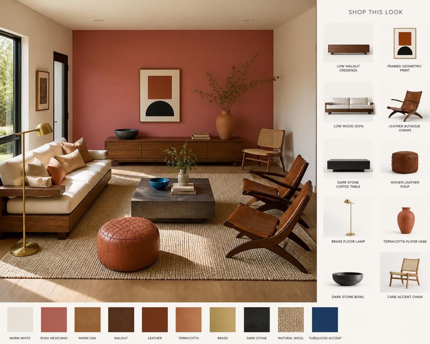
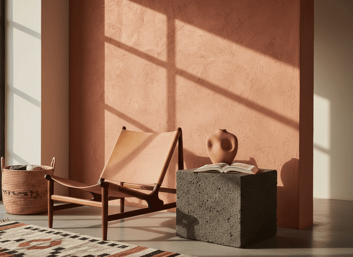
The chair that does all the heavy lifting sits low with a reclined seat, exactly the shape Porset made modern. Put two of these opposite the sofa.
The wool rug with a spine to it anchors the seating group. Flatweave wool in natural tones reads handmade instead of printed.
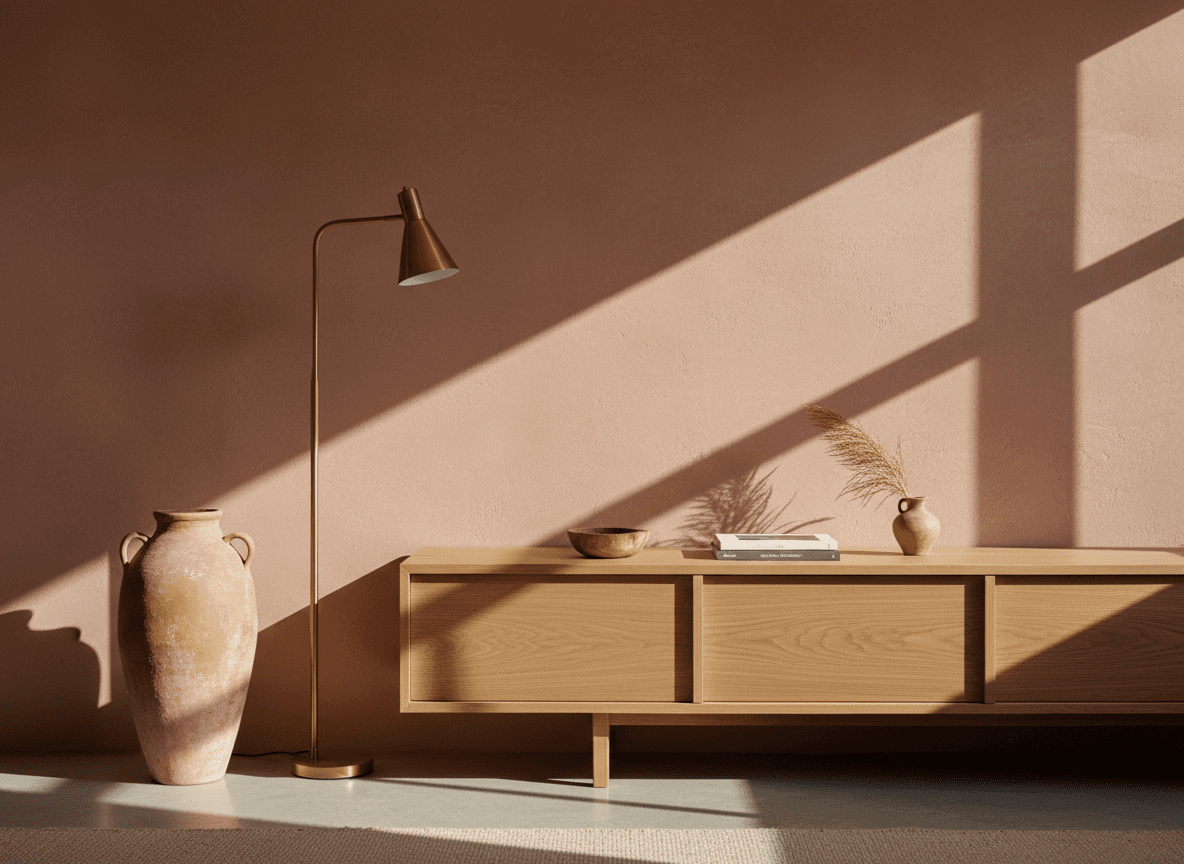
The long low credenza goes on the wall opposite the sofa. Storage plus a horizontal line to balance all that color.
The clay vase that needs nothing in it lives on the floor beside the credenza. Unglazed, matte, quietly enormous.
The woven leather pouf is your flex seat and footrest. Pull it into the circle when people show up.
The brass lamp that warms the corner goes behind a chair. Warm metal keeps saturated color from going cold.
The cane chair for the odd corner fills the spot near the window without blocking light.
The pillows that carry the color story sit on the sofa in twos, never in a matched set of four.
How It Differs From American Mid-Century
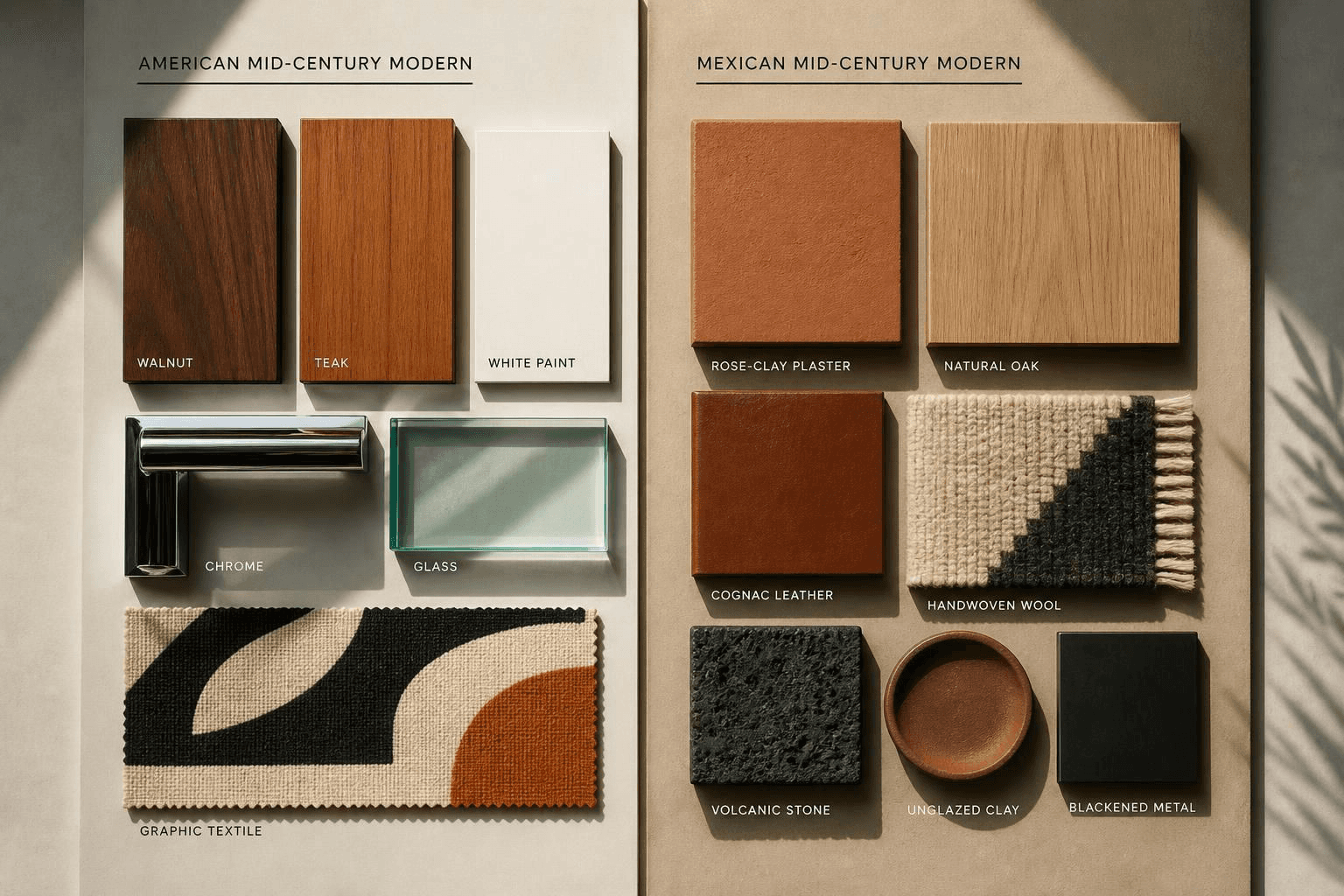
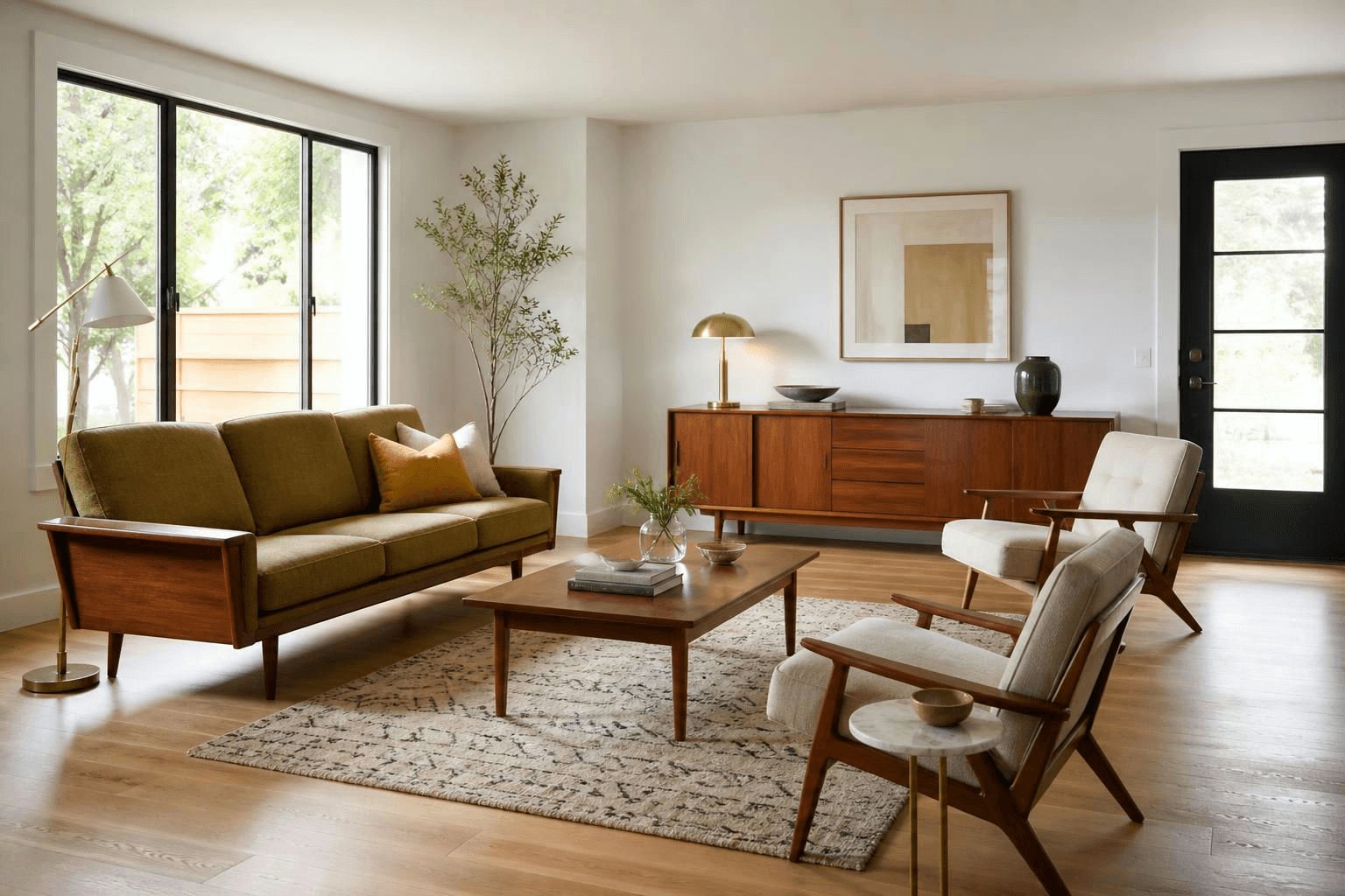
They're cousins, not twins. American mid-century leans cool, restrained and factory made. Mexican modernism leans warm, saturated and hand made.
Element | American Mid-Century | Mexican Mid-Century |
|---|---|---|
Walls | White or soft neutral, color lives in upholstery | One or two full planes of saturated color, treated as architecture |
Wood | Teak and walnut, thin legs, refined | Parota, mesquite, heavy solid wood, chunkier joinery |
Seating | Tapered legs, foam cushions, tight upholstery | Low butaque and equipal forms, leather slings, woven seats |
Stone | Marble accents | Dark volcanic stone, cantera, rough and matte |
Textiles | Tweed, boucle, nubby wool | Handwoven wool, cotton, natural and cochineal dyes |
Ornament | Graphic, printed, abstract | Handcraft itself is the ornament |
Overall feel | Cool, optimistic, engineered | Warm, sculptural, sun soaked |
If you already lean toward one side, my post on a warm mid-century modern living room covers the American half in more depth.

The Color Wall Is Architecture, Not an Accent
This is the part people get wrong, so I'll be blunt about it.
An accent wall is decoration you add after the room is done. A color plane is structural. It defines where the room ends, catches light, and changes the whole feeling depending on the hour.
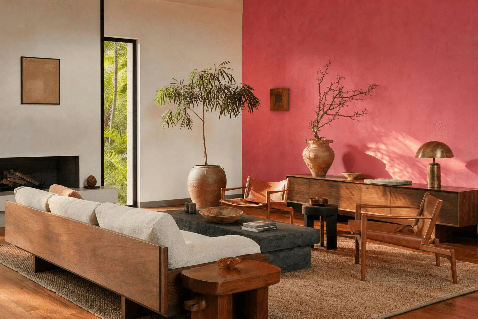
Three rules I hold to. Take the color floor to ceiling and corner to corner, no stopping at a chair rail. Pick the wall that gets raking light rather than flat light, because saturated color is boring when it's evenly lit. And keep everything else warm white or plaster toned so the color has somewhere to breathe.
Role | Color family | Where it goes | Why it works |
|---|---|---|---|
The plane | Rosa mexicano, cochineal red, or deep ochre | One full wall, usually behind the credenza | Reads as built, not applied |
The ground | Warm white, lime plaster tone | All remaining walls and ceiling | Keeps the color from feeling like a paint job |
The warmth | Oak, walnut, parota | Furniture, frames | Bridges the bold wall and the neutral ones |
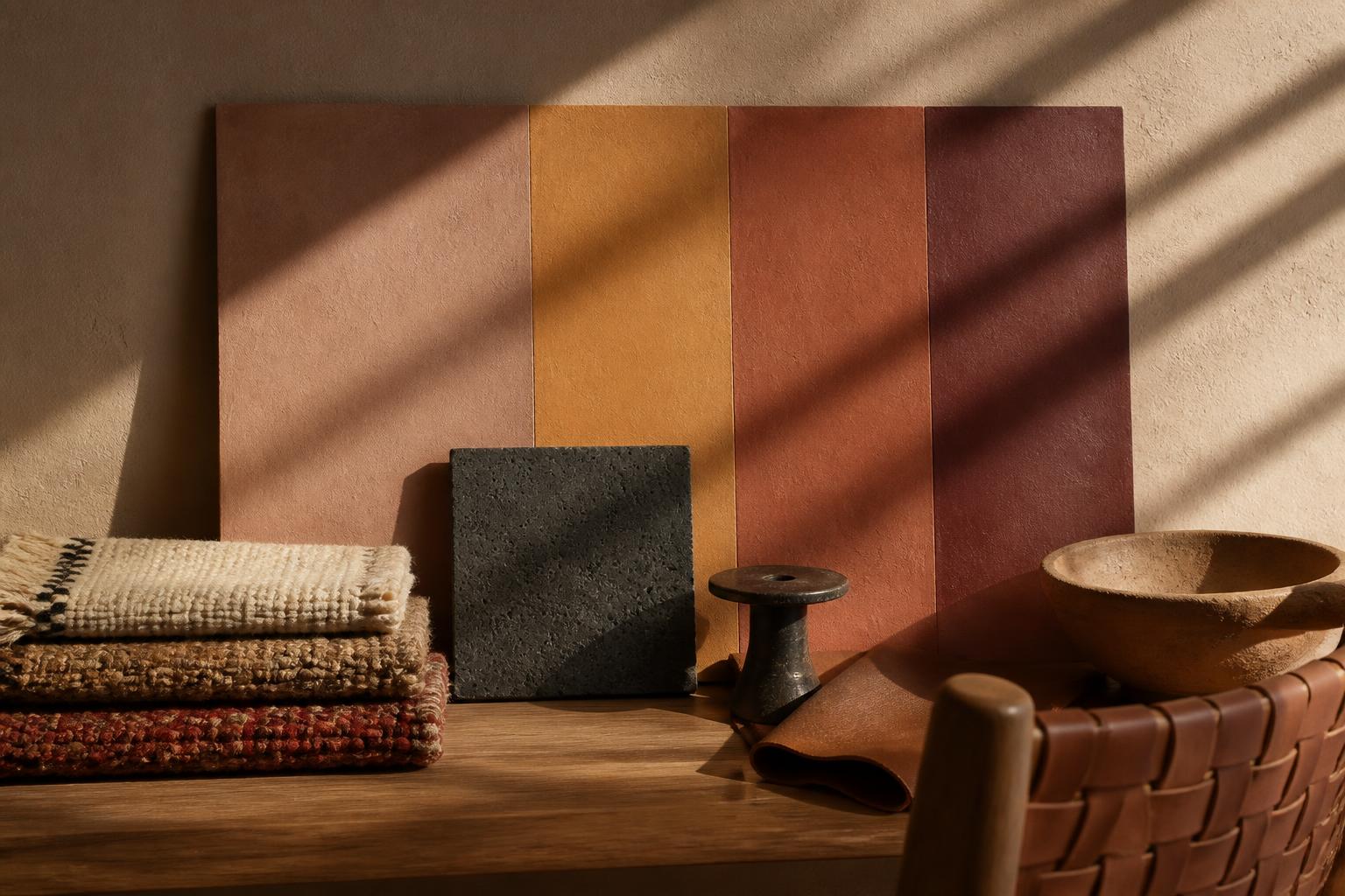
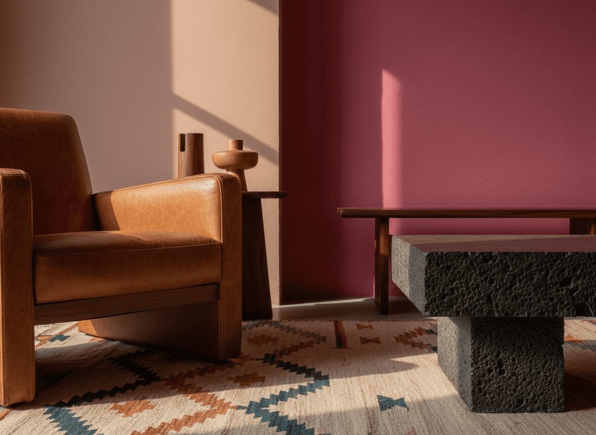
The weight | Dark volcanic gray, near black | Low table, lamp bases, iron | Grounds the color so it doesn't float |
The spark | Turquoise or cobalt | One object, ceramic or textile | Small, deliberate, never repeated four times |
One thing I'll say plainly: if you're renting or you hate the idea of repainting in two years, do the color plane in a hanging textile or a large piece of art instead. Same effect, less commitment.
Not sure which direction your color instincts run? The Style Discovery quiz is free with the code FRIENDS, a $49 value, and it'll tell you whether you're actually after rosa mexicano or whether you just like it on other people's walls.
Furniture, Materials and Why They Have to Be Real
Low is the rule. Butaque chairs, equipal style seats from Jalisco with their woven pigskin and wood frames, long credenzas, sofas that sit close to the floor.
Low furniture makes a standard 8 or 9 foot ceiling feel taller, and it makes a bold wall feel like it's holding the room instead of shouting at you.
For materials, go with things that age instead of wear out. Volcanic stone or a honed dark stone for the low table. Unglazed clay for vessels. Handwoven wool for the rug. Vegetable tanned leather for seating. Solid wood over veneer where the budget allows.
Skip the printed cactus pillows and the mass market serape stripes. The style already has enough personality. You don't need to announce it.
A Sample 13 by 16 Layout
Here's how I'd plan a 13 foot by 16 foot living room with one window on a short wall and a cased opening to the hall on the opposite short wall.
Float the sofa about a foot off one long wall, facing in. Two butaque chairs go opposite, angled slightly toward each other rather than squared up. A low stone table sits between them, roughly 16 to 18 inches from the seat edges so people can reach it without leaning. The credenza takes the other long wall, under the color plane.
The walking lane from the hall opening to the window stays clear, generally 30 to 36 inches wide. That's the lane that decides whether the room feels calm or annoying, and it's the first thing I draw.
Rug sits under the front legs of everything in the group, which usually means an 8 by 10 in a room this size. Lamp behind a chair, not in the lane. Pouf parks near the sofa and moves when company comes.
Treat those numbers as starting points. Your door swing, your vent locations and your actual furniture depths get the final vote.
If your room is fighting you and you'd rather hand the graph paper to somebody else, space planning is the service I'd point you to, and you can tell me what you're working with.
It Depends on Your Space
If the room is small, do one color plane only, keep the furniture legs visible, and choose a low table you can see over. Wall mount the credenza if you can.
If the room is large, you can run color across two adjacent planes and break the room into a main conversation group plus a reading corner. Large rooms need more than one destination or they feel like a lobby.
If you rent, the color goes on a big textile, a stretched canvas, or removable paint if your lease allows. Put your money into the butaque chairs and the rug, because those come with you.
If your light is low or north facing, skip the cool pinks and go warm. Ochre, terracotta and clay hold up in dim light. Cool saturated colors go muddy fast. My guide to lighting placement helps here more than any paint chip will.
If you have kids or pets, choose leather that's allowed to scar, wool that hides crumbs, and a stone table with rounded edges rather than a sharp sled base. Wool and leather both improve with abuse, which is more than I can say for velvet.
If the budget is tight, buy the rug and one real chair. Paint is cheap and does enormous work. Fill in over two years instead of ordering a matched set now.
Sourcing: Vintage, New and Mexican Makers
Vintage is where the shape lives. Look for original butaque frames, solid parota pieces and old equipal seating. Expect to reweave or re-sling something.
New mass market is where you cover the functional pieces, sofa, storage, lighting. Nobody needs their sofa to be a heritage object.
Mexican makers are where the soul comes from, and they're worth the effort. Handwoven wool rugs from Teotitlán del Valle in Oaxaca. Talavera ceramics from Puebla. Equipal chairs from Jalisco. Blown glass from Tonalá. Black clay, barro negro, from San Bartolo Coyotepec.
I'm not going to link shops I can't personally vouch for, because that's how people get burned. Search those region names plus the craft, buy from sellers who name the artisan or the village, and expect to pay real money for real work.
For pieces that don't need to be heirloom, a flatweave wool runner, a set of matte stoneware bowls and simple oatmeal linen curtains will carry the look without eating the budget.
Want the rest of the house? The room-by-room modern Mexican design guide covers kitchens, baths and bedrooms in the same language.
FAQ
What is Mexican mid-century modern style?
It's the blend of Mexican modernist architecture and mid-century furniture design, combining bold architectural color, low horizontal forms, and handcrafted materials like wool, clay, leather and volcanic stone. Think Luis Barragán's color planes paired with Clara Porset's butaque chairs.
What colors are used in Mexican modernism?
Saturated pinks, cochineal reds, ochres and yellows, balanced by warm white plaster tones and dark volcanic gray. The trick is committing to one or two colors across full walls rather than sprinkling several around the room.
What is a butaque chair?
A low chair with a deeply curved, reclined seat and a wood frame, rooted in Latin American vernacular furniture. Clara Porset reworked it into a modern piece in mid-century Mexico, and it's the single most recognizable seat in this style.
Can I do this style in a small living room?
Yes, and small rooms often handle it better than people expect. Use one color plane, keep furniture low with visible legs, and protect a clear walking lane so the bold color reads as confident rather than crowded.
Is Mexican mid-century modern still current?
It reads as current because it never depended on trend colors or disposable materials. Solid wood, wool, leather and clay only look better as they age.
Two styles, one room, and a layout that holds up on a random Tuesday. That's the whole Venn diagram. If you want help finding the overlap in your own house, let's talk about your room.
More Inspiration

I love a design smashup. Same reason I love those songs that merge two tracks into one and somehow make a third thing that's better than either.
So here I am with a Venn diagram. Circle one is Mexican modernism, all bold color and handmade texture. Circle two is mid-century modern, all low lines and warm wood. And circle three, the one everybody forgets, is whether the room actually works on a Tuesday night when somebody is eating cereal on the sofa.
The overlap is the whole game.
Here's the short answer. Mexican mid-century modern works because both styles already agree on the important things: low horizontal furniture, honest materials, and no fussy ornament. What Mexican modernism adds is architectural color and real handcraft. You get there by planning the layout first, then choosing one wall to carry the color, then letting wood, wool, leather and clay do the rest.
What Mexican Modernism Actually Is
It's a mid-twentieth century movement that took modernist architecture and ran it through Mexican craft, climate and color.
The name most people know is Luis Barragán, the architect who won the Pritzker Prize in 1980. His work is famous for big planes of saturated color, thick plaster walls, volcanic stone, water, and light used like a building material. His own house in Mexico City is a UNESCO World Heritage site.
Clara Porset, a Cuban-born designer who built her career in Mexico, is the furniture half of the story. She studied vernacular Mexican forms and reinterpreted the butaque, a low slung chair with a curved, reclined seat, into something modern. Her whole argument was that good design should come from how people actually live, not from imported catalogs. I think about that constantly.
And Pedro Friedeberg, the Mexican artist and designer behind the Hand Chair, is the reminder that this movement had a surreal, funny streak. Not everything needs to be reverent.
That's the foundation. Architecture with nerve, furniture rooted in craft, and a willingness to be strange.
Shop This Room
As an Amazon Associate, I earn from qualifying purchases. It doesn't change what I recommend.
The chair that does all the heavy lifting sits low with a reclined seat, exactly the shape Porset made modern. Put two of these opposite the sofa.
The wool rug with a spine to it anchors the seating group. Flatweave wool in natural tones reads handmade instead of printed.
The long low credenza goes on the wall opposite the sofa. Storage plus a horizontal line to balance all that color.
The clay vase that needs nothing in it lives on the floor beside the credenza. Unglazed, matte, quietly enormous.
The woven leather pouf is your flex seat and footrest. Pull it into the circle when people show up.
The brass lamp that warms the corner goes behind a chair. Warm metal keeps saturated color from going cold.
The cane chair for the odd corner fills the spot near the window without blocking light.
The pillows that carry the color story sit on the sofa in twos, never in a matched set of four.
How It Differs From American Mid-Century
They're cousins, not twins. American mid-century leans cool, restrained and factory made. Mexican modernism leans warm, saturated and hand made.
Element | American Mid-Century | Mexican Mid-Century |
|---|---|---|
Walls | White or soft neutral, color lives in upholstery | One or two full planes of saturated color, treated as architecture |
Wood | Teak and walnut, thin legs, refined | Parota, mesquite, heavy solid wood, chunkier joinery |
Seating | Tapered legs, foam cushions, tight upholstery | Low butaque and equipal forms, leather slings, woven seats |
Stone | Marble accents | Dark volcanic stone, cantera, rough and matte |
Textiles | Tweed, boucle, nubby wool | Handwoven wool, cotton, natural and cochineal dyes |
Ornament | Graphic, printed, abstract | Handcraft itself is the ornament |
Overall feel | Cool, optimistic, engineered | Warm, sculptural, sun soaked |
If you already lean toward one side, my post on a warm mid-century modern living room covers the American half in more depth.
The Color Wall Is Architecture, Not an Accent
This is the part people get wrong, so I'll be blunt about it.
An accent wall is decoration you add after the room is done. A color plane is structural. It defines where the room ends, catches light, and changes the whole feeling depending on the hour.
Three rules I hold to. Take the color floor to ceiling and corner to corner, no stopping at a chair rail. Pick the wall that gets raking light rather than flat light, because saturated color is boring when it's evenly lit. And keep everything else warm white or plaster toned so the color has somewhere to breathe.
Role | Color family | Where it goes | Why it works |
|---|---|---|---|
The plane | Rosa mexicano, cochineal red, or deep ochre | One full wall, usually behind the credenza | Reads as built, not applied |
The ground | Warm white, lime plaster tone | All remaining walls and ceiling | Keeps the color from feeling like a paint job |
The warmth | Oak, walnut, parota | Furniture, frames | Bridges the bold wall and the neutral ones |
The weight | Dark volcanic gray, near black | Low table, lamp bases, iron | Grounds the color so it doesn't float |
The spark | Turquoise or cobalt | One object, ceramic or textile | Small, deliberate, never repeated four times |
One thing I'll say plainly: if you're renting or you hate the idea of repainting in two years, do the color plane in a hanging textile or a large piece of art instead. Same effect, less commitment.
Not sure which direction your color instincts run? The Style Discovery quiz is free with the code FRIENDS, a $49 value, and it'll tell you whether you're actually after rosa mexicano or whether you just like it on other people's walls.
Furniture, Materials and Why They Have to Be Real
Low is the rule. Butaque chairs, equipal style seats from Jalisco with their woven pigskin and wood frames, long credenzas, sofas that sit close to the floor.
Low furniture makes a standard 8 or 9 foot ceiling feel taller, and it makes a bold wall feel like it's holding the room instead of shouting at you.
For materials, go with things that age instead of wear out. Volcanic stone or a honed dark stone for the low table. Unglazed clay for vessels. Handwoven wool for the rug. Vegetable tanned leather for seating. Solid wood over veneer where the budget allows.
Skip the printed cactus pillows and the mass market serape stripes. The style already has enough personality. You don't need to announce it.
A Sample 13 by 16 Layout
Here's how I'd plan a 13 foot by 16 foot living room with one window on a short wall and a cased opening to the hall on the opposite short wall.
Float the sofa about a foot off one long wall, facing in. Two butaque chairs go opposite, angled slightly toward each other rather than squared up. A low stone table sits between them, roughly 16 to 18 inches from the seat edges so people can reach it without leaning. The credenza takes the other long wall, under the color plane.
The walking lane from the hall opening to the window stays clear, generally 30 to 36 inches wide. That's the lane that decides whether the room feels calm or annoying, and it's the first thing I draw.
Rug sits under the front legs of everything in the group, which usually means an 8 by 10 in a room this size. Lamp behind a chair, not in the lane. Pouf parks near the sofa and moves when company comes.
Treat those numbers as starting points. Your door swing, your vent locations and your actual furniture depths get the final vote.
If your room is fighting you and you'd rather hand the graph paper to somebody else, space planning is the service I'd point you to, and you can tell me what you're working with.
It Depends on Your Space
If the room is small, do one color plane only, keep the furniture legs visible, and choose a low table you can see over. Wall mount the credenza if you can.
If the room is large, you can run color across two adjacent planes and break the room into a main conversation group plus a reading corner. Large rooms need more than one destination or they feel like a lobby.
If you rent, the color goes on a big textile, a stretched canvas, or removable paint if your lease allows. Put your money into the butaque chairs and the rug, because those come with you.
If your light is low or north facing, skip the cool pinks and go warm. Ochre, terracotta and clay hold up in dim light. Cool saturated colors go muddy fast. My guide to lighting placement helps here more than any paint chip will.
If you have kids or pets, choose leather that's allowed to scar, wool that hides crumbs, and a stone table with rounded edges rather than a sharp sled base. Wool and leather both improve with abuse, which is more than I can say for velvet.
If the budget is tight, buy the rug and one real chair. Paint is cheap and does enormous work. Fill in over two years instead of ordering a matched set now.
Sourcing: Vintage, New and Mexican Makers
Vintage is where the shape lives. Look for original butaque frames, solid parota pieces and old equipal seating. Expect to reweave or re-sling something.
New mass market is where you cover the functional pieces, sofa, storage, lighting. Nobody needs their sofa to be a heritage object.
Mexican makers are where the soul comes from, and they're worth the effort. Handwoven wool rugs from Teotitlán del Valle in Oaxaca. Talavera ceramics from Puebla. Equipal chairs from Jalisco. Blown glass from Tonalá. Black clay, barro negro, from San Bartolo Coyotepec.
I'm not going to link shops I can't personally vouch for, because that's how people get burned. Search those region names plus the craft, buy from sellers who name the artisan or the village, and expect to pay real money for real work.
For pieces that don't need to be heirloom, a flatweave wool runner, a set of matte stoneware bowls and simple oatmeal linen curtains will carry the look without eating the budget.
Want the rest of the house? The room-by-room modern Mexican design guide covers kitchens, baths and bedrooms in the same language.
FAQ
What is Mexican mid-century modern style?
It's the blend of Mexican modernist architecture and mid-century furniture design, combining bold architectural color, low horizontal forms, and handcrafted materials like wool, clay, leather and volcanic stone. Think Luis Barragán's color planes paired with Clara Porset's butaque chairs.
What colors are used in Mexican modernism?
Saturated pinks, cochineal reds, ochres and yellows, balanced by warm white plaster tones and dark volcanic gray. The trick is committing to one or two colors across full walls rather than sprinkling several around the room.
What is a butaque chair?
A low chair with a deeply curved, reclined seat and a wood frame, rooted in Latin American vernacular furniture. Clara Porset reworked it into a modern piece in mid-century Mexico, and it's the single most recognizable seat in this style.
Can I do this style in a small living room?
Yes, and small rooms often handle it better than people expect. Use one color plane, keep furniture low with visible legs, and protect a clear walking lane so the bold color reads as confident rather than crowded.
Is Mexican mid-century modern still current?
It reads as current because it never depended on trend colors or disposable materials. Solid wood, wool, leather and clay only look better as they age.
Two styles, one room, and a layout that holds up on a random Tuesday. That's the whole Venn diagram. If you want help finding the overlap in your own house, let's talk about your room.
More Inspiration
Other Blogs
Other Similar Blogs
Your go-to destination for insightful articles, tips, and inspiration on all things landscaping and outdoor living
Other Blogs
Other Similar Blogs
Your go-to destination for insightful articles, tips, and inspiration on all things landscaping and outdoor living
Other Blogs
Other Similar Blogs
Your go-to destination for insightful articles, tips, and inspiration on all things landscaping and outdoor living



Join our newsletter list
Sign up to get the most recent blog articles in your email every week.