
Author
Suzanne is an Owner/Designer
Author
Suzanne is an Owner/Designer
Checkerboard flooring is back, and the new wave goes way beyond black and white. Four rooms, three materials, and the layout decisions that make the pattern actually work.
Checkerboard flooring is back, and the new wave goes way beyond black and white. Four rooms, three materials, and the layout decisions that make the pattern actually work.
Checkerboard Revival: New Palettes and Materials for a Classic Pattern That's Trending Again
*This blog contains affiliate links
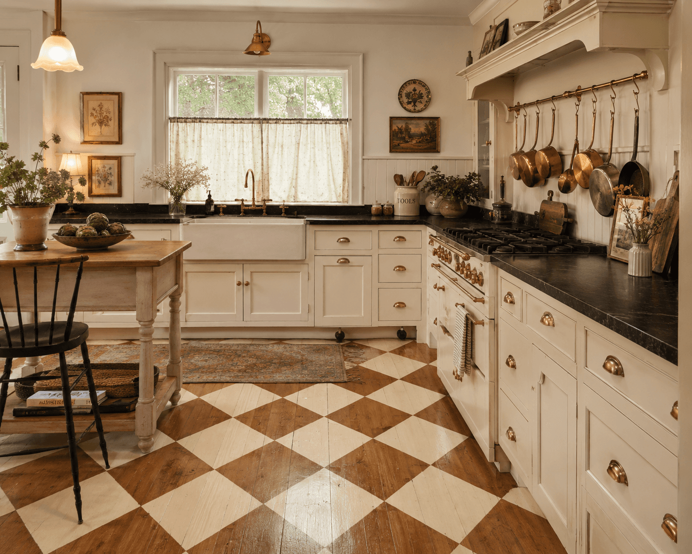
I cant remember where I first saw a checkerboard floor that made me stop scrolling. It might have been a photo of some Belgian kitchen, late afternoon light, sage and cream tiles slightly uneven in a way that made the whole room feel like it had been breathing for a hundred years. The squares were maybe 16 inches. Not small and busy. Just, settled.
And I remember thinking, that doesn't look like a checkerboard floor. It looks like the floor that was always supposed to be there.
Thats the version of checkerboard thats coming back right now. Not the retro diner thing. Not the Alice in Wonderland thing. Something quieter, and honestly, way more interesting.
Shop This Room
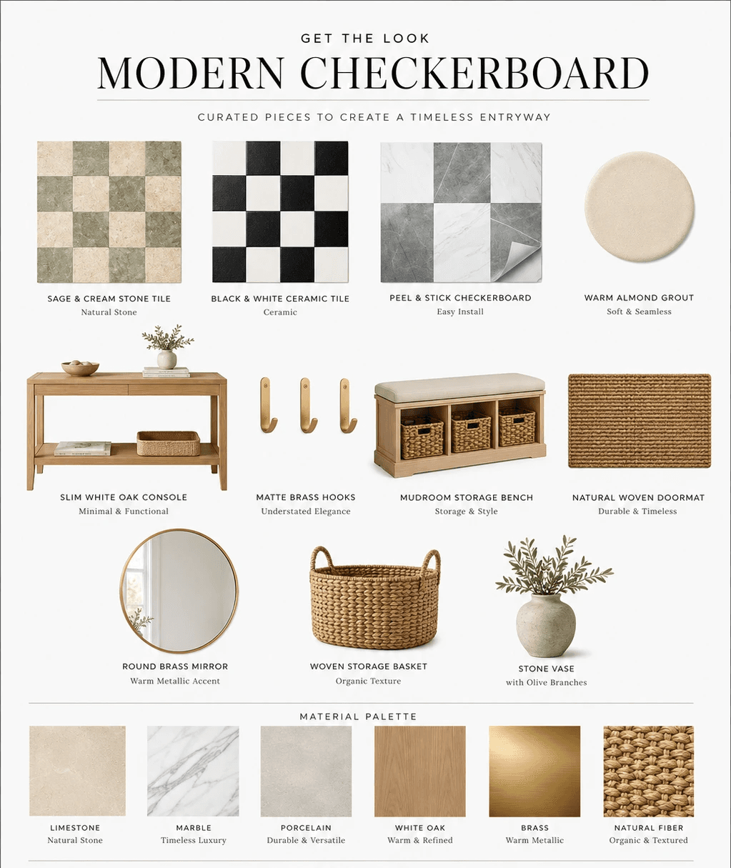
Before we get into the details, here are the pieces and materials that show up throughout this post. Everything links to Amazon so you can start browsing.
Marble square tiles in white and green tones for that old-world entryway look
Black and white ceramic floor tiles for kitchens and powder baths
Peel-and-stick checkerboard floor tiles for renters or anyone who wants to test before committing
Warm-toned unsanded grout, the quiet hero of this whole look
A slim entryway console table that doesn't crowd the pattern
A low-profile mudroom bench with shoe storage underneath
A woven natural fiber doormat to layer at the threshold
---
What Makes Modern Checkerboard Different
The old version of checkerboard was always high contrast. Pure black, pure white, glossy, 12-inch tiles, straight grid. It read as a choice. Like the floor was making a statement and the rest of the room had to work around it.
The new version is lower contrast. Softer colors. Sometimes matte. Sometimes stone instead of ceramic. And the tiles are often bigger, 16 or even 18 inches, which slows the pattern down and makes it feel architectural instead of decorative.
Thats the shift. Checkerboard used to be decor. Now its structure.
The colorways that are landing the hardest right now:
Sage and cream. This is the one I keep coming back to. It has that washed European quality. Works in entryways, kitchens, mudrooms. Pairs well with warm wood and brass.
Burgundy and warm cream. Richer, moodier. Gorgeous in a powder bath. Gives you that old library floor feeling without being heavy.
Charcoal and linen white. If you want the contrast of black and white but softer. The charcoal reads as warm gray in most light.
Terracotta and pale blush. This one is unexpected and I love it. Very Southern European. Very good in a laundry room, which always makes me nervous to say because most of my laundry room opinions are strong.
---
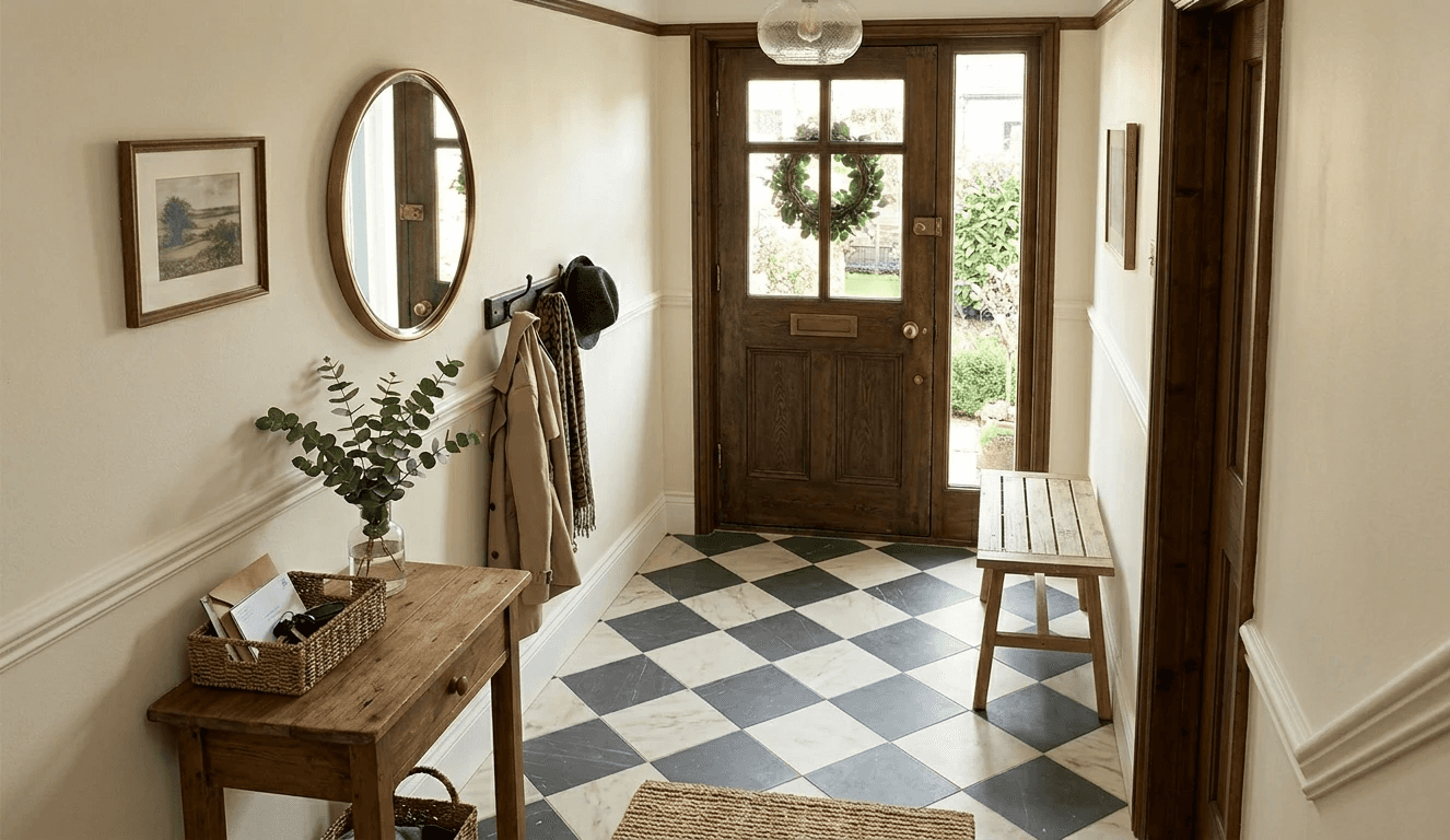
Application 1: The Entryway
This is the most natural place for checkerboard and honestly the place it does the most functional work.
An entryway has one job. Receive you. Take your stuff. Let you move through. The floor is doing almost all the visual heavy lifting because the walls are usually narrow, the furniture is minimal, and the light is whatever it is.
Checkerboard in an entryway tells you: this is a real room, not a hallway you walk through. It gives the floor a sense of purpose.
Layout note: In a narrow entryway, lay the pattern on the diagonal. Always. Straight grid in a tight footprint makes the room feel like a corridor. Diagonal tricks your eye into reading width.
A natural fiber doormat layered on top of the tile at the threshold is not just functional, it softens the transition and keeps the pattern from running right into the front door.
Keep furniture minimal. A slim console along one wall. Some brass hooks above it. The floor is the thing. Let it be the thing.
---
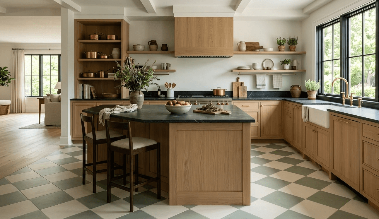
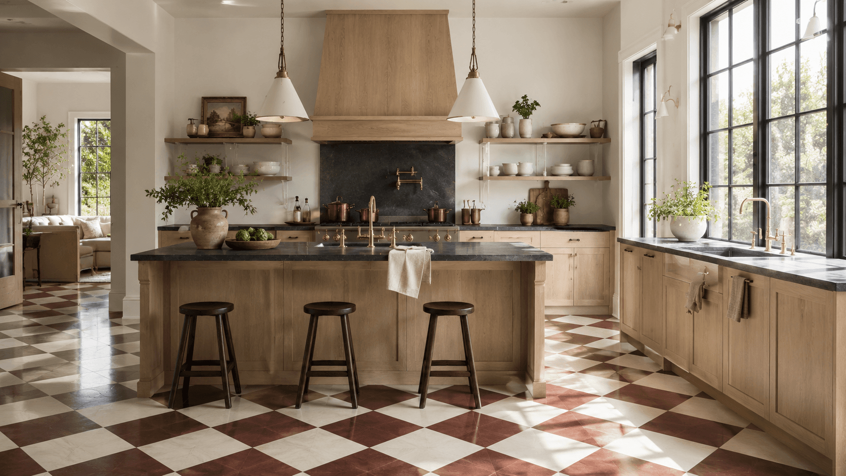
Application 2: The Kitchen Floor
This one requires more courage, and more planning.
Kitchens have islands. They have cabinets with toe kicks. They have transitions to other flooring in adjacent rooms. All of this means the checkerboard pattern is going to get interrupted, and you need to think about where those interruptions land before the first tile goes down.
The biggest mistake I see is running the pattern wall to wall without considering sightlines. You walk into the kitchen and the first thing you notice is a row of cut tiles jammed against the island base. It looks unplanned. Because it was.
Layout note: Center the pattern on the most visible axis. In most kitchens, thats the line from the main entry to the sink or the island. Let the cuts happen at the perimeter where cabinets hide them.
For kitchens, I lean toward ceramic tile in matte finish. Its more forgiving with spills and wear than stone, and the matte surface doesn't show water spots the way polished marble will.
Sage and cream is stunning here. The green undertone picks up herbs on the counter, copper pots, the backyard through the window. It connects without trying.
---
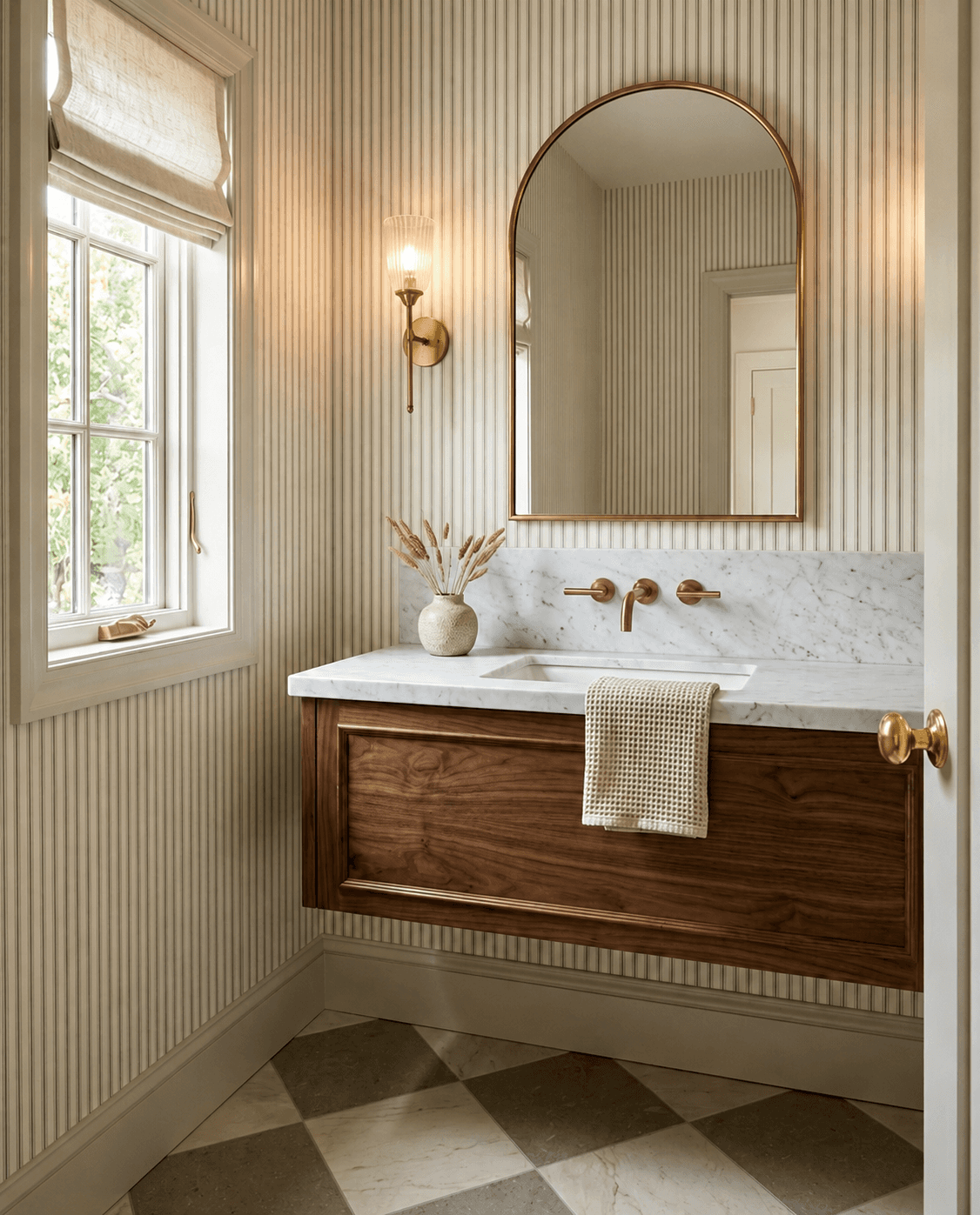
Application 3: The Powder Bath
The powder bath is the room where you can go darker, richer, and more dramatic with checkerboard because its small and self-contained. Nobody lives in a powder bath. You visit it.
Burgundy and warm cream on the floor of a 28-square-foot powder bath is genuinely one of the most satisfying things Ive seen this year. Add a simple pedestal sink, a round mirror with a thin brass frame, and warm white walls. Thats it. The floor carries the entire room.
Scale note: In a powder bath, you can go smaller with the tiles. 8-inch or even 6-inch squares work because the room itself is tiny and the smaller pattern creates density that feels intentional. In bigger rooms, small tiles get busy. In here, they get jewel-box.
---
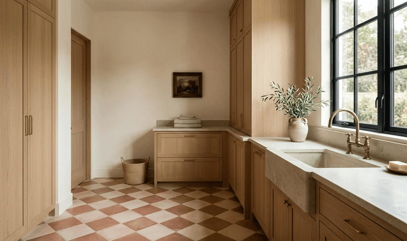
Application 4: The Laundry Room and Mudroom
This is where checkerboard becomes genuinely practical, and where I think it has the most untapped potential.
Mudrooms and laundry rooms are wet. They get dirty. They deal with dog paws and rain boots and detergent drips. A patterned floor hides all of that better than a solid floor. The eye doesn't land on individual marks because its busy reading the pattern.
Terracotta and pale blush here. Or sage and cream. Something warm enough that the room doesn't feel clinical but light enough to still feel clean.
A low storage bench along the wall gives you a seat for pulling off boots and hides shoes underneath. Matte black wall hooks above keep coats off the floor. The whole room works as a landing strip, and the checkerboard floor makes it feel finished instead of forgotten.
For laundry rooms, a washer and dryer pedestal lifts the machines enough that the tile pattern reads underneath them, which makes the room feel like a room and not a closet with appliances in it.
---
Material Pros and Cons
Not all checkerboard is the same once you get past the visual. The material changes everything about how it lives.
Natural Stone (Marble, Limestone, Travertine)
Pros: Unmatched character. Slight color variation tile to tile. Ages beautifully. Feels substantial underfoot.
Cons: Porous. Needs sealing. Marble especially will etch from acidic spills (lemon juice, vinegar, wine). Higher cost. Heavier, so subfloor needs to handle it.
Best for: Entryways, powder baths. Rooms where traffic is moderate and the floor can be a statement.
Ceramic or Porcelain Tile
Pros: Durable. Water-resistant. Wide range of colors and finishes. More affordable than stone. Easy to clean.
Cons: Can feel flat or manufactured compared to stone. Very uniform, which some people love and some people don't.
Best for: Kitchens, mudrooms, laundry rooms. High-traffic, high-moisture areas.
Browse porcelain floor tiles in checkerboard colors to see whats available.
Painted Wood
Pros: Incredible warmth. Works over existing wood floors. Fully customizable color. Has that hand-done quality that photographs beautifully.
Cons: Wears. Will chip and scratch, especially in high-traffic zones. Needs repainting every few years. Not great in wet areas.
Best for: Entryways (if you embrace the wear), sunrooms, covered porches. Anywhere you want patina.
A good floor and porch paint in your chosen colors plus a painters tape for clean lines and youre honestly 90% of the way there.
---
This is exactly what I do for clients.
The floor sets the layout. The layout determines what furniture goes where, what the room feels like to walk through, how the light lands. I start with the floor plan, not the Pinterest board.
Want me to design your room like this? Let's Chat.
Not sure what your style actually is? Start with the Style Discovery quiz.
---
Scale: Small Squares vs. Large Squares
This decision changes the feeling of the floor more than color does.
Small squares (6 to 8 inches): Dense, detailed, old-world. Works in small rooms. Powder baths, compact entryways. Can feel busy in anything over about 60 square feet.
Medium squares (12 inches): The classic. Works almost anywhere. Familiar enough to read as checkerboard immediately. Safe but good.
Large squares (16 to 18 inches): Modern, calm, architectural. Slows the pattern down. Makes the floor feel quieter. Best in kitchens, mudrooms, and any room over 80 square feet.
And the diagonal question.
Straight grid is stable and formal. It aligns with walls and doorways and feels orderly. Diagonal is dynamic. It makes rooms feel wider and adds movement. In narrow rooms, go diagonal. In square rooms, either works.
---
FAQ
What color grout should I use with checkerboard tile?
Match the grout to the lighter tile. This is my default answer for almost every colorway. Matching the lighter tile lets the pattern breathe and keeps the grid from becoming a cage. Matching the darker tile makes the whole floor feel heavier, which can work in a powder bath but usually overwhelms everywhere else.
Avoid pure white grout unless your lighter tile is also pure white. A warm gray or almond grout almost always reads better and stays cleaner looking over time.
Is checkerboard tile slippery?
Depends entirely on the finish. Polished marble or glossy ceramic? Yes, especially wet. Matte porcelain, honed stone, or textured ceramic? Generally fine. For wet areas like mudrooms, laundry rooms, and bathrooms, go matte or honed. Look for a slip resistance rating (COF of 0.42 or higher for wet areas). Most matte porcelain floor tiles meet that standard.
How do I handle checkerboard pattern alignment in a room with weird angles or not-square walls?
This is the question that separates a good tile job from a frustrating one. Most rooms aren't perfectly square. Walls bow. Corners are 89 degrees instead of 90.
Start the pattern from the center of the room and work outward. Snap chalk lines to find true center, then dry-lay tiles along both axes before setting anything. The cuts at the perimeter should be as even as possible on opposite sides. If one side gets a 2-inch sliver and the other gets an 11-inch cut, something went wrong with the starting point.
In rooms with doorways on multiple walls, prioritize alignment with the most visible threshold. Thats the one guests see first.
---
One More Thing
Checkerboard is one of those patterns that feels like it should be simple. Two colors, alternating. But the decisions around it, the colorway, the material, the tile size, the orientation, the grout color, the room it goes in, all of those things stack up.
And when they stack up well, the floor stops being a floor and starts being the reason the room works.
I keep thinking about that Belgian kitchen photo. The sage and cream. The way the tiles weren't perfect. The way the whole room felt like it had just always been that way.
Thats what Im chasing when I think about checkerboard now. Not a pattern. A feeling that the room was built from the ground up, starting with the floor.
If youre thinking about trying it, Let's Make It Happen. I love this kind of project.
Checkerboard Revival: New Palettes and Materials for a Classic Pattern That's Trending Again
*This blog contains affiliate links
I cant remember where I first saw a checkerboard floor that made me stop scrolling. It might have been a photo of some Belgian kitchen, late afternoon light, sage and cream tiles slightly uneven in a way that made the whole room feel like it had been breathing for a hundred years. The squares were maybe 16 inches. Not small and busy. Just, settled.
And I remember thinking, that doesn't look like a checkerboard floor. It looks like the floor that was always supposed to be there.
Thats the version of checkerboard thats coming back right now. Not the retro diner thing. Not the Alice in Wonderland thing. Something quieter, and honestly, way more interesting.
Shop This Room
Before we get into the details, here are the pieces and materials that show up throughout this post. Everything links to Amazon so you can start browsing.
Marble square tiles in white and green tones for that old-world entryway look
Black and white ceramic floor tiles for kitchens and powder baths
Peel-and-stick checkerboard floor tiles for renters or anyone who wants to test before committing
Warm-toned unsanded grout, the quiet hero of this whole look
A slim entryway console table that doesn't crowd the pattern
A low-profile mudroom bench with shoe storage underneath
A woven natural fiber doormat to layer at the threshold
---
What Makes Modern Checkerboard Different
The old version of checkerboard was always high contrast. Pure black, pure white, glossy, 12-inch tiles, straight grid. It read as a choice. Like the floor was making a statement and the rest of the room had to work around it.
The new version is lower contrast. Softer colors. Sometimes matte. Sometimes stone instead of ceramic. And the tiles are often bigger, 16 or even 18 inches, which slows the pattern down and makes it feel architectural instead of decorative.
Thats the shift. Checkerboard used to be decor. Now its structure.
The colorways that are landing the hardest right now:
Sage and cream. This is the one I keep coming back to. It has that washed European quality. Works in entryways, kitchens, mudrooms. Pairs well with warm wood and brass.
Burgundy and warm cream. Richer, moodier. Gorgeous in a powder bath. Gives you that old library floor feeling without being heavy.
Charcoal and linen white. If you want the contrast of black and white but softer. The charcoal reads as warm gray in most light.
Terracotta and pale blush. This one is unexpected and I love it. Very Southern European. Very good in a laundry room, which always makes me nervous to say because most of my laundry room opinions are strong.
---
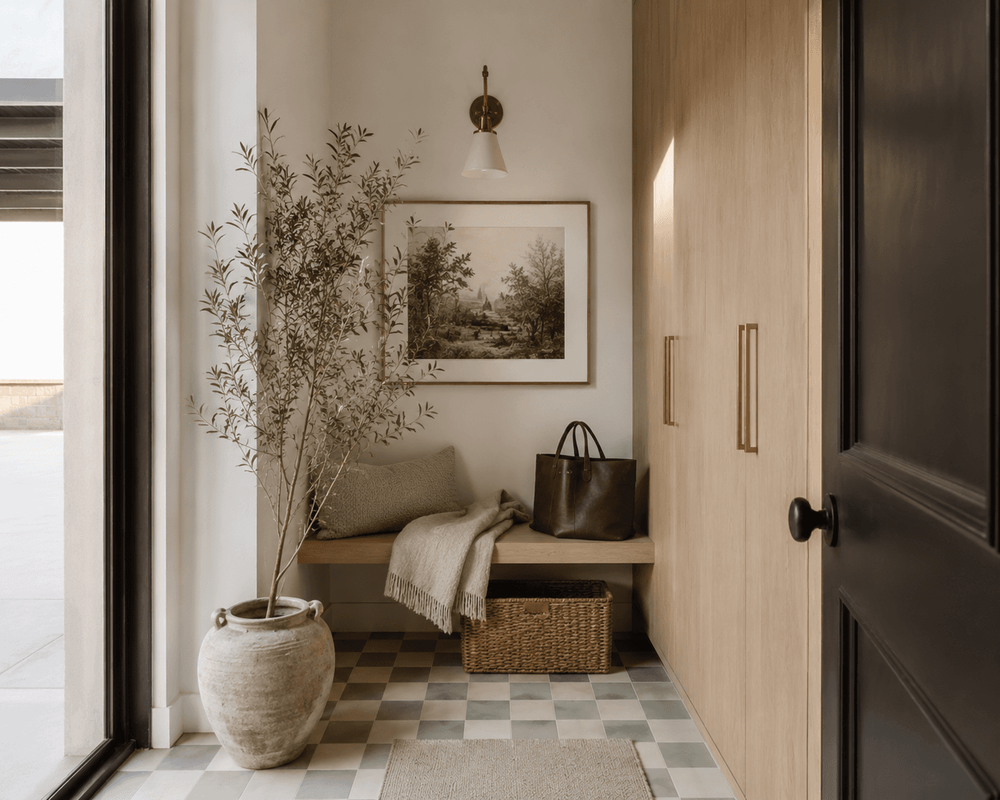
Application 1: The Entryway
This is the most natural place for checkerboard and honestly the place it does the most functional work.
An entryway has one job. Receive you. Take your stuff. Let you move through. The floor is doing almost all the visual heavy lifting because the walls are usually narrow, the furniture is minimal, and the light is whatever it is.
Checkerboard in an entryway tells you: this is a real room, not a hallway you walk through. It gives the floor a sense of purpose.
Layout note: In a narrow entryway, lay the pattern on the diagonal. Always. Straight grid in a tight footprint makes the room feel like a corridor. Diagonal tricks your eye into reading width.
A natural fiber doormat layered on top of the tile at the threshold is not just functional, it softens the transition and keeps the pattern from running right into the front door.
Keep furniture minimal. A slim console along one wall. Some brass hooks above it. The floor is the thing. Let it be the thing.
---
Application 2: The Kitchen Floor
This one requires more courage, and more planning.
Kitchens have islands. They have cabinets with toe kicks. They have transitions to other flooring in adjacent rooms. All of this means the checkerboard pattern is going to get interrupted, and you need to think about where those interruptions land before the first tile goes down.
The biggest mistake I see is running the pattern wall to wall without considering sightlines. You walk into the kitchen and the first thing you notice is a row of cut tiles jammed against the island base. It looks unplanned. Because it was.
Layout note: Center the pattern on the most visible axis. In most kitchens, thats the line from the main entry to the sink or the island. Let the cuts happen at the perimeter where cabinets hide them.
For kitchens, I lean toward ceramic tile in matte finish. Its more forgiving with spills and wear than stone, and the matte surface doesn't show water spots the way polished marble will.
Sage and cream is stunning here. The green undertone picks up herbs on the counter, copper pots, the backyard through the window. It connects without trying.
---
Application 3: The Powder Bath
The powder bath is the room where you can go darker, richer, and more dramatic with checkerboard because its small and self-contained. Nobody lives in a powder bath. You visit it.
Burgundy and warm cream on the floor of a 28-square-foot powder bath is genuinely one of the most satisfying things Ive seen this year. Add a simple pedestal sink, a round mirror with a thin brass frame, and warm white walls. Thats it. The floor carries the entire room.
Scale note: In a powder bath, you can go smaller with the tiles. 8-inch or even 6-inch squares work because the room itself is tiny and the smaller pattern creates density that feels intentional. In bigger rooms, small tiles get busy. In here, they get jewel-box.
---
Application 4: The Laundry Room and Mudroom
This is where checkerboard becomes genuinely practical, and where I think it has the most untapped potential.
Mudrooms and laundry rooms are wet. They get dirty. They deal with dog paws and rain boots and detergent drips. A patterned floor hides all of that better than a solid floor. The eye doesn't land on individual marks because its busy reading the pattern.
Terracotta and pale blush here. Or sage and cream. Something warm enough that the room doesn't feel clinical but light enough to still feel clean.
A low storage bench along the wall gives you a seat for pulling off boots and hides shoes underneath. Matte black wall hooks above keep coats off the floor. The whole room works as a landing strip, and the checkerboard floor makes it feel finished instead of forgotten.
For laundry rooms, a washer and dryer pedestal lifts the machines enough that the tile pattern reads underneath them, which makes the room feel like a room and not a closet with appliances in it.
---
Material Pros and Cons
Not all checkerboard is the same once you get past the visual. The material changes everything about how it lives.
Natural Stone (Marble, Limestone, Travertine)
Pros: Unmatched character. Slight color variation tile to tile. Ages beautifully. Feels substantial underfoot.
Cons: Porous. Needs sealing. Marble especially will etch from acidic spills (lemon juice, vinegar, wine). Higher cost. Heavier, so subfloor needs to handle it.
Best for: Entryways, powder baths. Rooms where traffic is moderate and the floor can be a statement.
Ceramic or Porcelain Tile
Pros: Durable. Water-resistant. Wide range of colors and finishes. More affordable than stone. Easy to clean.
Cons: Can feel flat or manufactured compared to stone. Very uniform, which some people love and some people don't.
Best for: Kitchens, mudrooms, laundry rooms. High-traffic, high-moisture areas.
Browse porcelain floor tiles in checkerboard colors to see whats available.
Painted Wood
Pros: Incredible warmth. Works over existing wood floors. Fully customizable color. Has that hand-done quality that photographs beautifully.
Cons: Wears. Will chip and scratch, especially in high-traffic zones. Needs repainting every few years. Not great in wet areas.
Best for: Entryways (if you embrace the wear), sunrooms, covered porches. Anywhere you want patina.
A good floor and porch paint in your chosen colors plus a painters tape for clean lines and youre honestly 90% of the way there.
---
This is exactly what I do for clients.
The floor sets the layout. The layout determines what furniture goes where, what the room feels like to walk through, how the light lands. I start with the floor plan, not the Pinterest board.
Want me to design your room like this? Let's Chat.
Not sure what your style actually is? Start with the Style Discovery quiz.
---
Scale: Small Squares vs. Large Squares
This decision changes the feeling of the floor more than color does.
Small squares (6 to 8 inches): Dense, detailed, old-world. Works in small rooms. Powder baths, compact entryways. Can feel busy in anything over about 60 square feet.
Medium squares (12 inches): The classic. Works almost anywhere. Familiar enough to read as checkerboard immediately. Safe but good.
Large squares (16 to 18 inches): Modern, calm, architectural. Slows the pattern down. Makes the floor feel quieter. Best in kitchens, mudrooms, and any room over 80 square feet.
And the diagonal question.
Straight grid is stable and formal. It aligns with walls and doorways and feels orderly. Diagonal is dynamic. It makes rooms feel wider and adds movement. In narrow rooms, go diagonal. In square rooms, either works.
---
FAQ
What color grout should I use with checkerboard tile?
Match the grout to the lighter tile. This is my default answer for almost every colorway. Matching the lighter tile lets the pattern breathe and keeps the grid from becoming a cage. Matching the darker tile makes the whole floor feel heavier, which can work in a powder bath but usually overwhelms everywhere else.
Avoid pure white grout unless your lighter tile is also pure white. A warm gray or almond grout almost always reads better and stays cleaner looking over time.
Is checkerboard tile slippery?
Depends entirely on the finish. Polished marble or glossy ceramic? Yes, especially wet. Matte porcelain, honed stone, or textured ceramic? Generally fine. For wet areas like mudrooms, laundry rooms, and bathrooms, go matte or honed. Look for a slip resistance rating (COF of 0.42 or higher for wet areas). Most matte porcelain floor tiles meet that standard.
How do I handle checkerboard pattern alignment in a room with weird angles or not-square walls?
This is the question that separates a good tile job from a frustrating one. Most rooms aren't perfectly square. Walls bow. Corners are 89 degrees instead of 90.
Start the pattern from the center of the room and work outward. Snap chalk lines to find true center, then dry-lay tiles along both axes before setting anything. The cuts at the perimeter should be as even as possible on opposite sides. If one side gets a 2-inch sliver and the other gets an 11-inch cut, something went wrong with the starting point.
In rooms with doorways on multiple walls, prioritize alignment with the most visible threshold. Thats the one guests see first.
---
One More Thing
Checkerboard is one of those patterns that feels like it should be simple. Two colors, alternating. But the decisions around it, the colorway, the material, the tile size, the orientation, the grout color, the room it goes in, all of those things stack up.
And when they stack up well, the floor stops being a floor and starts being the reason the room works.
I keep thinking about that Belgian kitchen photo. The sage and cream. The way the tiles weren't perfect. The way the whole room felt like it had just always been that way.
Thats what Im chasing when I think about checkerboard now. Not a pattern. A feeling that the room was built from the ground up, starting with the floor.
If youre thinking about trying it, Let's Make It Happen. I love this kind of project.
Other Blogs
Other Similar Blogs
Your go-to destination for insightful articles, tips, and inspiration on all things landscaping and outdoor living
Other Blogs
Other Similar Blogs
Your go-to destination for insightful articles, tips, and inspiration on all things landscaping and outdoor living
Other Blogs
Other Similar Blogs
Your go-to destination for insightful articles, tips, and inspiration on all things landscaping and outdoor living


Join our newsletter list
Sign up to get the most recent blog articles in your email every week.